Variance Analysis in Excel – Making better Budget Vs Actual charts
Variance Analysis in Excel – Making better Budget Vs Actual charts
Either it is about daily life or business, we almost all the time in our minds comparing the actual results with our plans. Though we can talk numbers and percentages but the way charts tell the stories is unbeatable. However, variance charts are often tricky as you have three things to report:
- planned figures
- actual figures
- variances i.e. the difference between plan and actual figures which can either be favourable and unfavourable.
Charting three elements together is not a problem at all, the problem is to convey the story in the most meaningful possible way which boils down to the way we present it. Those of you who are interested in knowing what is variance analysis read this post as it describes the concept in easy words: What is variance analysis?
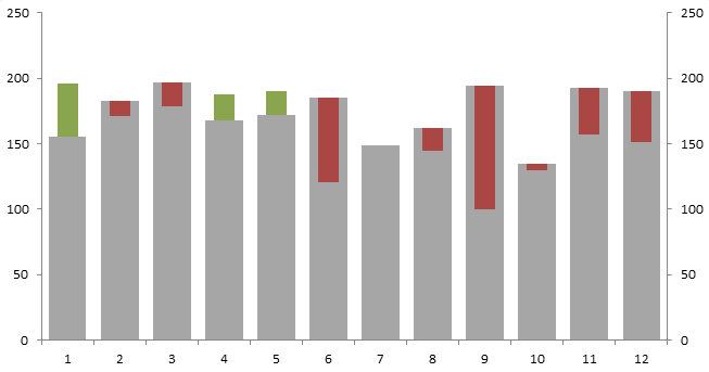
Following is the cool sales variance chart that we are going to learn today:
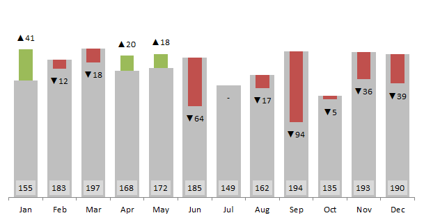
Spoiler alert! Following are few things we will be learning in this tutorial:
- Making conditional charts or multi color bar charts to separate the favourable and unfavourable variances.
- Understanding how primary and secondary axis work
- Adjusting the scale of graph
- Custom number formatting using symbols
- Custom data labels in excel charts or should I say dynamic data labels 🙂
And few other things of course like using NA() function. So lets get started!
Prepping the engine! Getting basics done
Step 1: Download and open the workbook. It already contains a simple sales data with actual and planned figures.
Step 2: Go to cell A22 and type the heading Actual < Plan. In this column we will find if actual results are less than the planned ones. So what we are looking for is simple TRUE or FALSE for each month. Put this formula in cell A23 and drag the fill handle down to cell A34 so that we have the results for all the months:
=B2<C2

Step 3: Go to cell B22 give heading Variance. In cell B23 put the following formula and drag the fill handle to cell B34:
=ABS(B2-C2)
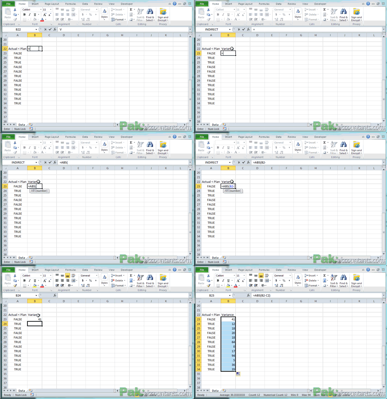
The reason of using absolute values instead of simple ones is to simplify the charting process as handling negative and positive figures may become a little tedious in charts to present the way want.
Step 4: From this point forward things are quite interesting and the Actual < Plan column will play an important part in it. Go to cell C22 and make a heading Placeholder. This column will help us fetch the actual or plan figure whichever is lower. Put this formula in cell C23 and copy the same down to cell C34:
=IF(A23,B2,C2)
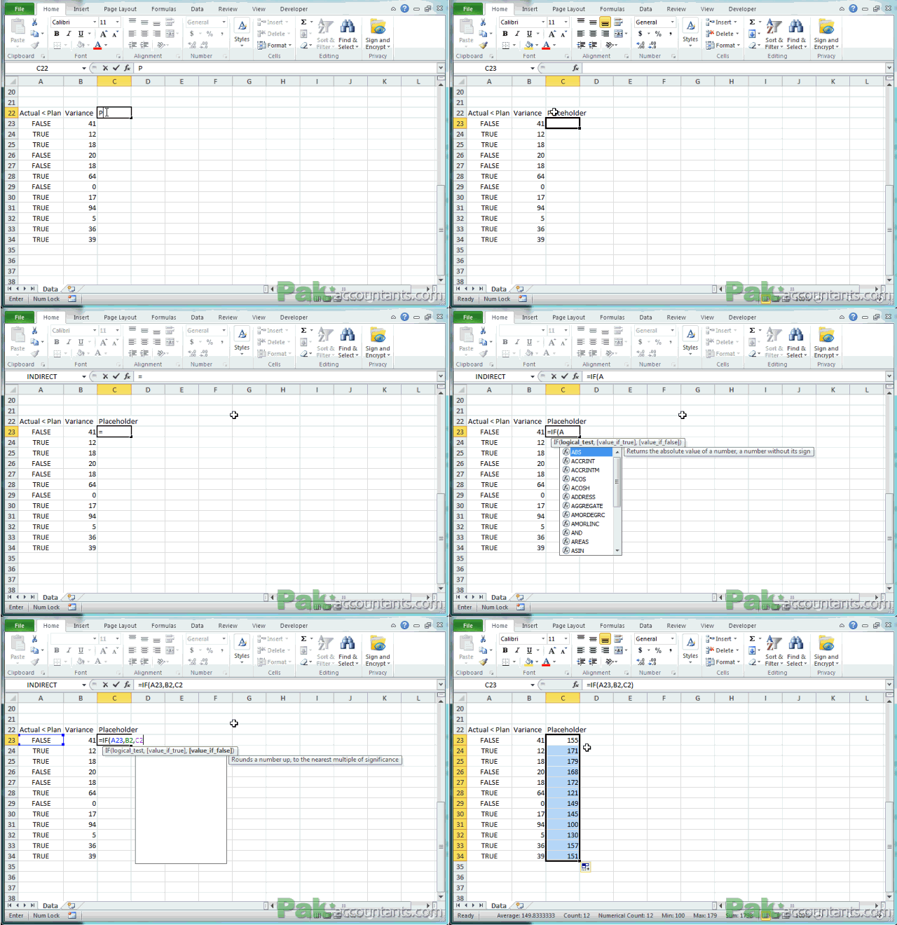
Step 5: As I said before we need to present favourable and unfavourable results in different colours therefore we need two different data sets i.e. one for green color (favourable variance) and one for red color (unfavourable variance).
Now the concept here is that variance can either be positive or negative but as we are reporting them in two separate data sets therefore if we have favourable variance then we will have the number in green column whereas nothing in red column. Similarly if variance is unfavourable then result will be pulled in red column but nothing in the green column.
Go to cell D22 and make a heading Red and in cell E22 make a heading Green. In cell D23 to D34 put the following formula:
=IF(A23,B23,NA())

Go cell E23 and put this formula down to cell E34:
=IF(A23,NA(),B23)

Up to this point the core items we needed to make the graph are already in place, but to give the finishing touches in more elegant way we need three more columns. Two columns will help us report cumulative figures if we like to report on chart and third one will be help us give custom data labels to help make the chart easier to understand.
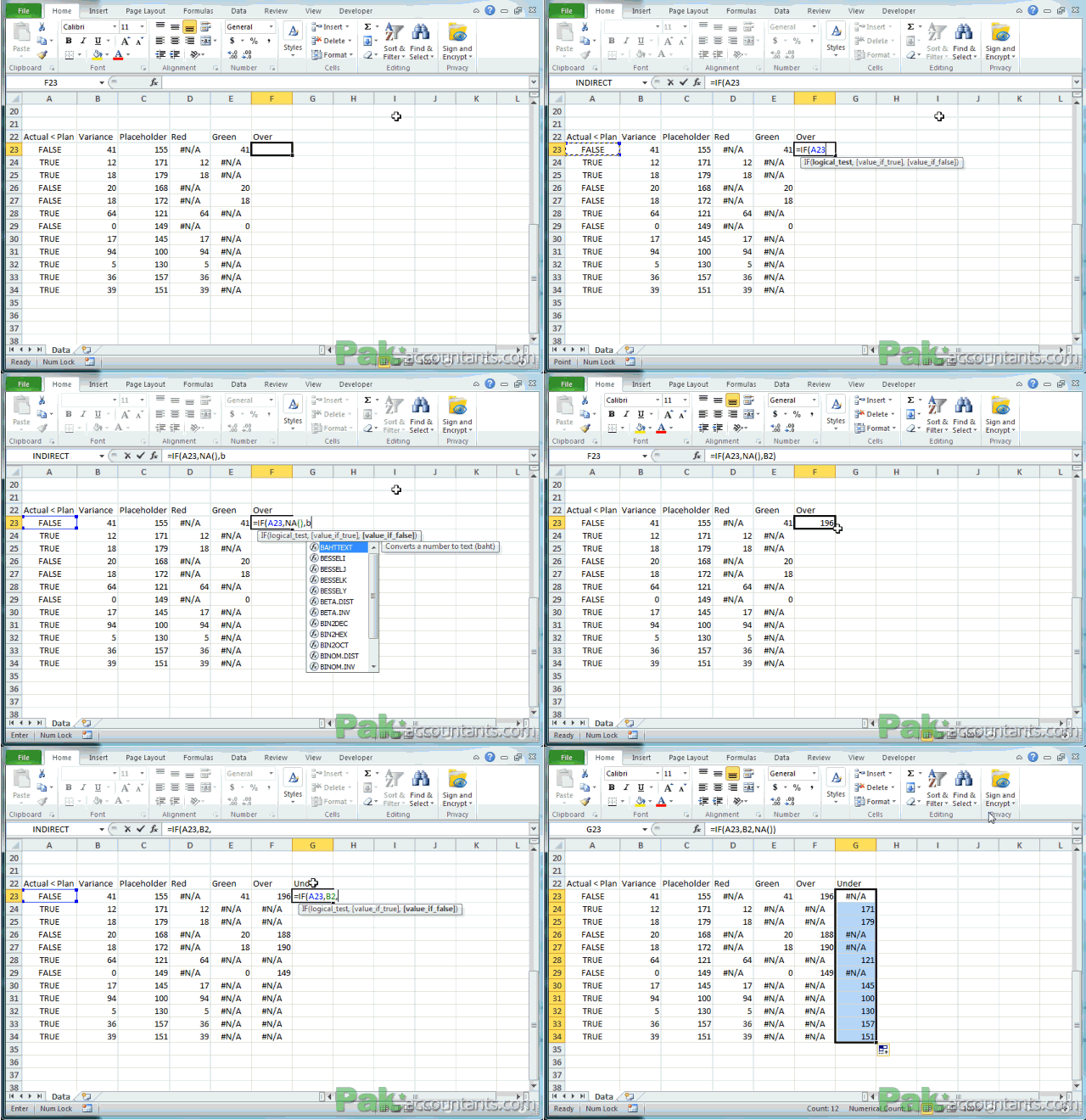
Step 6: We will continue with the same concept as we did with variances to split the figures in two columns. Using same concept we will have to additional columns with the name Over and Under. Both columns will home the actual figures but if actual figure is greater than plan then it will show up in Over column and if lesser than plan then it will show up in Under column.
Go to cell F22 and give heading Over and in cell F23 put this formula and drag the fill handle down to F34:
=IF(A23,NA(),B2)
This formula is checking if Actual value is less than plan value then show nothing otherwise get the value in cell B2.
Go to cell G22 and give heading Under and in cell G23 put this formula and drag it down to cell G34:
=IF(A23,B2,NA())
This formula is doing the opposite as it is fetching the value if actual figure is less than plan then show the value in B2 otherwise show nothing. Following animation shows the step 6:
Step 7: Now to final column which will help us to have custom data labels. Go to cell H22 and put heading Data labels and put this formula in cell H23:
=B2-C2
Drag the fill handle down to cell H34 to get the values for other months as well. Select the figures in cell H23:H34 and hit Ctrl+1 to invoke format cell dialogue box. Make sure number tab is active (which is by default). Click custom from the left list. Now we need to punch in few symbols like arrow pointing up if value is positive and arrow pointing downward if value is negative. To get this down follow these steps:
- Press and hold Alt key on the keyboard and on the numpad hit key 3 and 0 and release Alt key. This will insert a arrow pointing upward. Then punch in 0 followed by colon ;. This complete the format for positive numbers.
- Press and hold Alt key and then press 3 and 1 on the numpad and let go the Alt key. This will insert arrow pointing downward. Punch in 0 followed and then colon. This complete the format for negative figures.
- For zero figures put this: “-” this will show a dash if the result is zero.

Firing up the engine! Getting chart done
Step 1: Select Placeholder, Red, Green, Over and Under columns with figures. Click Insert tab in the ribbon click column button in charts group and select the first chart type under 2D. You will get the chart that looks something like this:
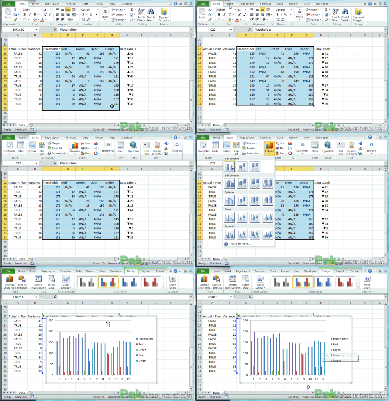
Step 2: Click somewhere in chart to activate (select it) it and lets clear out few things we don’t need by following these steps:
- Under chart tools ribbon options click layout and click gridlines > primary horizontal gridlines > select none.
- Click legends > select none

Step 3: Right click on chart somewhere empty area and click select data. Click Add button. With the series name box still active click cell C2. Move the cursor to series value input field. Delete anything in it and then select the values in the Plan column. Click OK. This will add another variable in the chart.
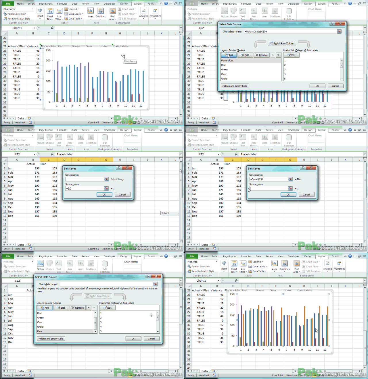
Step 4: Time to make major changes that includes not only cosmetic changes but also the way each series is plotted on the graph. So pay very close attention to the treatment on each item:
- Plan series
Position: Click anywhere in chart to activate it and also chart tools. Click format tab under chart tools and from the current selection group select Plan series. Look in the formula bar and look at the digit at the end. Change it 1. In my case it was 6.
Presentation: With Plan series still selected and under format tab click format selection button under current selection group. Format data series box will open up. Set overlap percentage to 0% and gap width to 40%
Color: If you like to change color of Plan series, now is the time as it is still selected. I changed the color to grey by changing color from shape fill drop down. Following animation shows all the steps.
- Placeholder series
Position: Select the Placeholder series from the selection drop down. Look in the formula bar change the last digit to 2 to make it a second element on the chart. Mine was second luckily.
Presentation: With series still selected click format selection button. Under plot series in box select secondary axis radio button. Set overlap to 100% and gap width to 150%. Click OK.
Color: As this series is there just to position the green and red elements therefore we don’t need it to be colored. So I had it transparent by selecting no fill from shape fill drop down.
- Red series
Position: It has to be 3
Presentation: Click format selection button after selecting the series. Just change the axis to secondary and then adjust the overlap to 100% and gap width to 150%
Color: Check if it has the correct color. Mine was luckily reddish one. Not exactly red but workable.
- Green series
Position: It should be 4.
Presentation: Same as Red series i.e. to have it plotted on secondary axis and overlap to be 100% with gap at 150%.
Color: Have it in green shade or any color you like to show for favourable variance.
Chart type: This is the interesting bit as you will see the whole chart falling into shape instantly. While green series still active/selected click design tab > click change chart type button > select stacked column chart which is second one in the bar chart category.
- Over series
Position it 5.
Chart type: We need to change the chart type for this series. Having the series still selected click design tab under chart tools and click change chart type button and select the line chart button under line category.
Color: As we don’t need to show it therefore click shape outline drop down and select no outline.
- Under series
Have it positioned at 6.
Chart type: Make the same changes as you did for Over series.
Color: Again change it to no outline to hide it.
This is how the graph should look like after all these six steps:
Correcting X-axis
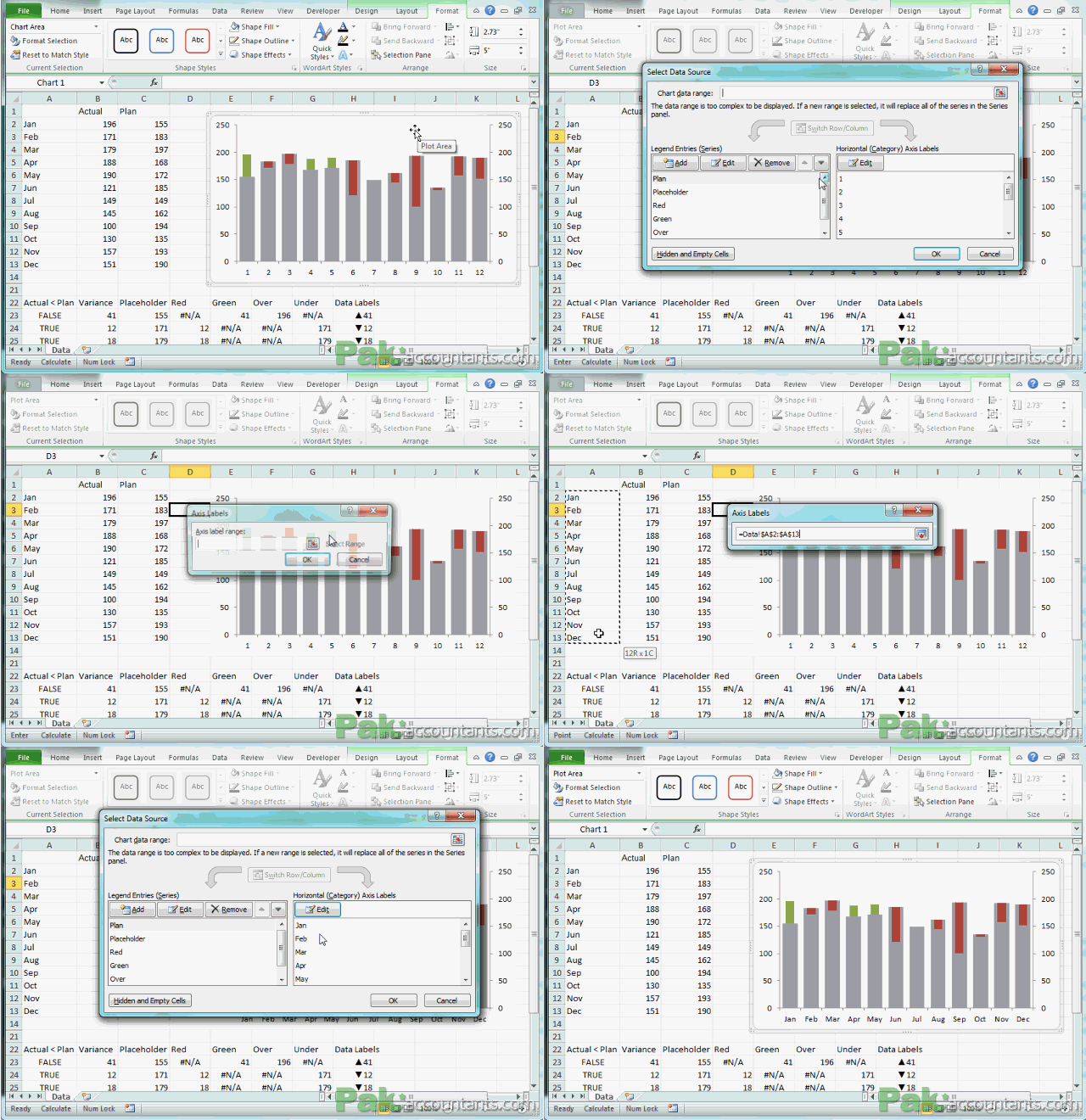
At the moment our x-axis is showing numbers instead of months. To correct it click anywhere inside empty area of chart and click select data from the menu. Make sure Plan is selected in the left list and click Edit button above the right list. Select the names of the month in column A and click OK to close the dialogue box. We are almost done.
Custom Data labels a.k.a Dynamic data labels
By custom data labels I mean that Excel should pull the data from specific cells to show as data labels instead of series numbers. This way labels are much more flexible and easy to work with as they are depending on the content of specific cell and thus dynamic as well.
Step 1: Have the chart selected and go to format tab and select Over series from the selection drop down. With the series selected click layout tab and then click data labels and select above. This will show the figures of above series above the green bars.
Step 2: Now select the Under series by going to format tab and then selecting it from chart selection group drop down. With the series selected go to layout and then click data labels and then select below to report the figures of Under series.
Step 3: Left click on the first data label once it will select all the data labels from Over series. Left click once again and it will select only the first data label. With that selected click inside formula bar and hit = key on the keyboard and then with the help of mouse select the cell H23. Hit enter and now you will see the variance figure that is not only reporting the variance but also with the help of arrows you can understand if it is favourable or unfavourable. Repeat this step for all the other data labels.
Following animation shows you how to carry out about steps:
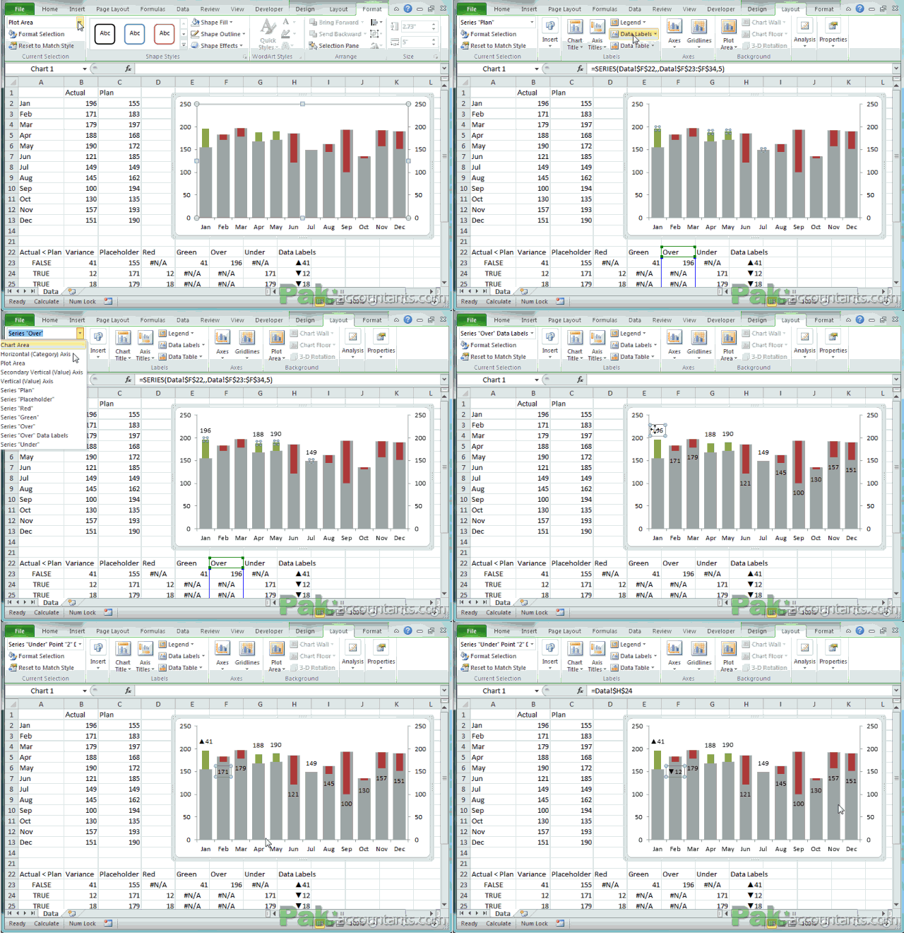
And lastly get rid of primary and secondary vertical axis to clean up the view even more and get exactly what are looking for 🙂 :
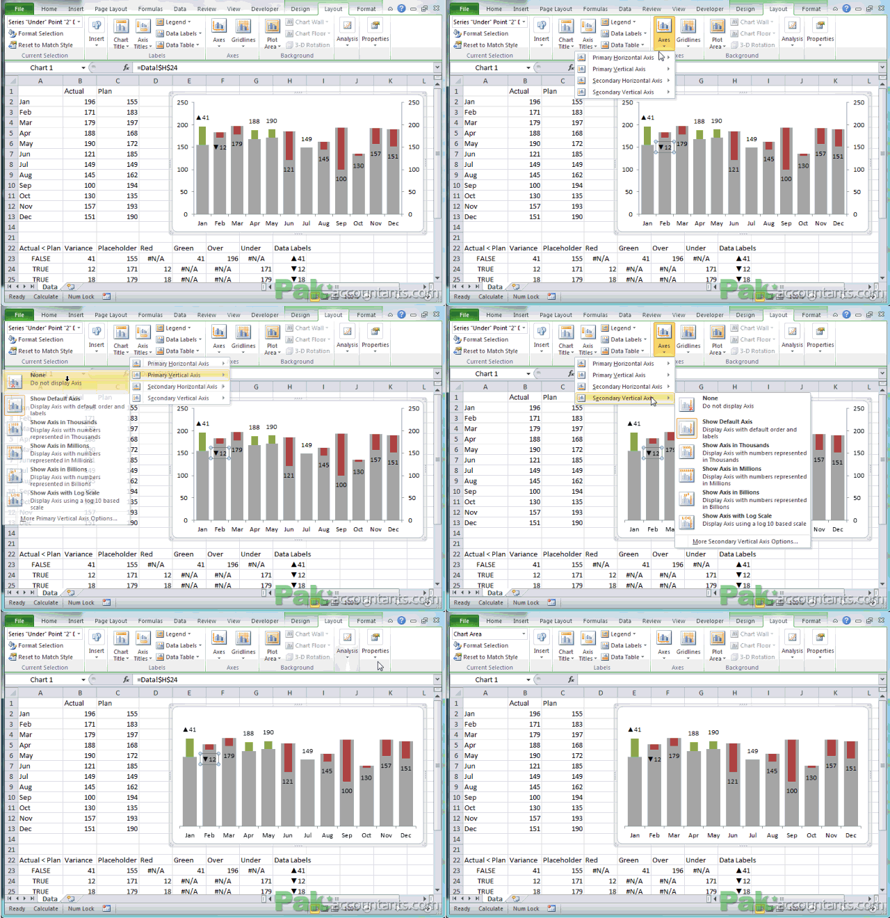
One last bit that I will leave for you as an assignment is to show data labels for Plan series. Enabling them would make even more easier for the viewer to understand the planned figures and the variance effect. Just select the plan series and enable the data labels to show inside base. Thats it! Mission accomplished!
- Preparing the data for excel charts and you can clearly see how much goes before you even start making charts sometimes.
- Using NA() function in IF() function to help prepare data for conditional charts. To be precise there is no such thing as conditional charts in excel and this is just a workaround. Check out another example of conditional charts.
- Using custom number format to force symbols in positive and negative figures for better presentation
- Creating charts
- Adding a series in chart once graph is already created
- Formatting charts
- Using primary and secondary axis to plot different series on one graph. Here we used it to format them differently.
- Using more than one chart type and how to do it. In this tutorial if you have noticed we have used three different types of charts namely, clustered column charts, stacked column charts, simple line charts.
- Correcting x-axis values by changing category values
- Using custom data labels or also known as dynamic data labels
Finally, I would like to thank HiChert.com for the inspiration.


Leave a Comment