Excel Actual Vs Target – Multi type charts with Subcategory axis and Broken line graph
Last time when we learnt about multi-category axis we saw how meaningful chart can become. But today we are going to add in more flavours and ingredients to it and by the end of this tutorial this is what we will get:
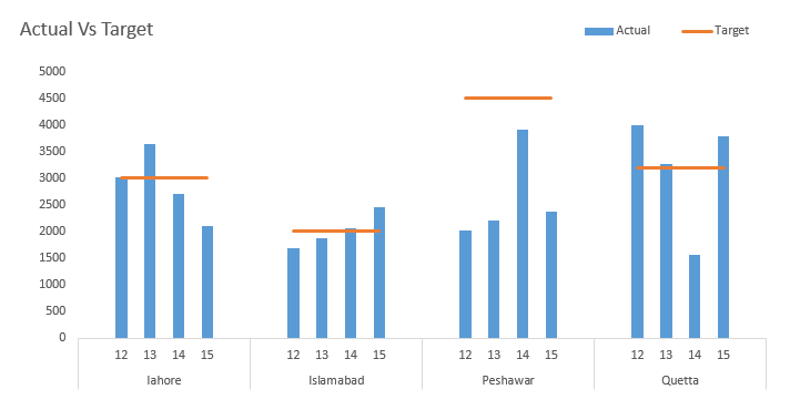
Thinking what spirits went into making this chart? Well don’t start biting your nails already. I have to admit that right in the beginning that to have such chart has more to do with data skills than charting skills and you will agree in few minutes.
Step 1: Observe the data and you can see column A has blank cells. This will help us achieve the multi-category requirement. Select the data then go to Insert tab > charts group > line chart. This will insert the ugliest and useless chart ever. Don’t panic we can fix it.
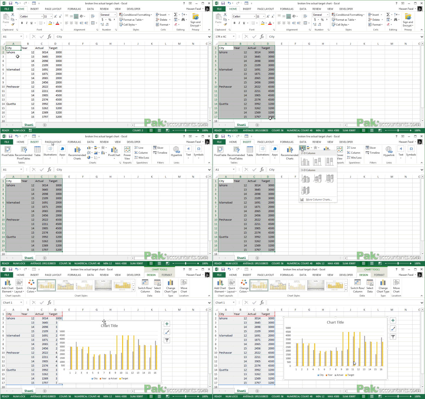
Step 2: Right click somewhere empty on chart and click select data. Select data source dialogue box will pop up. From the left remove city and year series.
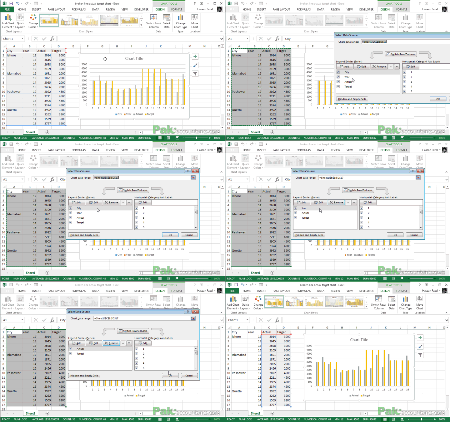
Step 3: Invoke the select data source dialogue again. On the right click Edit and select the City and Years column without headings. Click OK buttons twice and there you have nice bar charts plotting actual and target figures on multi-category axis
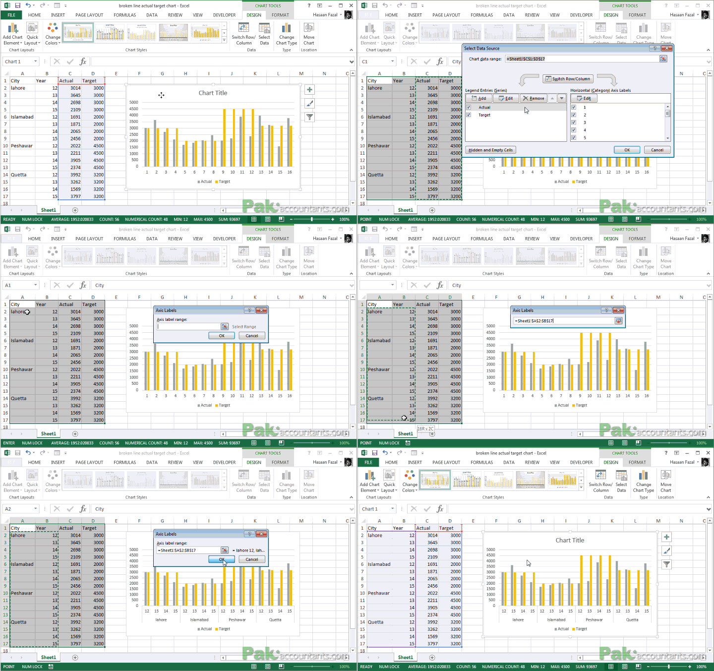
Step 4: Having chart active, go to design tab > type group > click change chart type button. Change the chart type for target series to line and click OK. This is what you will have by now:
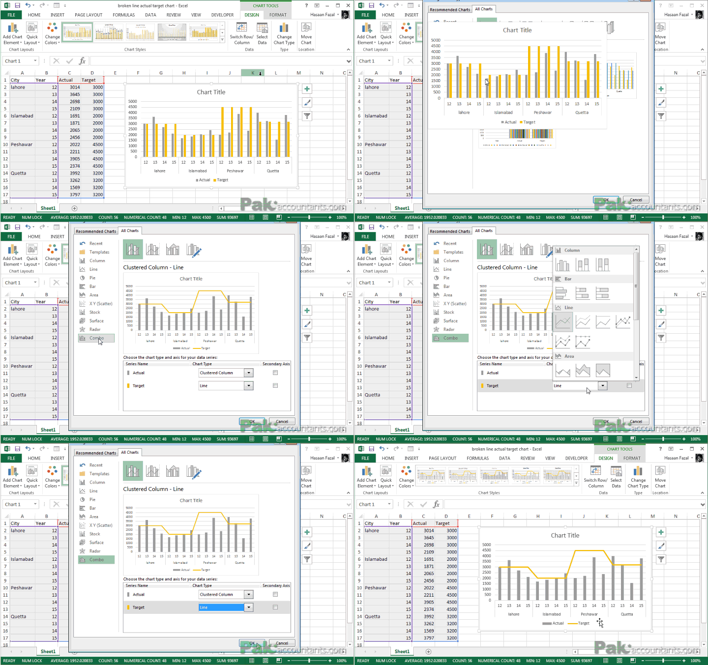
Charting process in itself is complete. However, the target line is all linked up and that doesn’t make any sense. And surely it is not helping us understand actual vs target relation either. To fix this we need to adjust our data.
Step 5: Remember we want to break the target line apart to show as levels. Select each row with city name as that is where the new data set is starting related to each city. Hold down CTRL key and use mouse’ left button to click respect row heading to completely select it. Once selected. Go to Home tab > cells group > click Insert button.
Adjust the selection again and insert another row. Following animation will help you understand better:
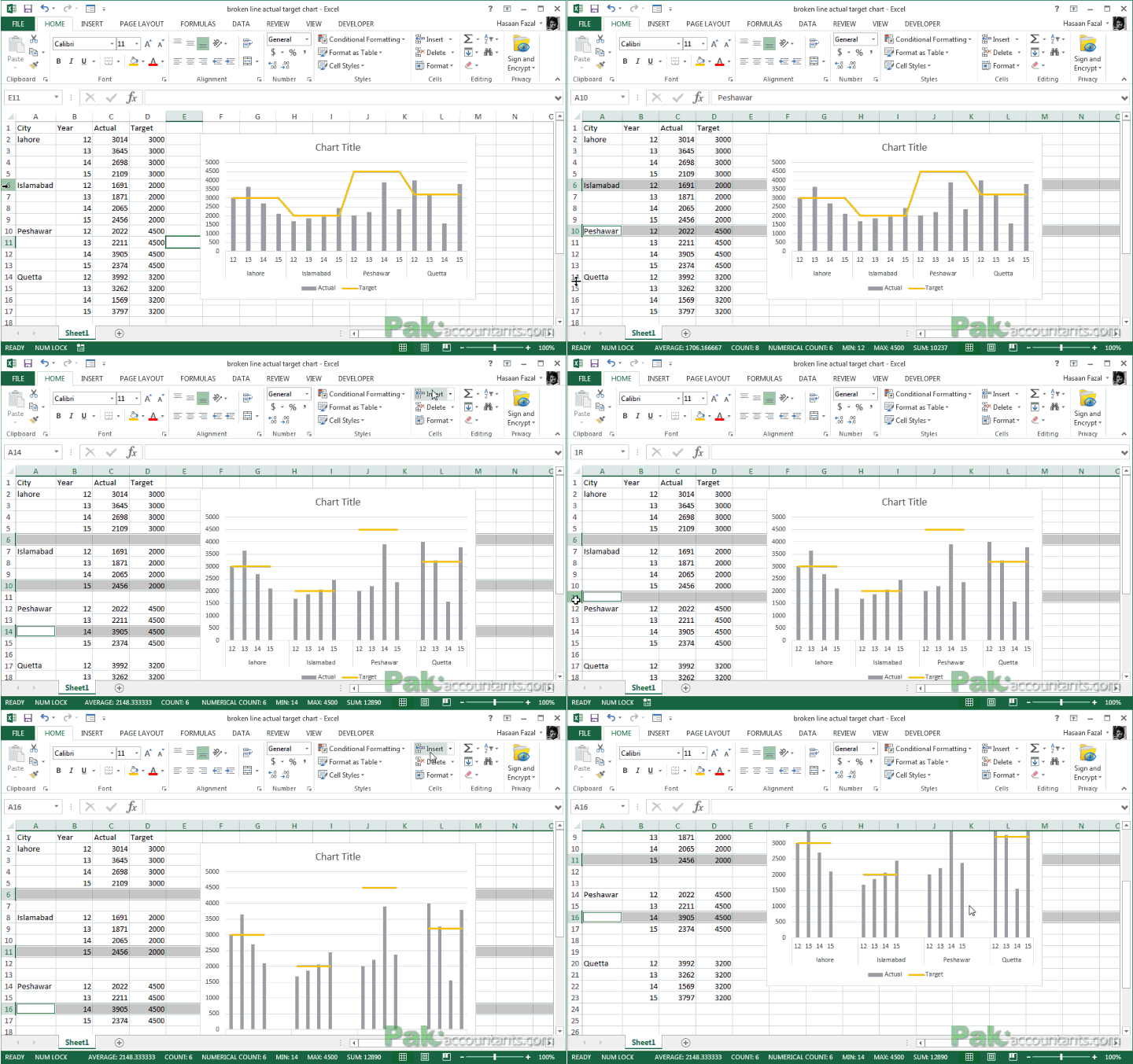
However, there is a slight aesthetic issue with the graph. You can see that the first three data groups in the graph have a space that really bothers. To fix this we have to go through some dodgy business. Unless I know a better way in future!
Step 6: Move the data of each city one row down by selecting all of them altogether. Though it should have fixed it on its own but now we have run into another problem. It seems that years do align in the center now but the bars are still there as before. Probably it is because Excel tried to “intelligent” and moved the ranges on its own to compensate the change in the data. To fix it click the bars on the graph and you will see which series it has plotted.
- Expand the range of City and years one row below
- Expand the actual range one row above.
Do the same by selecting target graph as well and it will get to this excellent shape!
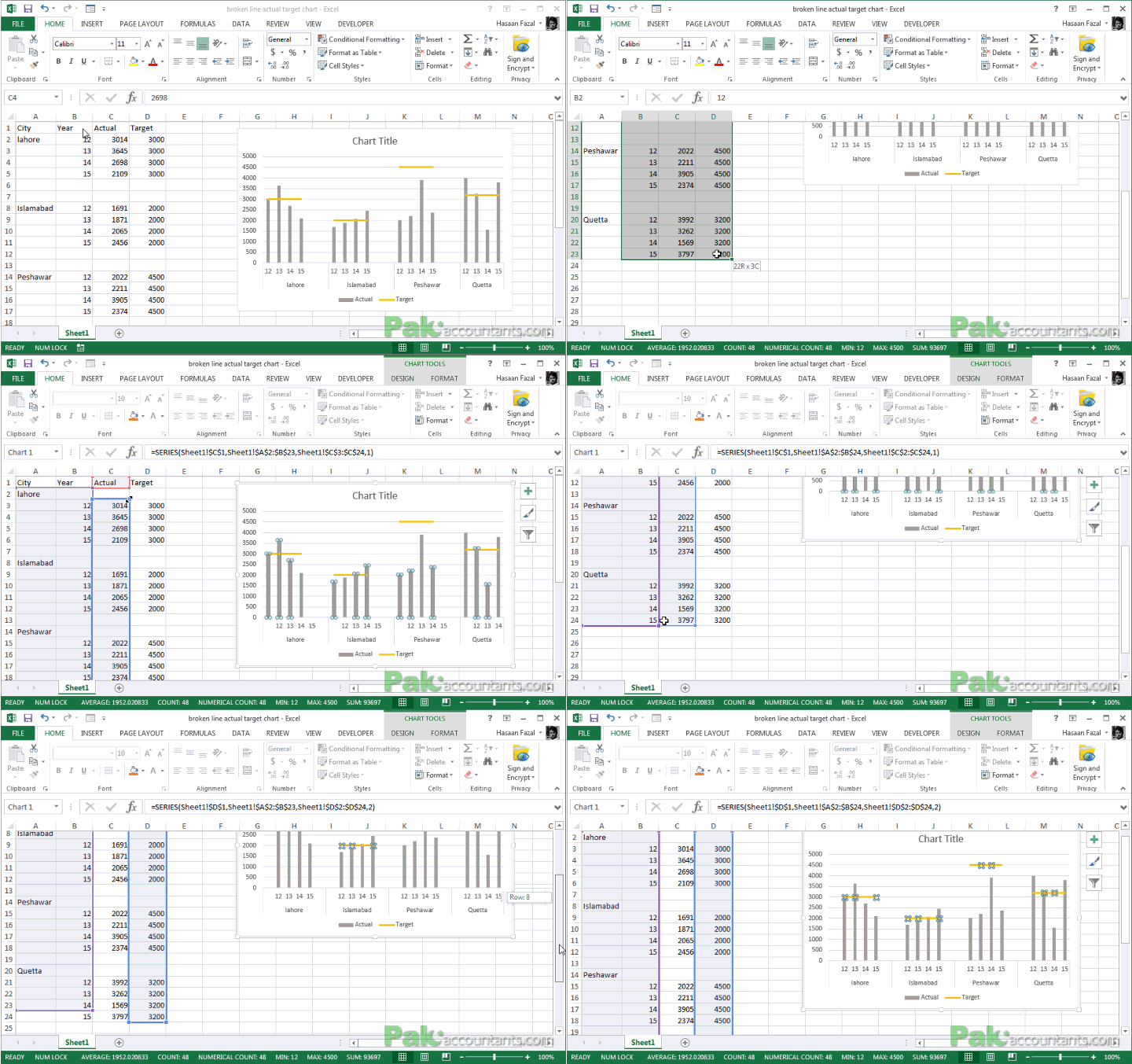
Yup! I see the last data set is falling to the right. To fix it just drag the range one row below and it will get sorted as well.
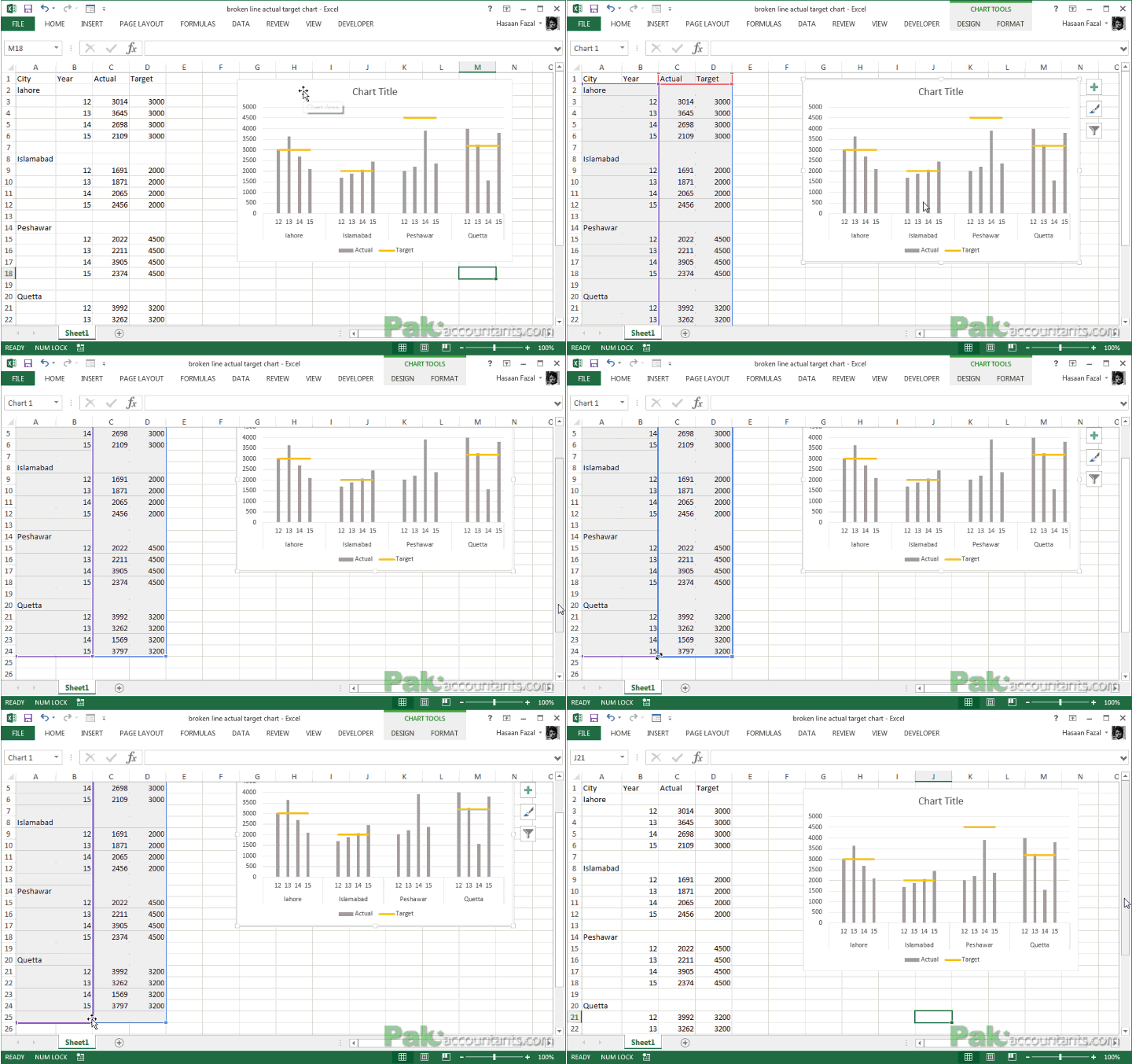
So there you have it. As I said earlier, it has more to do with your data than charting skills itself.


Leave a Comment