Custom Data Labels with Colors and Symbols in Excel Charts – [How To]
Is it possible to have colored data labels like red for negatives and blue or green for positive values inside excel chart? This question was asked by some when I posted Variance Analysis in Excel – Making better Budget Vs Actual charts as this shows the use of custom data labels that includes upward and downward arrows with positive and negative values right on the chart for easy understanding. This is what we are after in this tutorial:
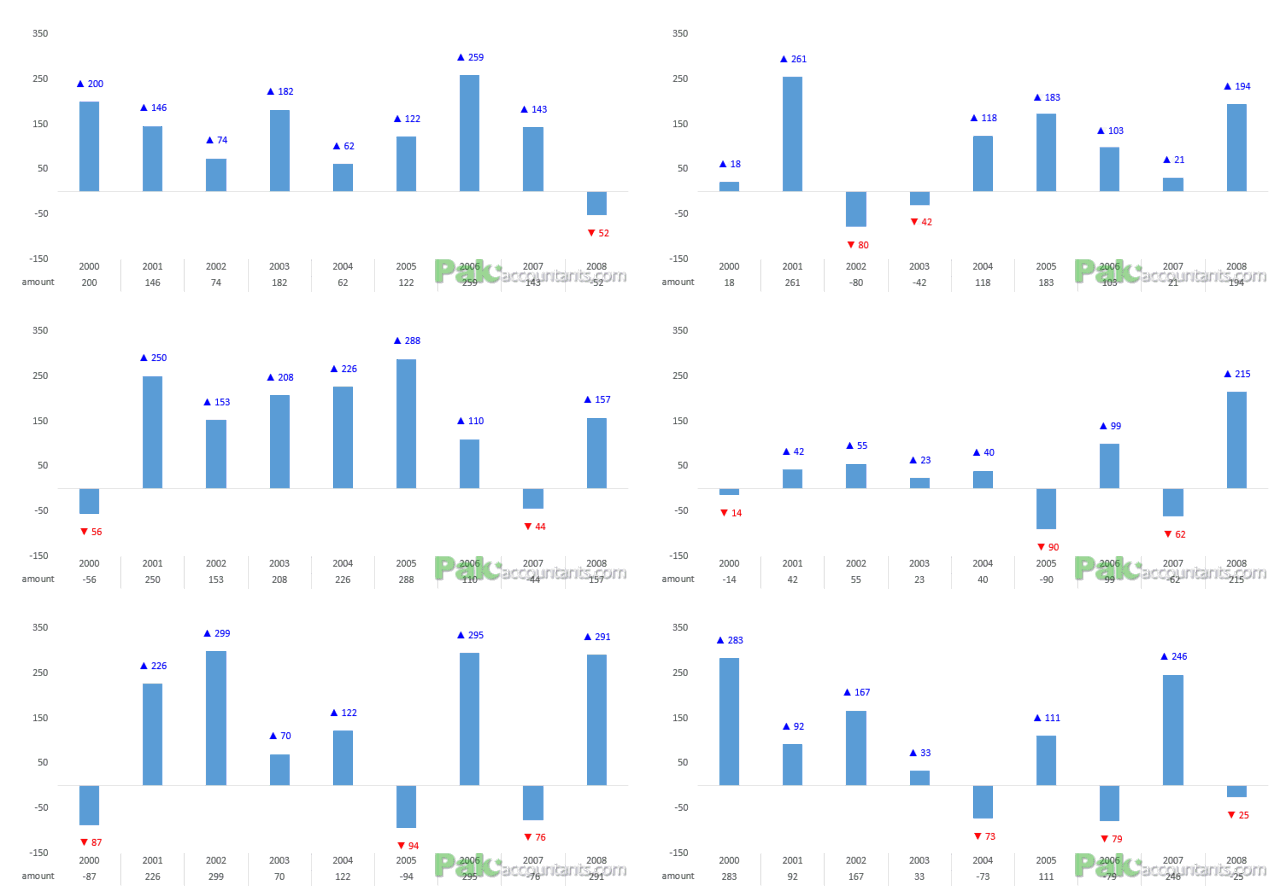
But having the positive and negative values in data labels colored as well, that was quite interesting. At that time I really was without answer as I tried few things but didn’t really get it done. So I suggested the old-fashioned way of having each data label “hard colored” (which I will explain in this article) but that was not the solution.
But I went back again on it and tried on a new sample data and there I not made it work the way it should have worked before but also found why it didn’t work the first time. So I will share the whole experience I have been through with the wrong-lazy approach and right-awesome approach!
Color Changing Data labels in Excel Charts – How To
Before Office 2013, I don’t know of any easy way either to insert symbols in data labels or get them conditionally colored to show negative and positive values in different colors. And above that getting the symbols and colors were two separate jobs.
The workaround for symbols, though long, is quite good as with that approach the data labels also update if the underlying data updates but not completely dynamic as it does not incorporate if additional data is added which makes it laborious. In the world of Excel it is known as custom data labels and I have discussed this approach in my some of my charting tutorials including Variance analysis chart.
The workaround for colored data labels however was a bit lame. May be there is a way via VB wizardry but I am still unaware of it. The reason why it is lame is that does not dynamic and doesn’t change with the change in data. Simple.
But as majority still use Excel 2003, 2007 and 2010 so these approaches can still help.
1.1 Custom data labels with symbols
The basic idea behind custom label is to connect each data label to certain cell in the Excel worksheet and so whatever goes in that cell will appear on the chart as data label. So once a data label is connected to a cell, we apply custom number formatting on the cell and the results will show up on chart also. Following steps help you understand the required:
Step 1: Setup chart and have data labels turned on on your chart. I have the data in column A and B with years and amounts respectively. I got a third column with Label as a heading and get the same values as in Amount column. You can use Amount column as well but to make but for understanding I am going with one additional column.
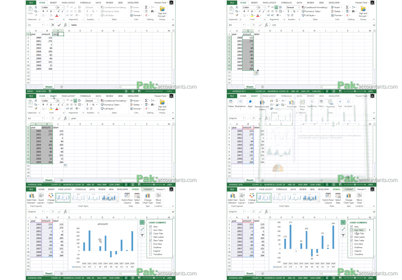
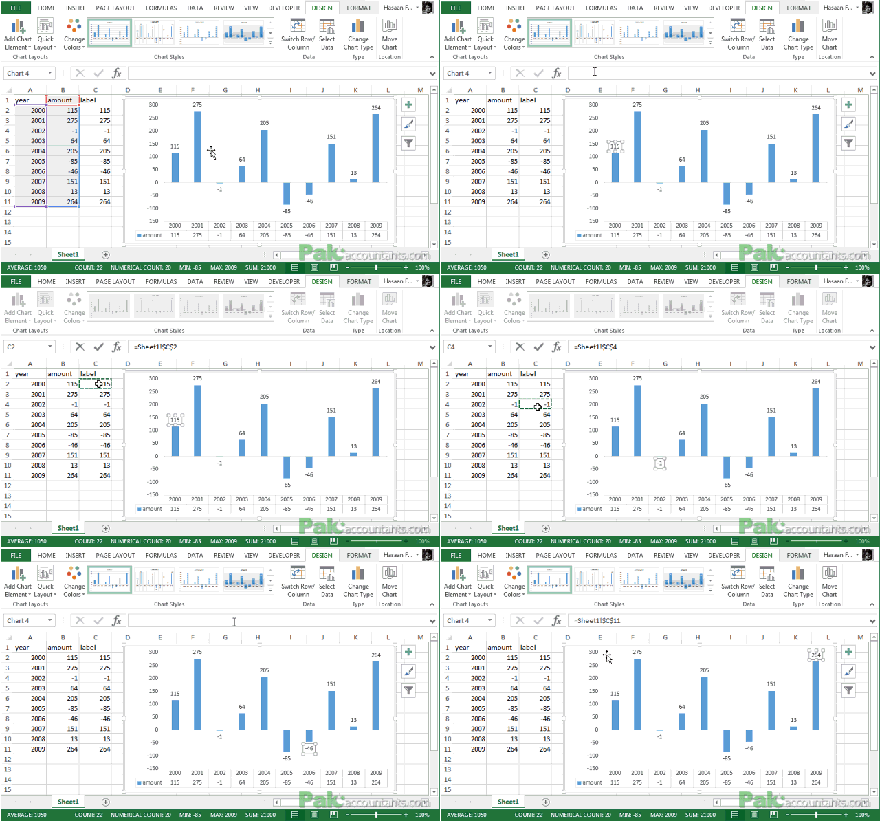
Step 2: Left click on any data label and it will select all of them or at least all the data labels of that series. Left click again and this time only the data label you clicked will be selected.
Step 3: Click inside the formula bar, Hit “=” button on keyboard and then click on the cell you want to link or type the address of that cell. In my case it is cell C2.Hit Enter key. Now the cell is connected to that data label. Repeat this process until all the cells are connected to each data label.
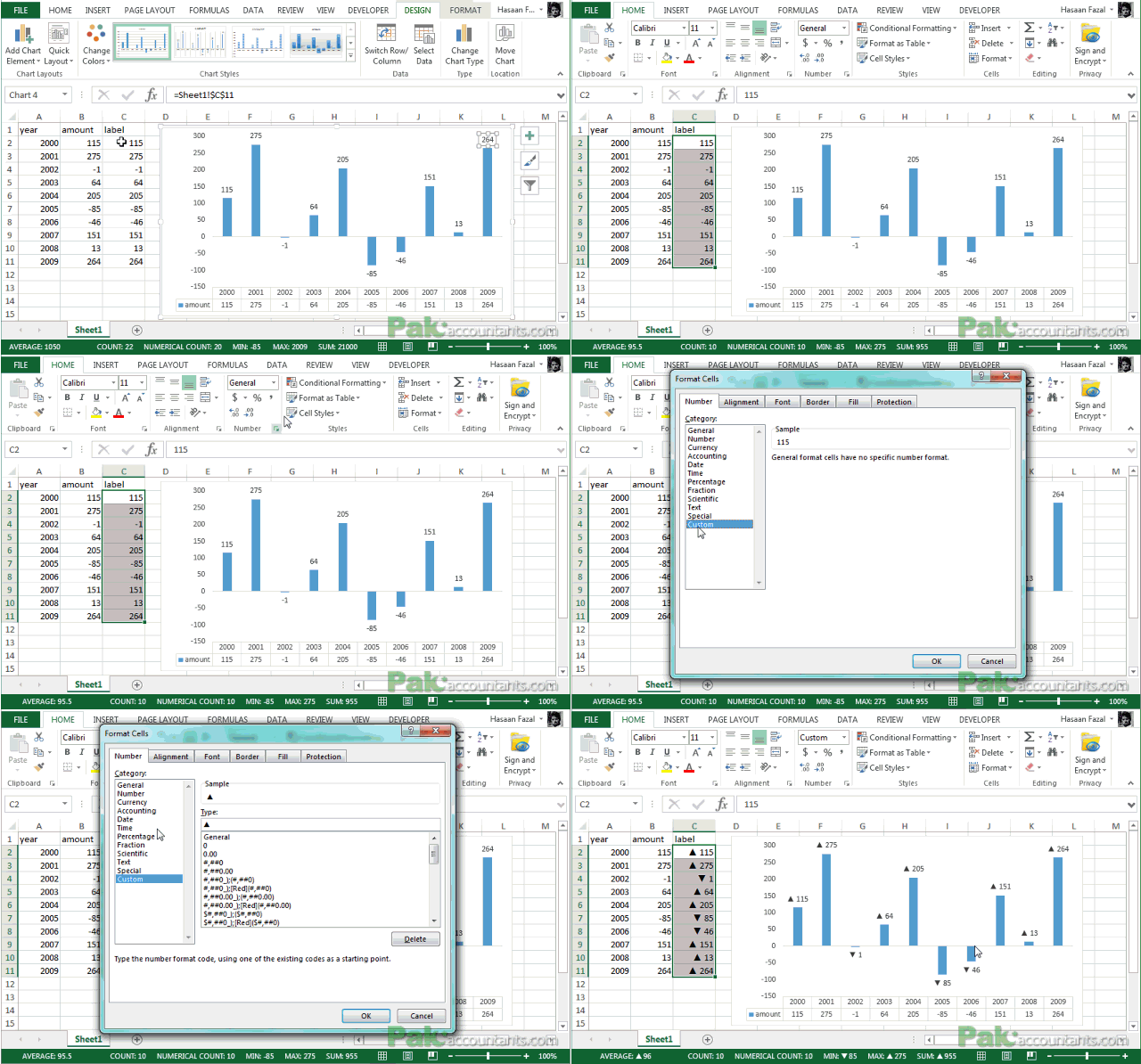
Step 4: Select the data in column C and hit Ctrl+1 to invoke format cell dialogue box. From left click custom and have your cursor in the type field and follow these steps:
- Press and Hold ALT key on the keyboard and on the Numpad hit 3 and 0 keys. Let go the ALT key and you will see that upward arrow is inserted. Hit 0 key. Then colon ; key. This completes the argument for positive value.
- Press and Hold ALT key on the keyboard and on the Numpad hit 3 and 1 keys. Let go the ALT key and you will see the downward arrow is inserted. Hit 0 key and then ; key. This completes the argument for negative value.
- Click OK button to close the format cell box.
The chart will show the upward and downward arrow instantly.
1.1.1 Problems
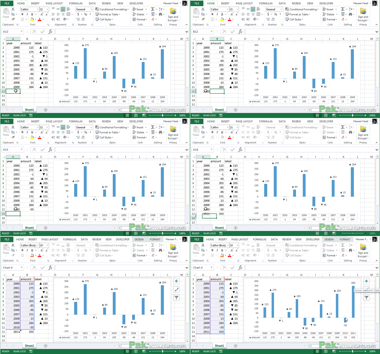
Problem as I said in the beginning is that though the data labels I connected will update if data changes, but if I throw additional rows to the chart, the new data labels needs to be connected too and that makes it quite cumbersome.
In my case I am using a helper column for data labels. So I not only have to update my helper column to include more rows but also connect each additional data label to newly added cells.
Have a look at the last 2 data labels once the new data is added and chart is updated:
1.2 Colored Data labels
Now coming to the second part i.e. coloring the data labels. What we are after is to color negatives in red essentially and positives in any color like blue or green or simply leave them black. So what is the way? To be honest there is no right way to do it. Only workaround to my knowledge. I am repeating my knowledge as there might be something better which I don’t know yet. If someone knows then please step forward and DO share as it will help thousands if not millions!
The way I know is to simply click the data label once and clicking it again will select the particular data label which you can then format with desired color. And of course you will have to do it for each data label separately.
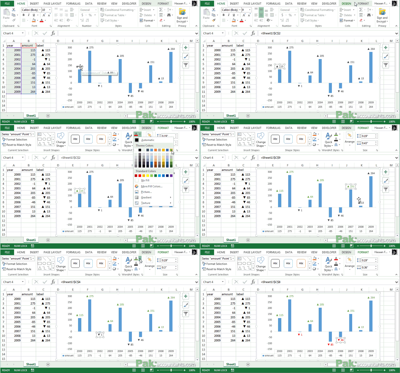
Tiring right? And above that it is “hard” coloring the labels. So if the data changes and instead of positives you have negatives, the color won’t change for you and it will definitely be a mess!
2 Post 2013 – Awesomeness begins!
What if I tell you that in Excel 2013 you can get all the solutions of having symbols and even getting colors in ONE go and that without any pitfalls of not being dynamic? Absolutely possible! Follow along:
Step 1: Have any cell selected outside the range hit Ctrl+1. Click custom from the left side and have your cursor in the type field and follow these steps:
- Type [Blue] and then Press and Hold ALT key and hit 3 and 0 key on the Numpad. Let go the ALT key and punch 0 and then colon.
- Type [Red] and then press and Hold ALT key and hit 3 and 1 key on the Numpad. Let go the ALT key and punch 0
- Select the whole code and hit copy! We are going to paste this code in specific field in a bit. So try not to copy anything after this step. If you do so. You can always come back here to copy it again.
- Click OK button to close the dialogue box AND also to save the code you just entered.
Step 2: Setup chart on the basis of two columns A and B. No need of third column anymore.
Step 3: Turn data labels on if they are not already by going to Chart elements option in design tab under chart tools.
Step 4: Click on data labels and it will select the whole series. Don’t click again as we need to apply settings on the whole series and not just one data label.
Step 4: Go to Label options > Number. From category drop down select Custom.
Step 5: Have your cursor in the format code field and hit Ctrl+V and it will paste the code we copied in Step 1.
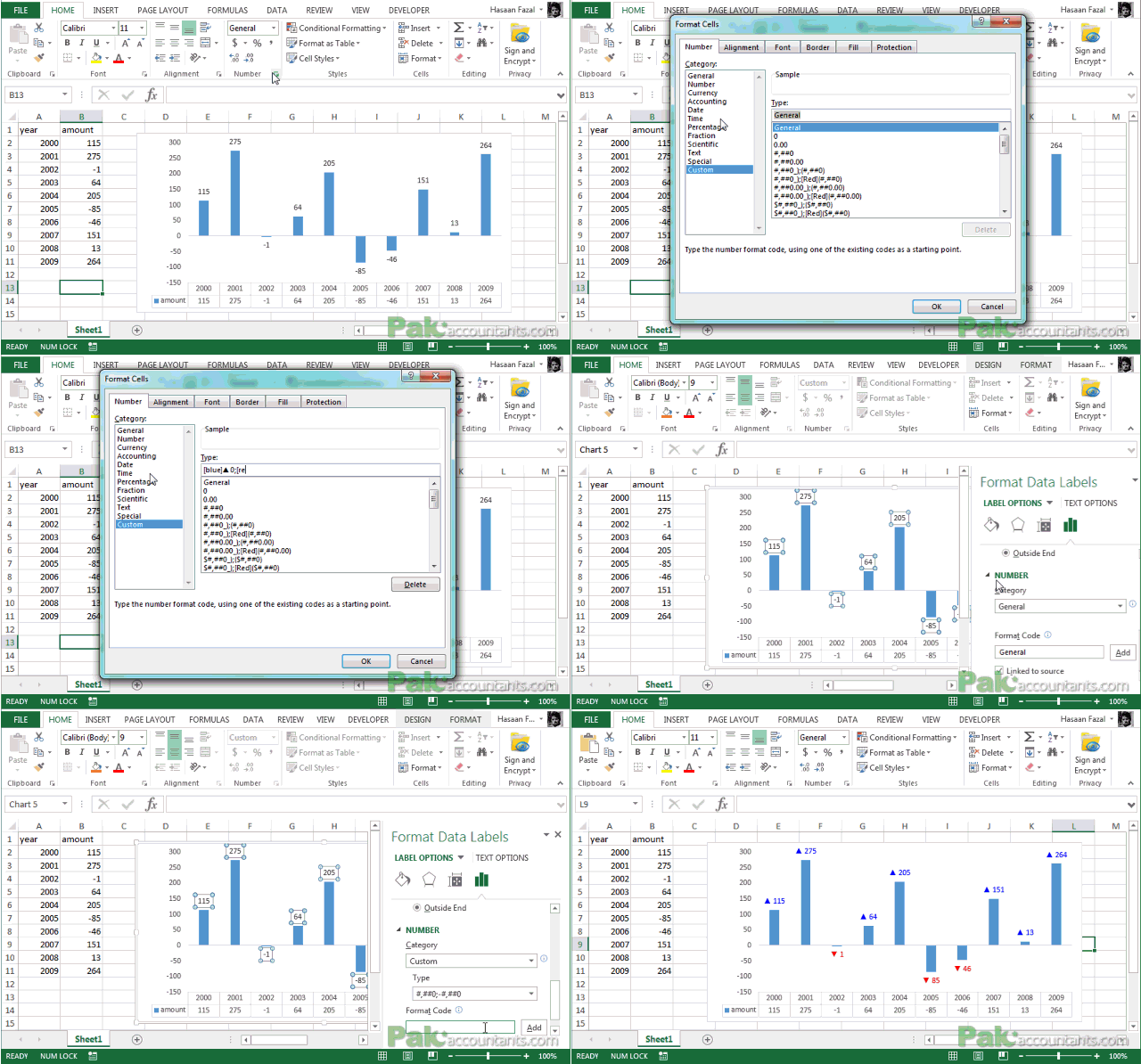
BANG!!!! BANG!!!! Yeah banged twice as we not only got the symbols but also the colors in one go!
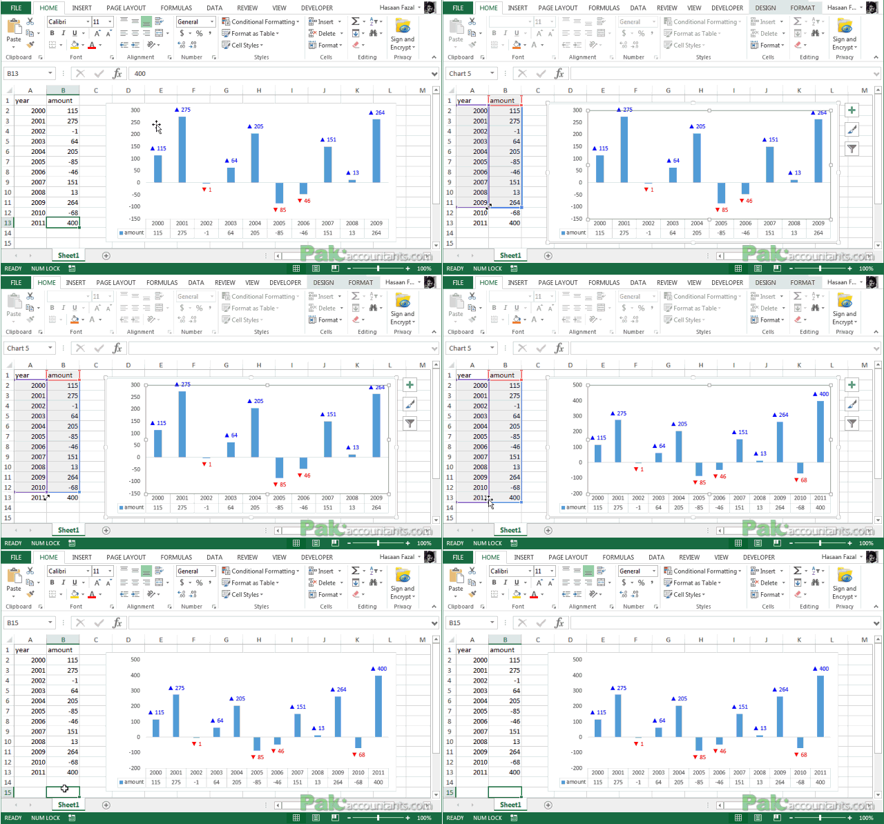
But hold on magic isn’t over yet! Now if you add additional data and update the chart, the data labels will update automatically and so you don’t need to worry about the recoloring or connecting cells etc. so BANG again for the third time 🙂
Have a look at the last two additional data items added to the chart and the data labels get updated accordingly:
2.1 Caution
When I was asked this question I had 2013 version of Excel already installed. And I tried the settings I mentioned above in post 2013 scenario. But it didn’t worked at that time and I thought it is not possible and color and symbols cannot be inserted. But both had their own issues.
To apply custom format on data labels inside charts via custom number formatting, the data labels must be based on values. You have several options like series name, value from cells, category name. But it has to be values otherwise colors won’t appear.
Symbols issue is quite beyond me. When I try to insert symbol via chart options hitting ALT key invokes Excel’s shortcut functionality. I tried to do the same even with detached bar but still I wasn’t able to get ALT work for me to insert symbols right in the chart options. That is I had to copy the code from format cell window as the first step.


Leave a Comment