Creating and Working with Dynamic Charts in Excel
Creating and Working with Dynamic Charts in Excel
Title should be “making charts dance to your command in Excel” but lets keep it technical.
OK let me be very quick at it as I learnt about this almost by chance. I used to thought that when you create a chart the selected range is locked tight so show graph therefore if the data grows or it is made to shrink by any means i.e. deleting rows or filtering data then graphs won’t have any effect unless you reselect the range or press F5. I don’t know why I had this concept which is really wrong. So lesson learnt confirmed that never believe what you think is right unless you test your think.
Revisiting Excel Tables
If you have read my post on Excel tables then you must have already fallen in love with this great feature. And today I will show you another example why you must know it really good.
Converting simple range to Tables
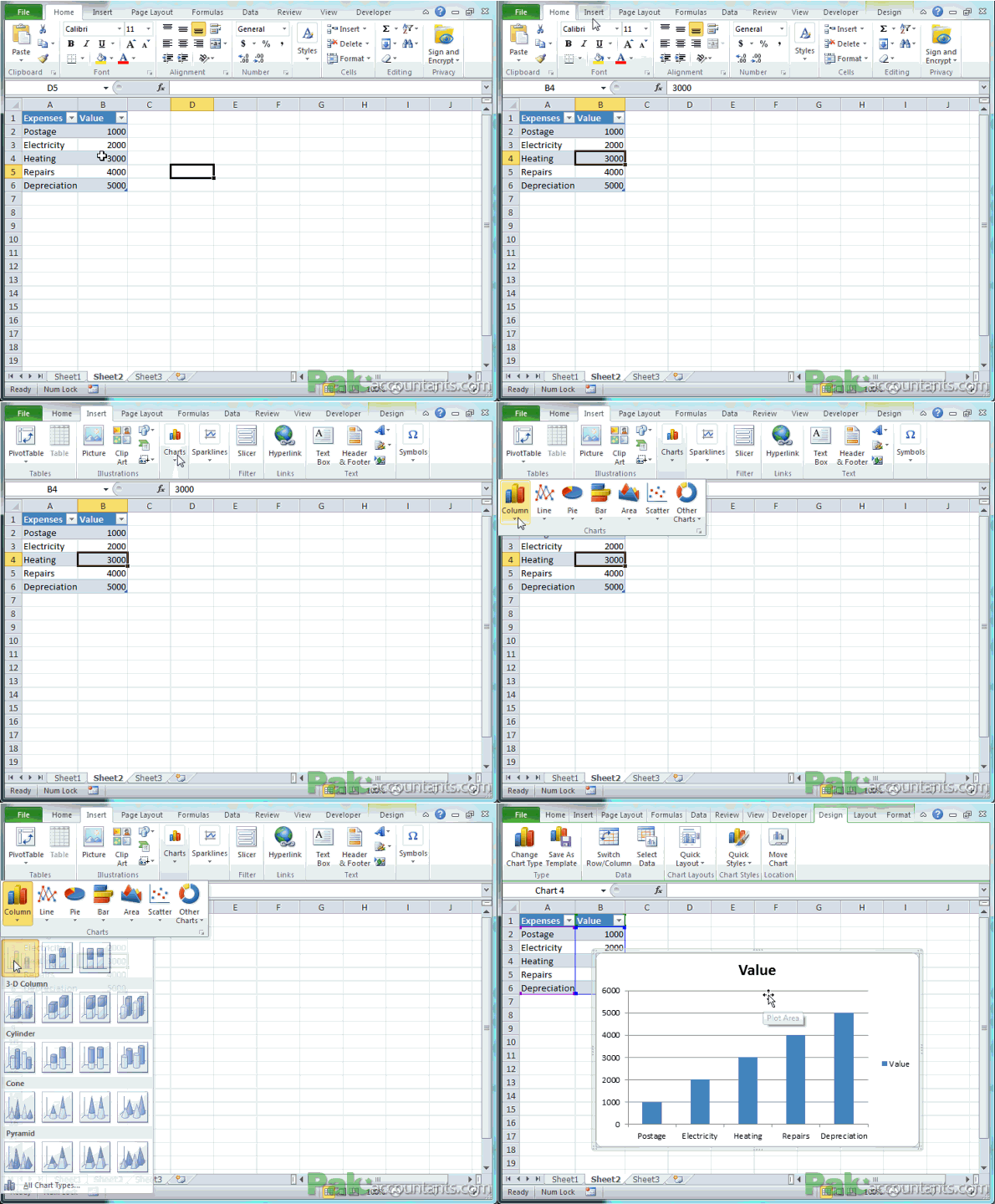
This is easy. Have an active cell inside the range and hit shortcut Ctrl+A. This will select the whole range. Hit Ctrl+T (T for table). A dialogue box will appear and click OK. Now you have fully functional table right out of simple data range.

Having the table selected hit Alt+F1 and this will quickly insert the bar chart based on the data inside table.
I apologize if you had an impression that learning and creating charts will take ages and now you have your perception bubble blown 😀

So now that you have a chart, lets see if the chart registers any change in the data source. Remember I have mentioned in several of my previous table tutorials that Excel Tables help you have dynamic data source. The benefit of dynamic data source is that if the data in the source grows then any connected resultant like charts, pivot tables etc will grow as well. In other words what you are about to experience is actually because of dynamic data source and thus dynamic charts too.
Add on the go
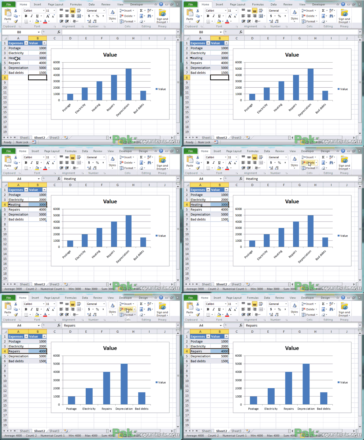
Have B6 as an active cell and hit Tab key on the keyboard. This will insert a new row to the table. In the first column type Bad debts > hit tab again and type 1500. You can see the chart making changes on the go on the right.

Delete on the go
Now move your cursor to any expense in column and once the cursor changes to pointing right hit left mouse button once to select the row. Go to Home tab > Cells group > click delete button and done. You must have noticed the value you just deleted is no more in the graph.

Filter on the go
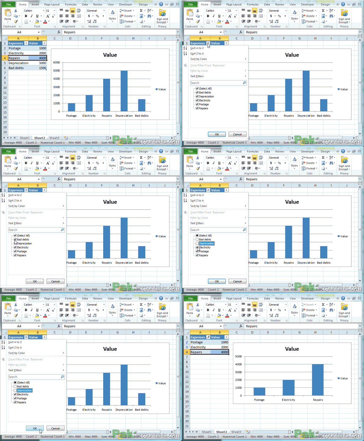
Yes, you can have charts on the go for filtered data too. Head to Expenses heading and click the downward pointing arrow to pop open the menu and from there select the expenses you like to hide and uncheck them e.g. uncheck bad debts and depreciation and click OK button. And now you have the chart only for the three selected/filtered values. This one I find very useful as we get filter dependent charts that change dynamically according to filtered data.

This behaviour is a lot like pivot table slicers I discussed earlier where we learnt that using slicers you can generate charts based on filtered data. In version 2013 of Excel we have slicers working in Tables as well. But in older versions i.e. 2010 and older slicers are only available with pivot tables.
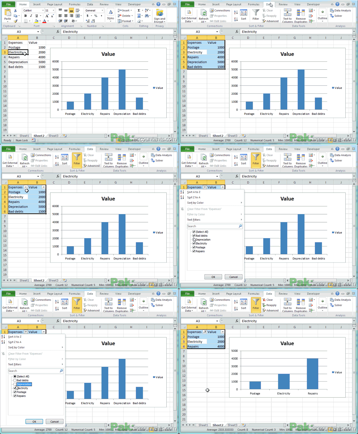
Later I find that filter capability with charts works on simple data ranges too and for that to work you don’t have to have Excel tables. Following animation shows this in action:


Leave a Comment