Budget vs Actual Variance Reports with “In the Cell Charts” in Excel
In life we all want to be in control. And usually we measure or judge whether things under control by comparing whats happening with what should be happening. In other words, we tend compare the actual events/results with planned events/results.
Though more interestingly most of us don’t really know if the “plan” is really under control or not. Anyways we will discuss the philosophy of perception vs reality some other time. So back to our topic comparisons and making budget vs actual reports.
Excel provides is immense flexibility to make variance analysis super easy either in numerical form using conditional formatting or custom formats or in the form of variance charts.
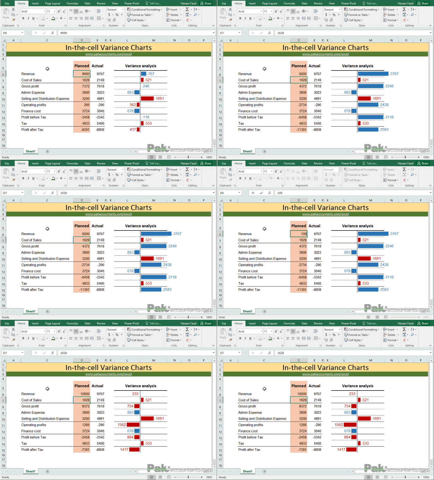
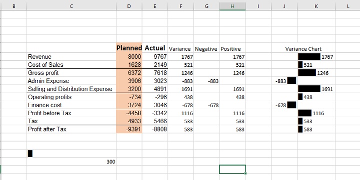
Today we are looking at yet another technique of reporting variances which is more of an in-the-cell charting. We are not going to make actual charts but it will be visually as helpful as normal charts. The final result of today’s technique is following:
Its really easy to do if you know how to use REPT() function. An overlooked and to many it doesn’t have any use. But it has quite a big role today. So lets learn it.
In cell Variance Charts – Step by Step
Download this workbook to help you walk through the steps discussed as under.
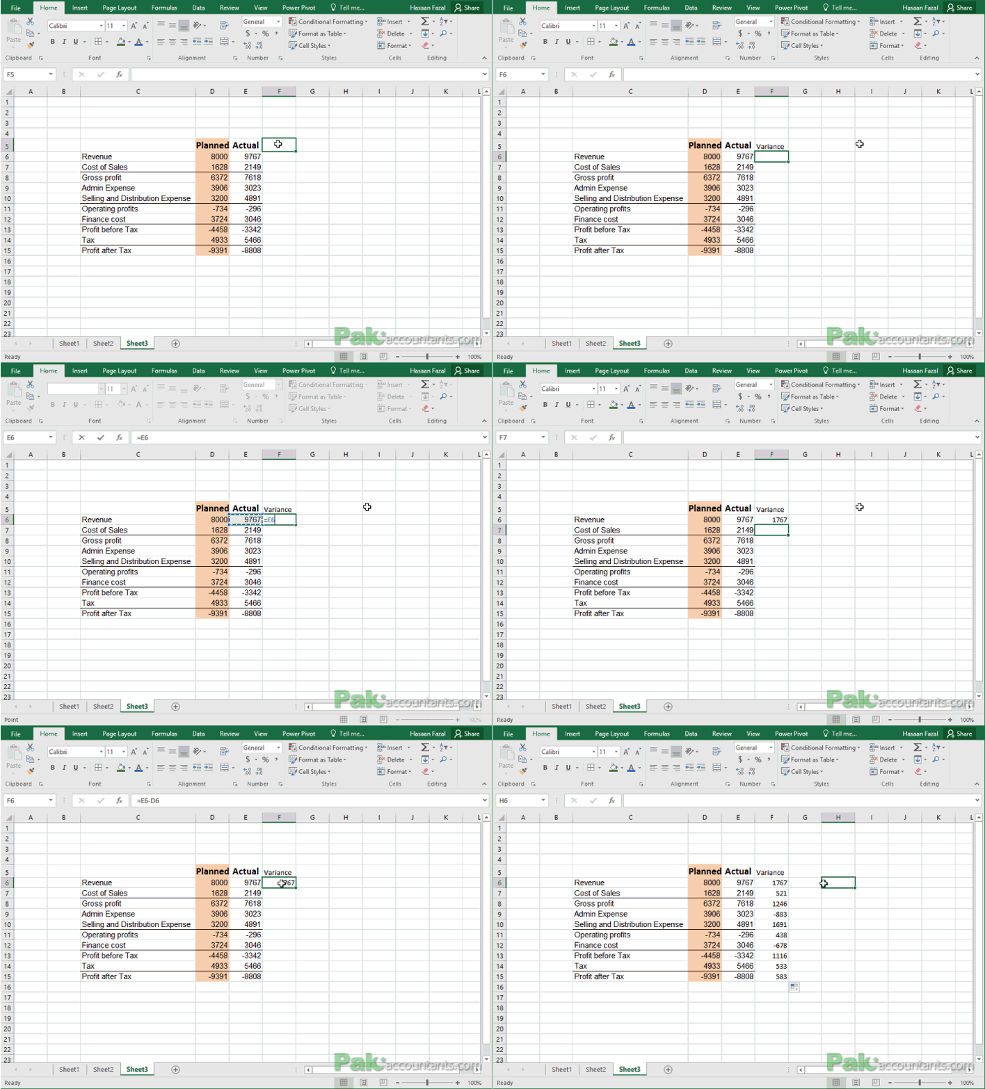
Step 1: In a separate column make a heading of Variance. In our case it will go in cell F5. And in cell F6 put this formula and double click the fill handle to populate the formula down the whole range:
=E6-D6
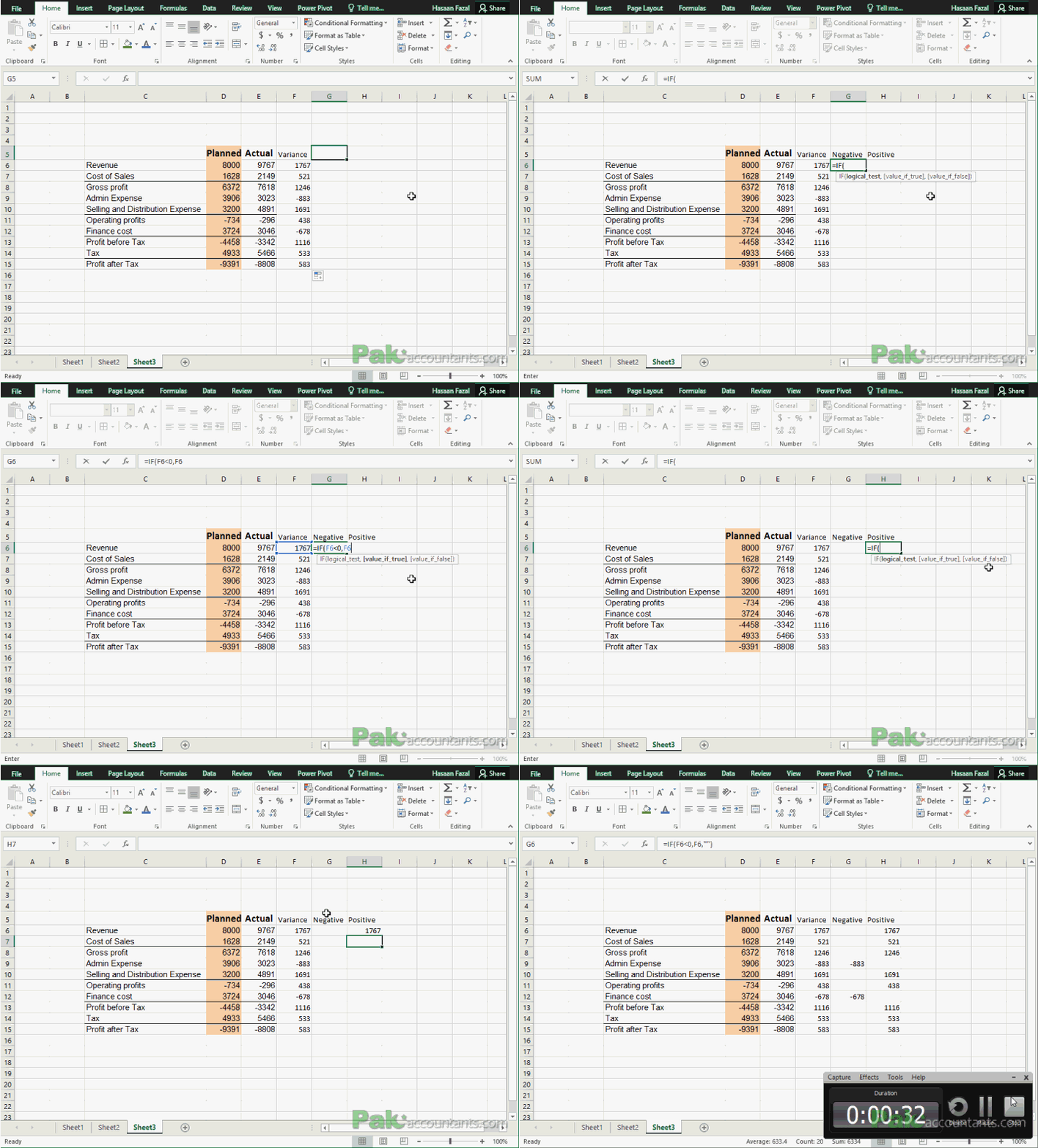
Step 2: Now that we have calculated the variances, for the sake of better understanding lets separate the negative and positive values in two columns. These are not needed if one has a good grip on IF() functions but for simplicity I will be employing helper columns.
Write “Negative” in cell G5 and in cell H5 “Positive”.
In cell G6 put this formula and double click the fill handle after pressing Enter key:
=IF(F6<0,F6,"")
In cell H6 put this formula and drag the fill handle down to fill the range:
=IF(F6>0,F6,"")
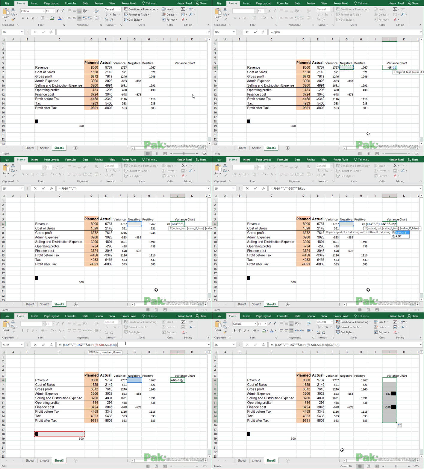
Step 3: Go to cell C18 and Insert a specific symbol which you can find in almost every font once you select “Block Elements”. Once inserted simply close the dialogue box.
Also put 300 in cell C19.
Step 4: Select cell J5 and K5 and merge them together. Write “Variance Chart” in merged cells
Step 5: Put this formula in cell J6:
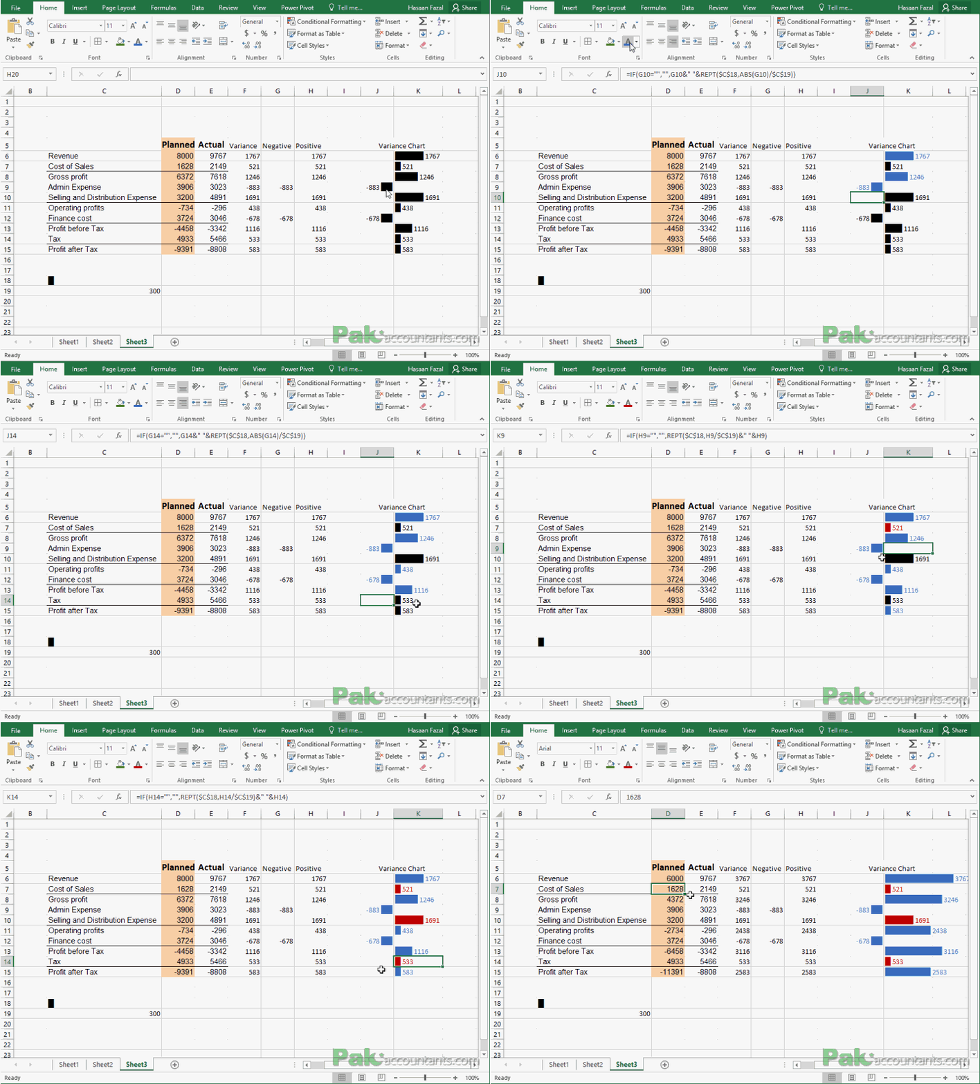
=IF(G6="","",G6&" "&REPT($C$18,ABS(G6)/$C$19))
Align the column to the right.
And in cell K6 put the following formula and drag the fill handle down to fill the formula in appropriate range:
=IF(H6="","",REPT($C$18,H6/$C$19)&" "&H6)
Once you are done with above steps your chart will look like this:
Step 6: Now coloring part is manual as we have separate favourable and unfavourable variances from each other. Not always a negative figure is a bad thing and not always a positive figure is a good thing.
So items like Revenue, Operating profit etc their positive variance is favourable so I colored them Blue whereas items like expenses their, positive variance indicate increase in cost therefore it is an unfavorable variance so I colored them Red.
With a touch of borders to fine tune the look and this is what I have in the end!
So hope you have enjoyed learning a new technique as must as I enjoyed writing about it. Check out more Excel tutorials by clicking here




Leave a Comment