Making a Slope Chart or Bump Chart in Excel – How To
Excel has many different styles of charts and graphs inbuilt and one can make them with a single click. A great convenience to have. But for charts and graphs convenience is required, merited and appreciated if its easy for the user to understand.
As humans progressed, same way their expression and the manner to present things moved forward and improved. That is the reason why some chart types are preferred and loved over others and some are simply loathed. Like take the case of pie charts on which jury is still out if they still be in use or should we prefer better and simple alternatives like line charts.
One of such charts that is loved and regarded by many in specific situations is Edward Tufte’s slope chart also known as bump chart. And to some it was a brainchild of modern day sparklines
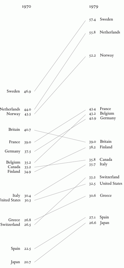
One can clearly see how things have changed between two instances of time or other event. It is this top-to-bottom or vertical or hierarchical, however you name it, approach that makes it one of the effective ways to present change in quantities.
But the problem is Excel doesn’t offer this chart type in package. But we can make it real easy. Here is my attempt at i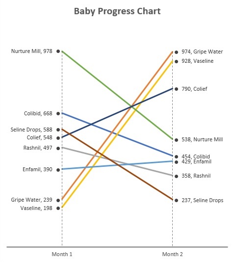
So lets learn how to do it in easy steps.
Making slopegraph / slope chart in Excel – Step by step
Step 1: We have a simple data with few products that a baby has consumed over two month’s time. We just want to compare how it has changed between first month and second month. So we have data like this:

Step 2: Select the data including the headers and go to insert tab > in charts group click line graph button > click line chart button. It will insert the chart:

Step 3: Having the chart selected click design tab > click switch row/column. It will instantly turn the axis and thus the plotting of elements. We are getting there!

Step 4: Time to tame the chart, need to subtract few things first and later add few things to make it just right. Start by deleting everything you see except the axis at left as shown in the following walkthrough by left clicking once on each element and hitting delete key:

Step 5: Having the chart selected, go to design tab > click add chart element button > go to lines > click drop lines

Step 6: Just note the maximum value of vertical axis and delete it. I kept it as a reminder for configuration needed for this step. We will be inserting an additional chart as overlaying chart. Why? I will explain that in a bit.
Select month 1’s quantities and go to Insert tab > click scatter charts button > click scatter chart. It will insert the chart with dots plotted. Then select month 2’s quantities > copy them and then paste them inside chart area. Another series will be added to the chart automatically.
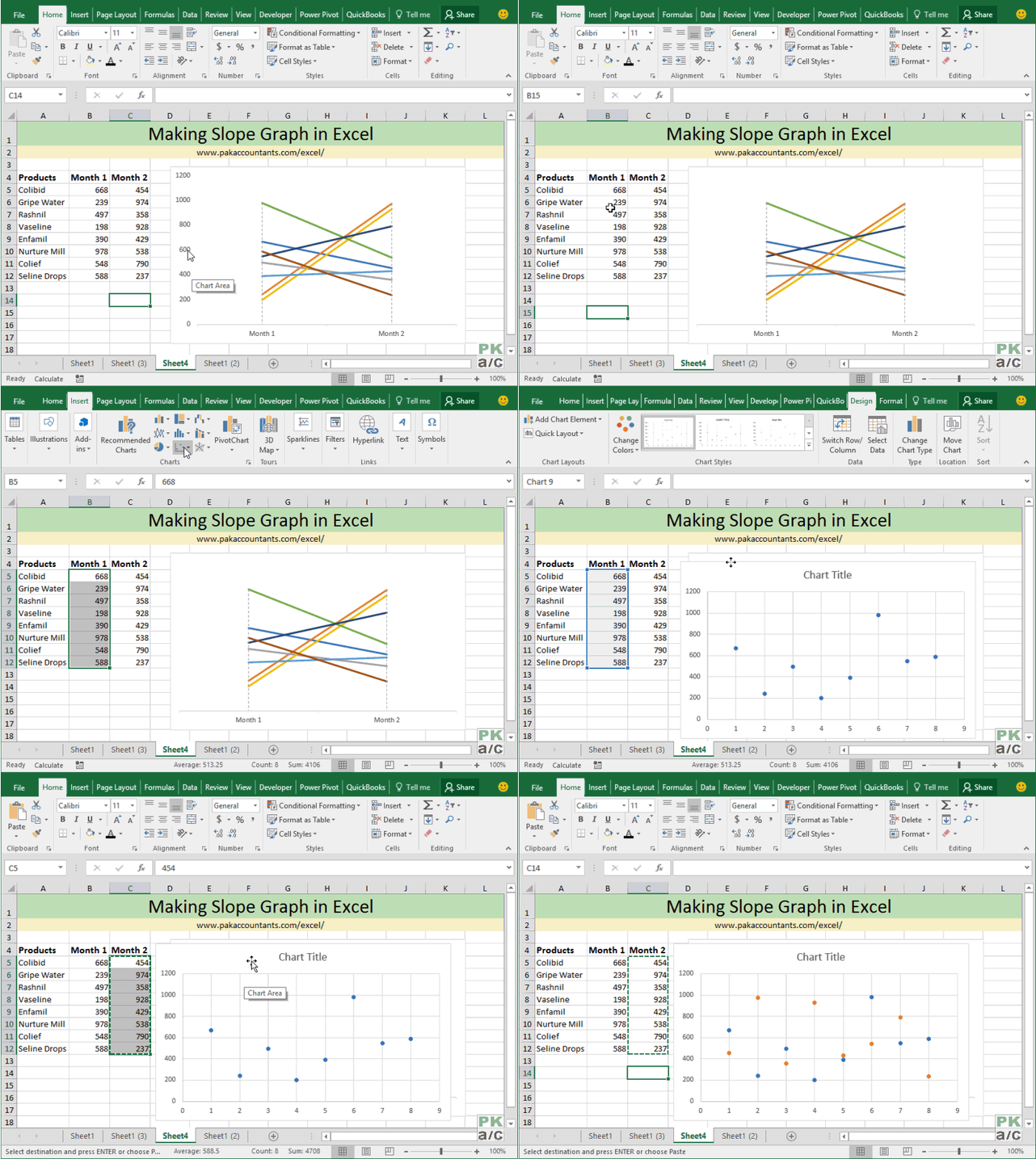
Step 7: Remove chart title and axial lines passing the chart vertical and horizontal.
Then select one of the series by simply clicking on any dot, orange or blue, and go to design tab > click change chart type and check plot on secondary axis for the last series in the list.

Step 8: Right click on the bottom horizontal axis and click format axis. Set the maximum to 100000 press enter. Right click on top horizontal axis and set its maximum to 100000 as well but don’t forget to tick the option “values in reverse order” so that both series clinch left and right extremes.
 Step 9: Remove the fill of chart so that it becomes “see-through” and later adjust the two charts over each other. I went ahead and formatted the dots as well and gave them black color.
Once formatted to satisfaction make the selection using select object tool and hit menu key on the keyboard and click group so that both charts are joined together.
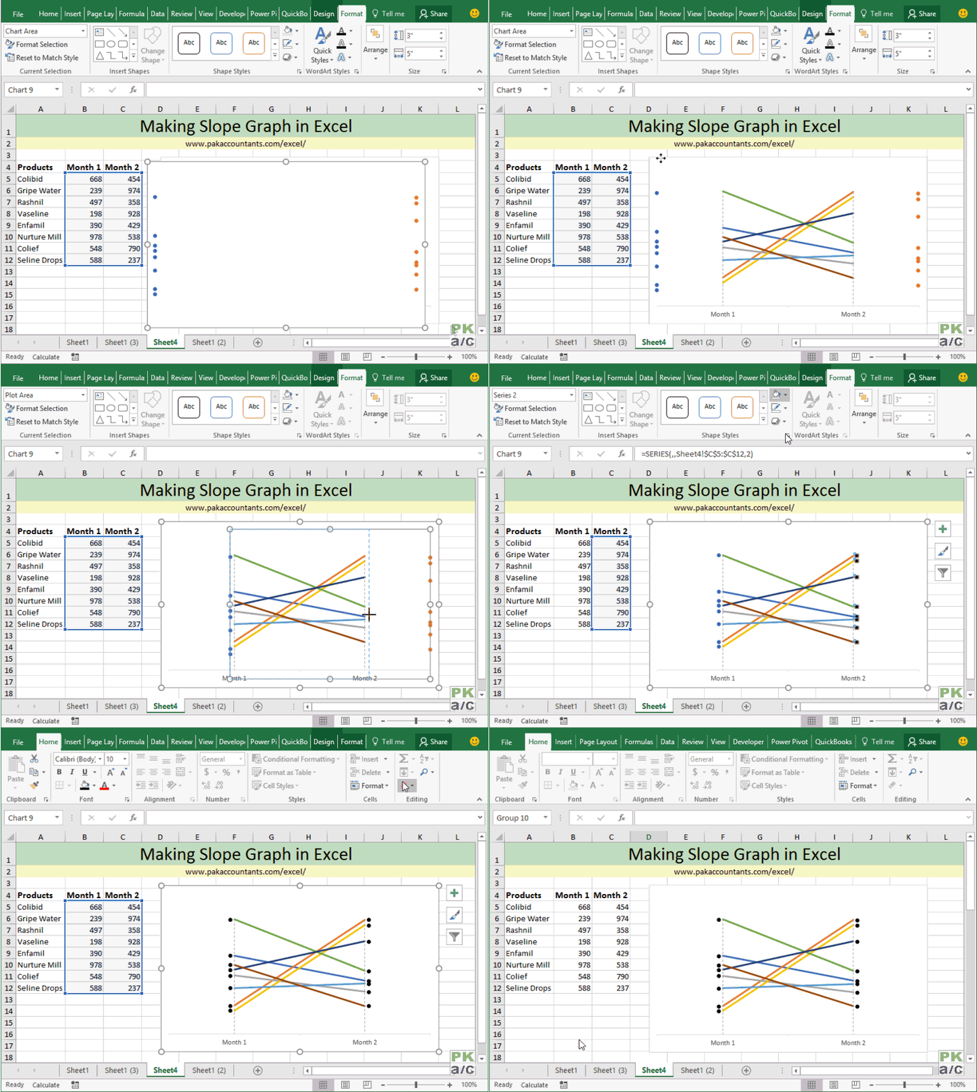
Step 10: Press escape once to disable select object tool and then select the left series and add data labels to it. Repeat the process for the right series as well.

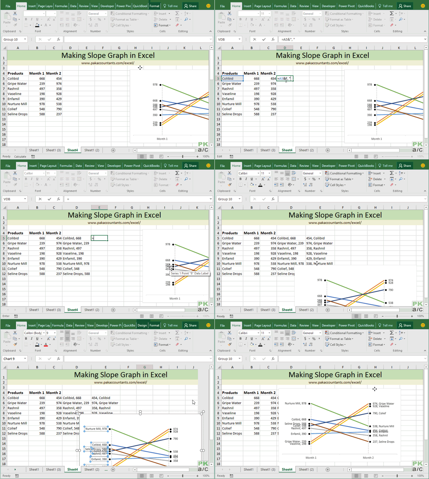
Step 11: Though data labels have been added but they aren’t helping much. As we are missing the product names with quantities. To solve it we will have additional data that serve as data labels.
Simply add two new columns by concatenating the quantities and product names appropriately.
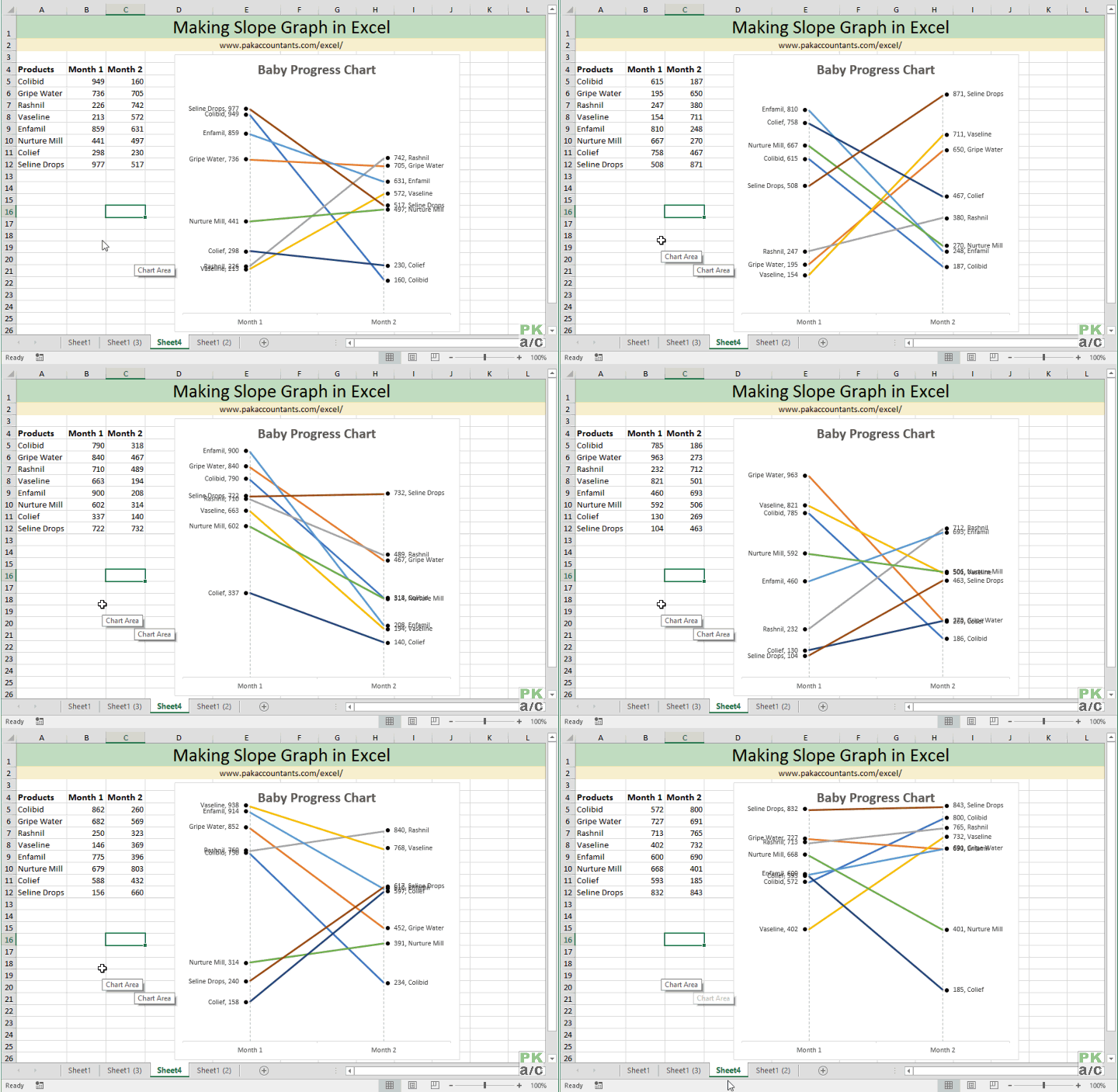
And here is the final output with chart title added added and expanded a little vertically with randomized data to show that it can update if the underlying data changes.
I have few more ideas to implement in this chart and will share them in coming weeks to make it even better.


Leave a Comment