Enable/Distable Data labels using form controls – Step by Step
Data labels in Excel charts can help users to get the information right at that spot without referring to any other source of information. In some situations however, same data labels can get in the way.
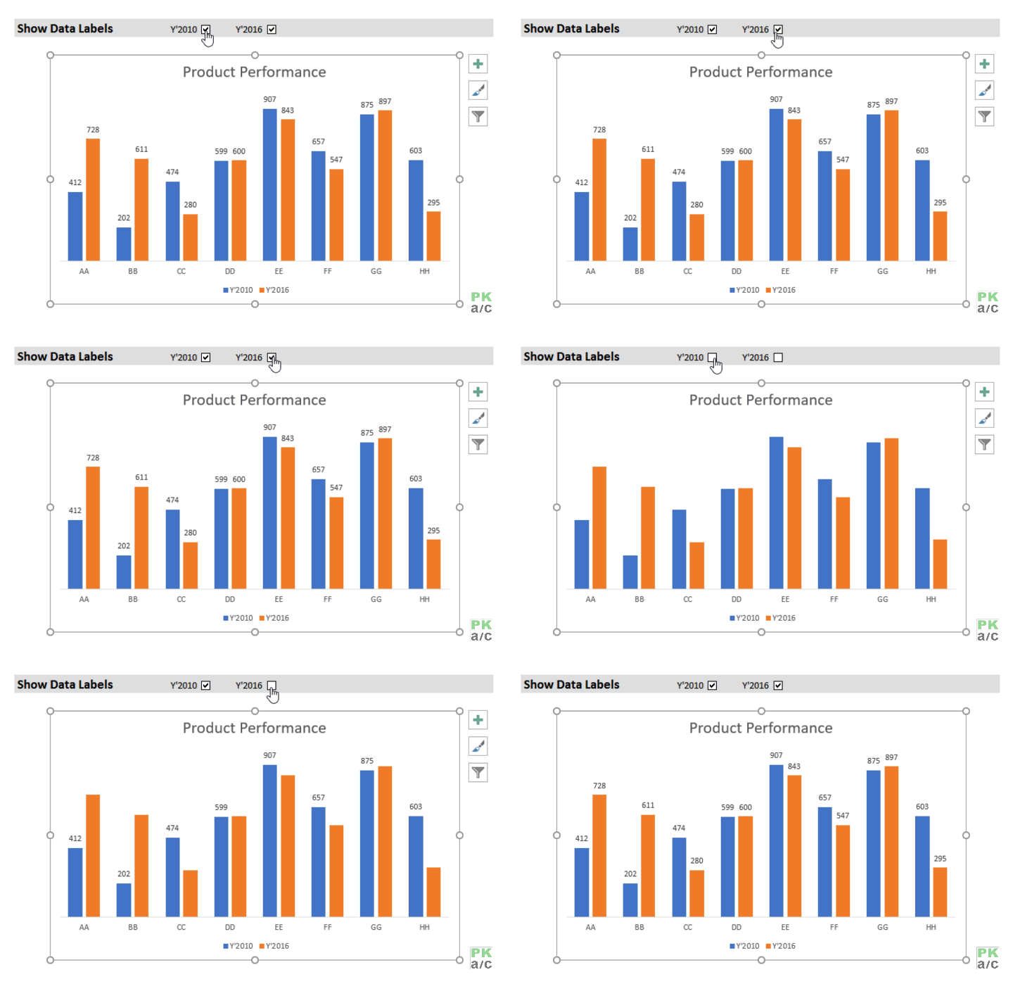
In such cases, having the flexibility to turn data labels on and off at the push of a button can be immensely helpful and make charts much more user friendly. We can do this easily using Excel form controls. Here is the look at what we are trying to achieve in today:

Lets do this!
Enable/Distable Data labels using form controls – Step by Step
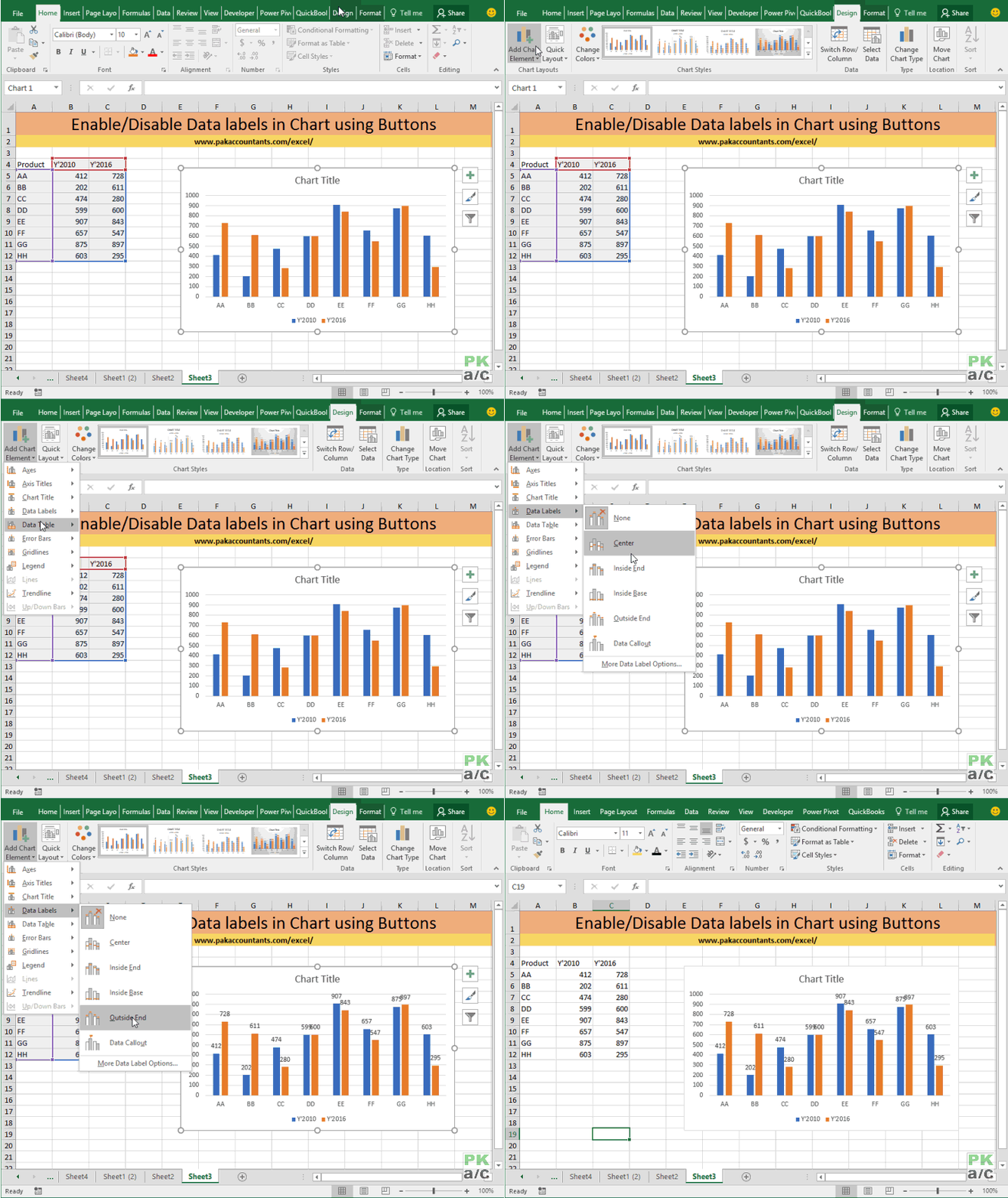
Step 1: Here is the sample data. Select and to go Insert tab > Charts group > Click column charts button > click 2D column chart. This will insert a new chart in the worksheet.

Step 2: Having chart selected go to design tab > click add chart element button > hover over data labels > click outside end or whatever you feel fit. This will enable the data labels for the chart.

Now we do have a way to disable them once again by redoing the whole step 2 but selecting none from the menu. This is cumbersome and is more like developer’s work to do and in the middle of presentation this approach will hinder the flow.
What we need is a nimble button or check box to enable or disable data labels on the chart. For this we need form controls that require developer tools/tab to be enabled.
Step 3: To enable developers tab right click on home tab > click customize the ribbon > from the right list check enable developer box > click OK

Step 4: Click developer tab > go to controls group > click insert button > under form controls click check box. This will turn pointer into insertion tool. Go to desired cell and left click once. This will insert the check box in the worksheet.
Step 5: Double click the text part of check box and remove the text. This will leave you with just the check box. Copy it and paste it to insert second check box. Arrange both of them as desired.

Step 6: Right click on the check box and click format control. This will open up a new window, click once inside linked cell rang box and click the appropriate cell where its output can be generated. Click OK. Now if you click the box, it will show results of TRUE or FALSE on tick and untick status.
 Step 7: Hide TRUE/FALSE outputs in linked cells by selecting them and hitting CTRL+1 > click custom and under type input bar enter “;;;” Click OK.

Step 8: Go to cell E5 and insert the following formula:
=IF($B$14=TRUE,B5,””)
This formula is checking if value in cell B14 is TRUE then fetch the value from cell B5 otherwise fetch nothing and leave the cell empty.
Go to cell F5 and inser the similar formula to fetch series of Y’2016.
=IF($C$14=TRUE,C5,””)
Select both E5 and F5 cells and drag the fill handle down to 12th row to populate the cells. Now if you enable the check box only then series will be displayed otherwise cells will be empty.

Step 8: Right click on any data label of Y’2010 in chart and select format data labels. Tick the option of value from cells and click select range button and select the first series in column E as it corresponds to Y’2010. Untick other options for data labels from the list.
Step 9: Right click on any data label of Y’2016 in chart and select format data labels. Tick the option of value from cells and click select range button and select the first series in column F as it corresponds to Y’2016. Untick other options for data labels from the list.
All Done! Now test if data labels are turned on/off at the click of a button.

And here is the final result with a little bit of formatting:


Leave a Comment