Adding a Secondary Axis in Excel chart – Why?
Excel charts are one of the best tools to give eyes to numbers. And Excel takes it further by letting you easily customize your charts.
Excel has many customization options for Excel charts to help us make better charts. And adding a secondary axis in Excel charts is one such customization option.
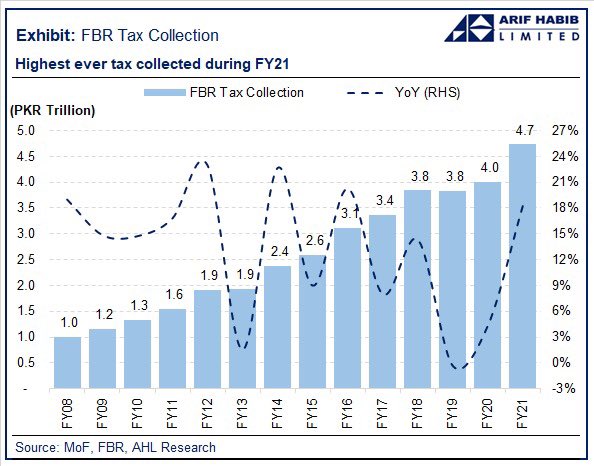
A secondary axis allows you to plot two variables along two distinct vertical axes i.e. y-axis. Each one on its own vertical axis. This helps us in making better charts as we can plot the data within one chart instead of two separate charts. Have a look at the following illustration:
Adding a Secondary Axis in Excel chart – Why?
Let’s understand why we need to add a secondary axis for better Excel charts in more detail.
Have a look at the following data containing sales figures and quantity in tonnage for two quarters.
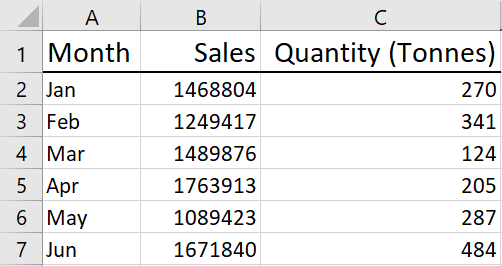
And following is the chart using the data in the above table.

Noticed anything? We cannot see quantity figures in the chart!
Although both sales and quantity figures are plotted in the above chart, we can ONLY see the sales in blue.
As sales figures are in millions and quantity in mere hundreds, the difference is significant. Plotting both on a single vertical axis will cause a scaling issue. Should we scale the chart as per sales numbers or should we opt for quantity figures?
If we go with sales figures, it has pushed the scale of the chart to 2 million to accommodate the sales bar (blue). And in the process, the quantity bar (orange) is now so so short, as it is in mere hundreds, that it is now invisible.
And even if we try switching the chart type from a bar chart to a line chart, it doesn’t help either. Rather adds more confusion.
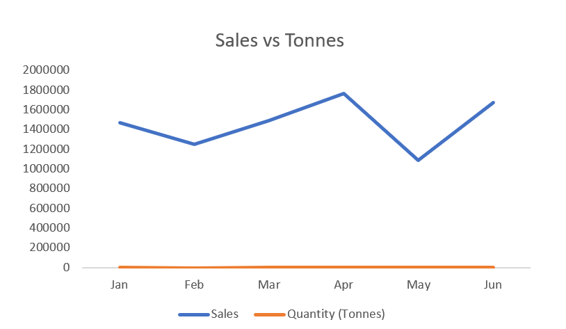
As you can see, the chart is giving a wrong impression that we made millions in sales by selling 0 units.
In the above example, we can clearly understand we cannot plot both sales and quantity on the same axis. And this is why we need a secondary axis.
And if we add a secondary axis to the above situation we instantly get a better Excel chart.
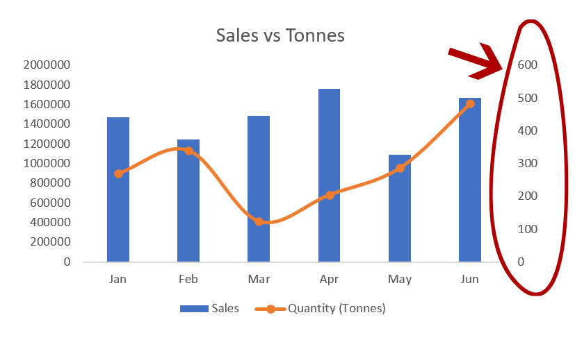
How did it happen? Let’s understand.
By adding a secondary axis to the chart, appearing on the right of the chart, we now have two vertical axes. And each axis has its own scale appropriate for the data plotted. The axis on the left is scaled for sales whereas, the axis on the right is scaled for quantity.
How to add a secondary axis to Excel Charts – Steps
Adding a secondary axis in Excel is very easy. Following are the steps you should follow to add a secondary axis to your Excel chart.
1: Select the entire data by having an active cell within data range and hitting CTRL+A shortcut.
2: Click Insert tab > under charts group click insert column or bar chart drop-down button > click clustered column chart.
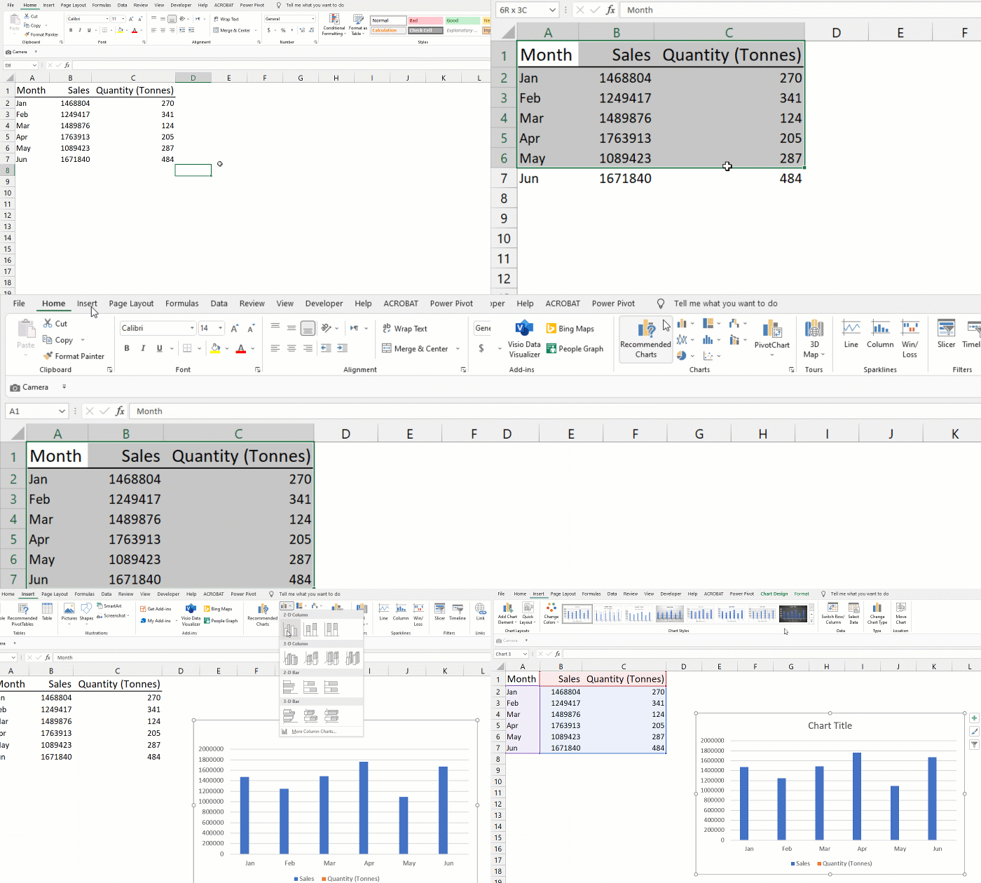
3: Having the chart selected > click chart design tab > click change chart type button. A pop-up with chart-type options will appear.
4: From the list on the left click combo.
5. For sales select clustered column from the chart type dropdown. And for the quantity, it should be “Line” or “Line with markers”.
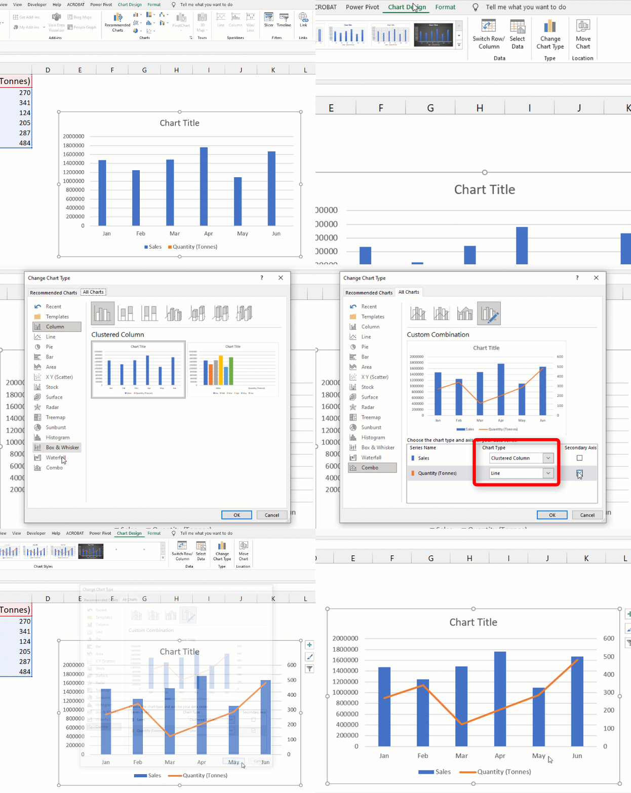
And you are done!
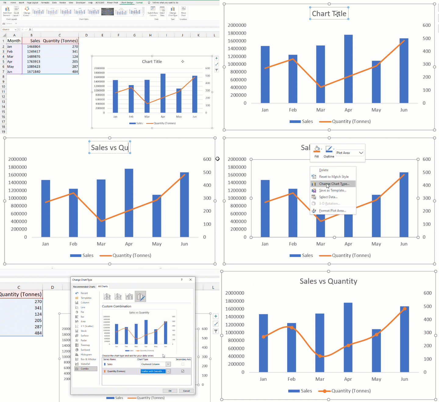
If you want an Excel chart to be aesthetically more pleasing, you can make more changes. Like for quantity figures instead of line chart type you can select “scatter with smooth lines and markers”.
And you can also change the colors of the bars, line, and background, etc.
How to remove a secondary axis in Excel Charts
If for some reason you want to remove the secondary axis from the Excel chart, it is only a keystroke away.
Simply select the secondary axis and hit the delete key on the keyboard. That’s it!
With the mouse, simply hover above the secondary axis > right click mouse button > click delete.
Liked this Excel tutorial? Help us spread the word! Pin it!


Leave a Comment