10+ ways to make Excel Variance Reports and Charts – How To
10+ ways to make Excel Variance Reports and Charts – How To
Whether it is daily life thing or any day at work, we are always comparing to see whats good and what is not so good. This differential analysis has a much popular name as variance analysis.
Whenever, whatever and whoever is deciding, you got to have the variance report to better understand the situation and what control actions are needed. Read this if you are interested in details about What is Variance analysis?
Normally this is how variance analysis looks like:
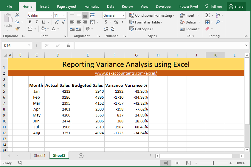 Not much a of a fan like this… right?
Lets face it! when you are in the seat deciding things you would like to have the data in such shape that you can process with most of your organs and senses and not just brain. That is why colors, charts and mix of other things are used. Following are 10 techniques to take variance analysis beyond simple numbers and percentages.
Method 1 Use brackets for negative numbers
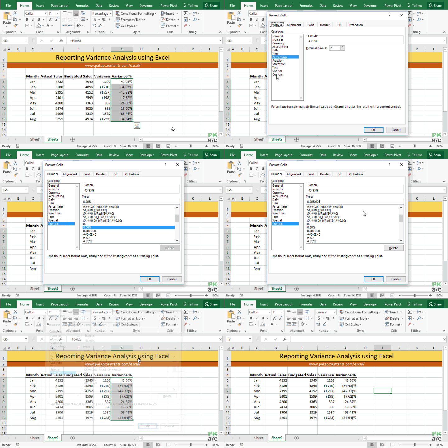
Simplest of all and very formal too. At the moment that small dash at left for negative or unfavourable variance need an effort in itself to see. Putting numbers in brackets make it much easier on eyes to separate the good from bad. This is how to do it:
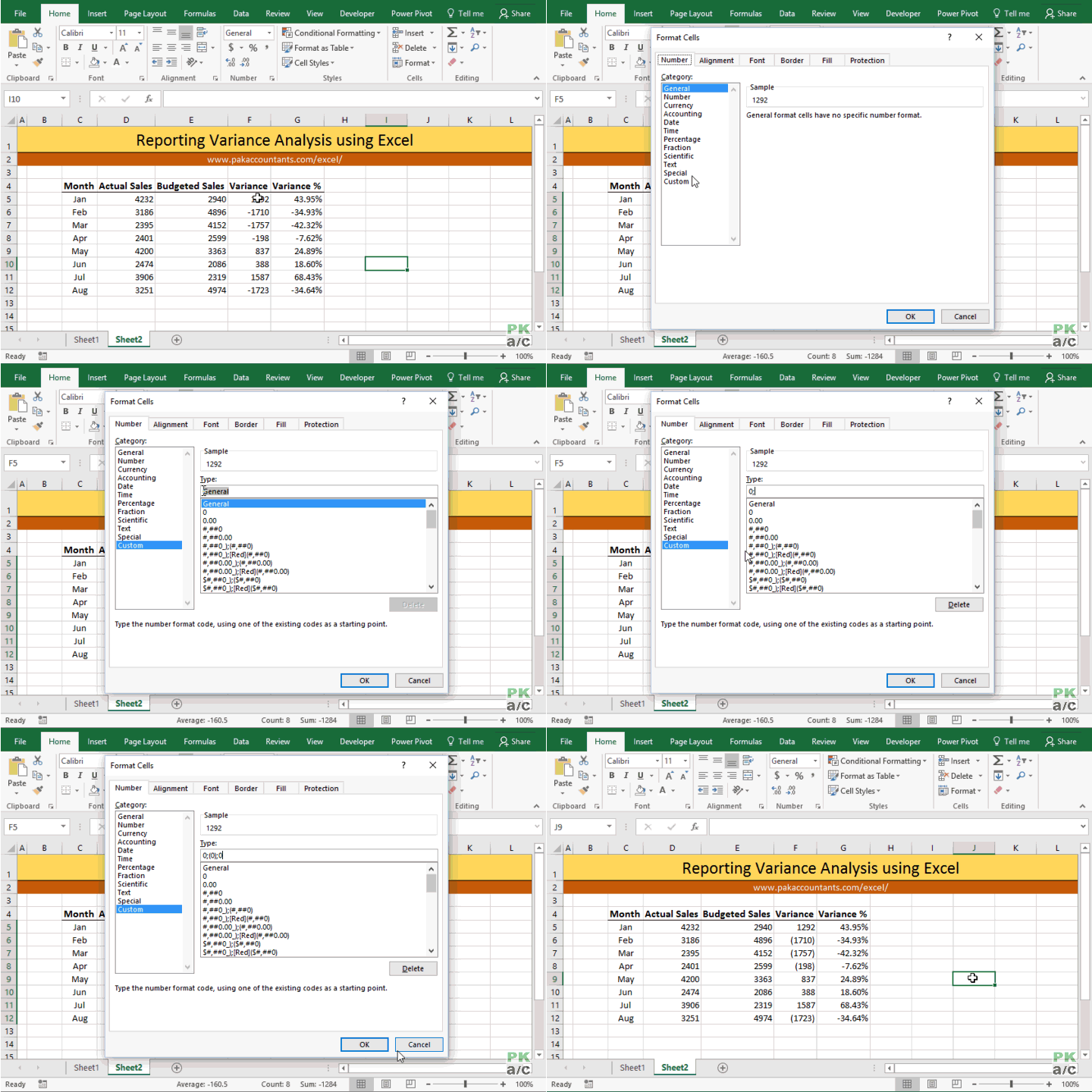
Select the cells you want to format > hit Ctrl+1 on the keyboard > from the dialogue box select number tab > select custom from the list at left > Under type input box remove anything that is written and put this:
0;(0);0
Click OK and now you have negative numbers in brackets.
With percentages the format code will be a little different as following:
0.00%;(0.00)%;0%
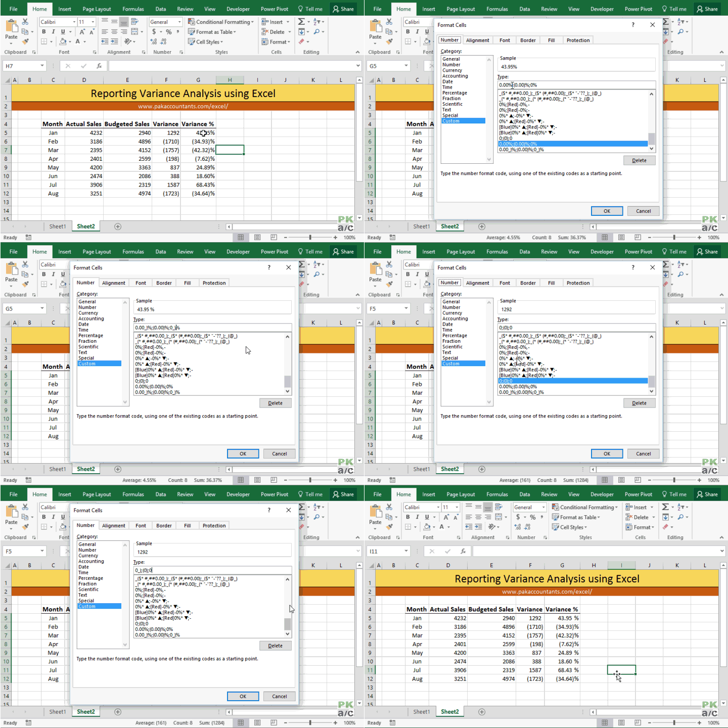
If you are one of those souls who pursue finesse at every level then you can adjust the format a little more for percentages so that numbers and brackets don’t break the visual harmony of the report. Lets change the code as following and see what it does:
0.00_)%;(0.00)%;0_)%
With negative numbers enclosed in brackets, the digit’s position is shifted a little and can cause confusion. Adding “_)” element helps get it sorted. See we are adding it only to positive number and zero portion of the code.
Method 2 Color the content or data – Custom number format
We can even use colors to differentiate the negative numbers/percentages from positive ones in addition to brackets or on simple numbers.
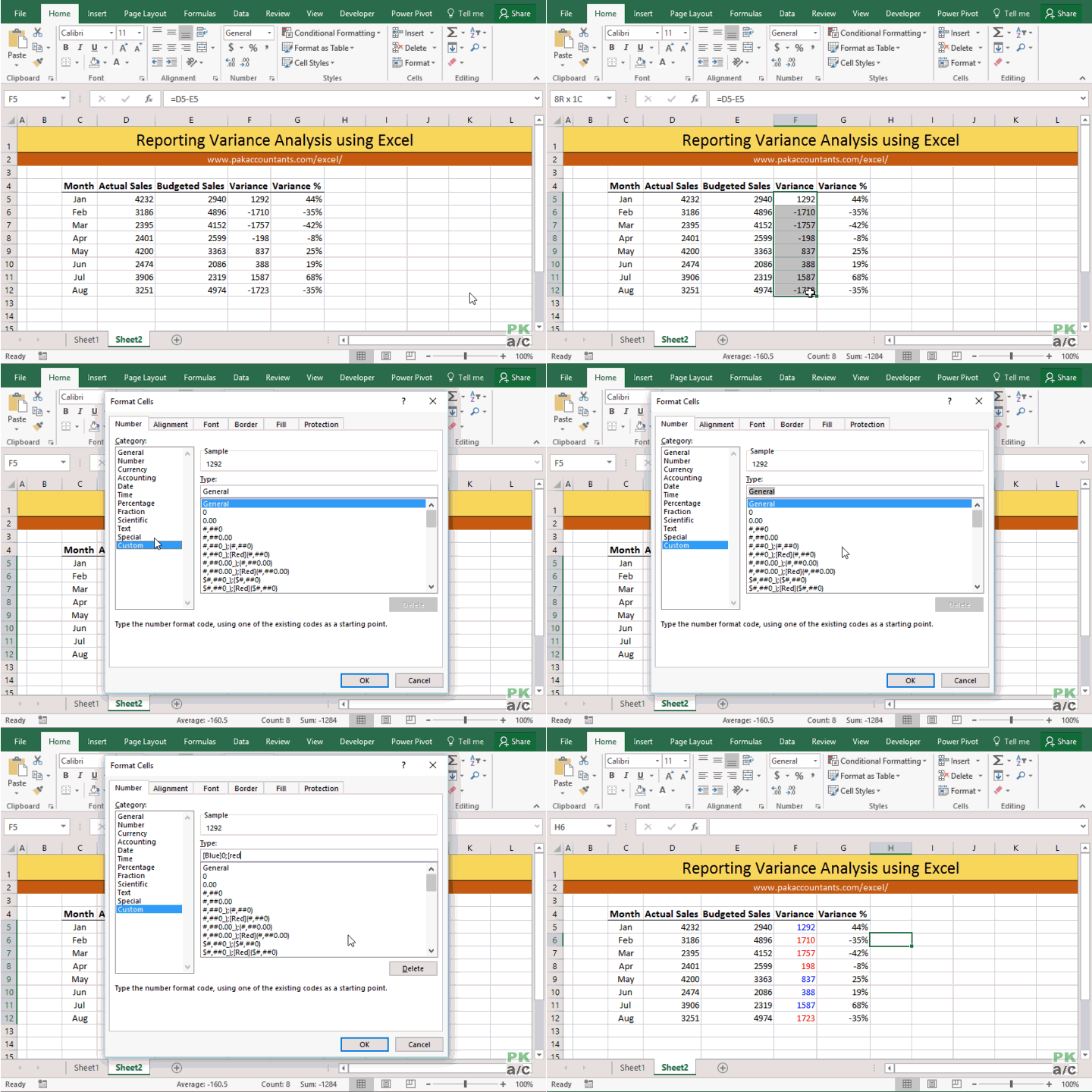
Again, go to custom number format dialogue box by selecting the data and hitting Ctrl+1 and put this code for numbers:
[Blue]0;[Red]0;0
This will give positive numbers in blue color, negative numbers in red and 0 will remain default color.
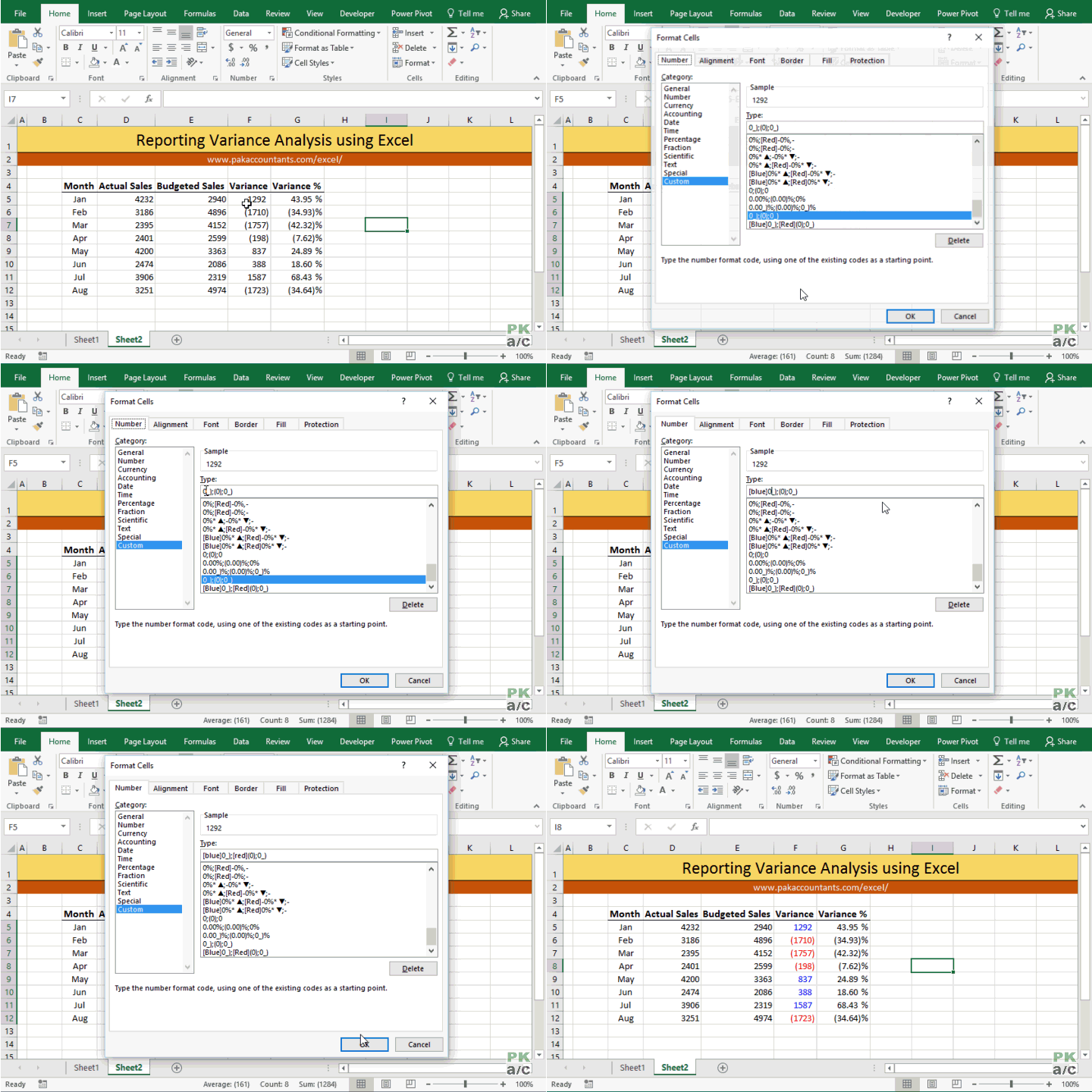
You can even use colors with the code mentioned in method 1 above as follows:
[Blue]0_);[Red](0);0_)
This code will show positive numbers in blue and negative numbers in brackets with red color while keeping the column aligned nicely.
So what we did is basically add color codes in square brackets for each of the positive and negative number portion of the code. You can use other specific color codes as well or apply a color only to negative or positive number.
Method 3 Use arrows
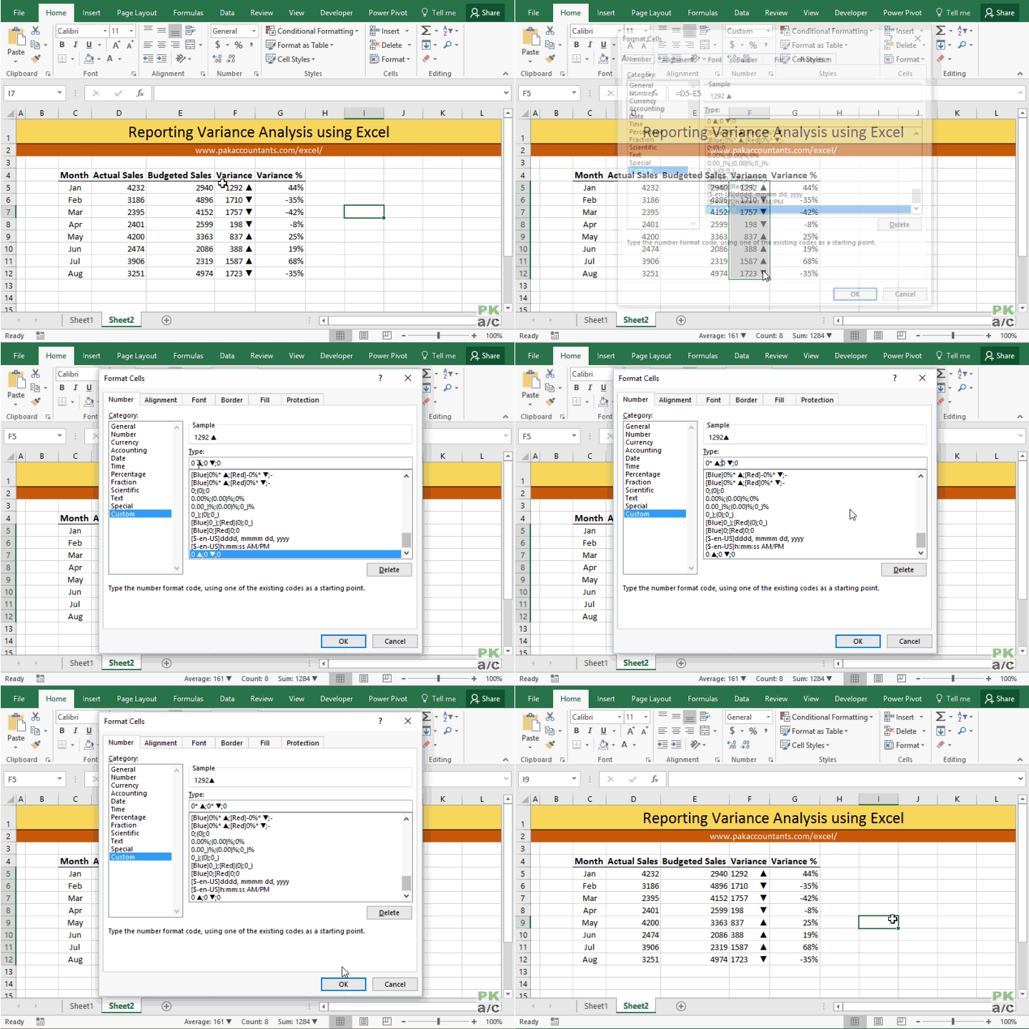
We can use up and down arrows to show the positive and negative numbers or favourable and unfavourable variance.
The basic trick is to input character code using number pad while holding down the ALT key on the keyboard. Yes! you need number pad for this. Number keys above alphabet keys won’t work.
Select the data and go to custom number format dialogue box by hitting Ctrl+1 combo. Go to custom and remove anything from type input bar. Press “0” key followed by a tap of spacebar and then press + hold down ALT key and from number pad press 3 followed by 0. Let go of ALT key and an arrow up will be inserted! Or simply ALT + 3 + 0.
Same goes for negative number but this time instead of 3 and 0, press 3 and 1 and it will insert an arrow down. So for arrow down the combination is ALT + 3 + 1
As wordpress won’t allow me to paste the original code so I am just putting the structure of code as following:
0 [space] [arrow up];0 [space] [arrow down];0
One improvement that can make it better by having arrows aligned to the right of the cell and numbers to the left of the cell. This is done by adding one additional element which is esterisk. So the structure will be as following:
0[esterisk][space][arrow up];0[esterisk][space][arrow down];0
As you can see we are including only esterisk symbol before the space character to the same code discussed earlier.
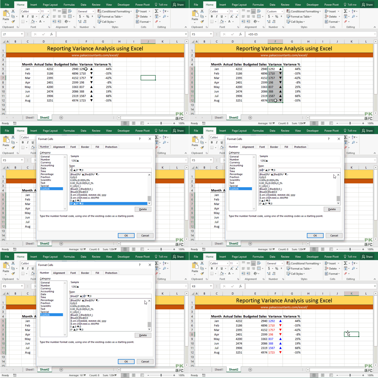
And definitely you can use colors as well to give more oomph:
Method 4 Use cell color
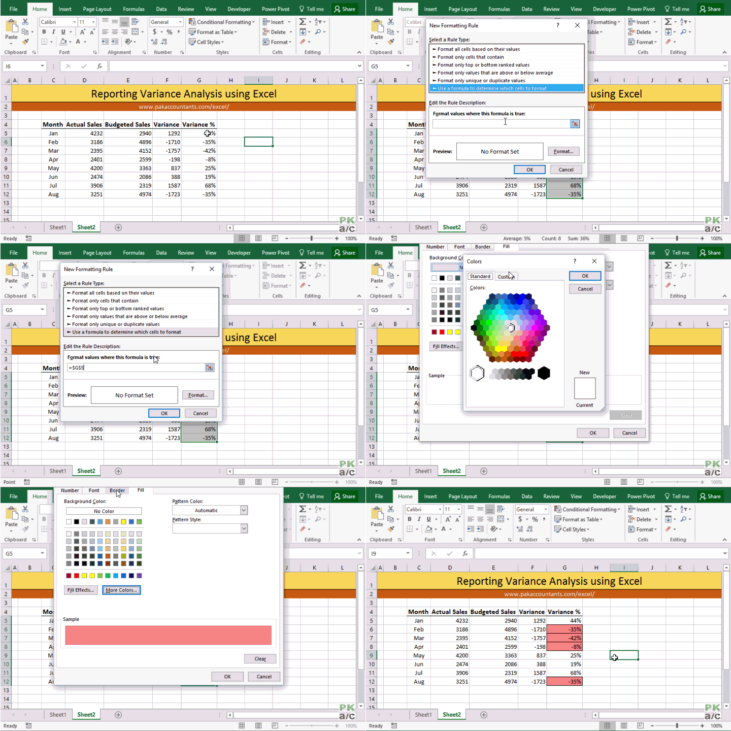
If you are not fond of colored text then you can use cell color to change for negative and/or positive numbers.
Select the data > go to home tab > styles group > click conditional formatting drop down button > click new rule. From the dialogue box select “Use a formula to determine which cells to format”
Now we can put a formula to color the cells with negative numbers with a simple formula like this one:
=G5<0
Click format button and select the color of cell you desire and make other formatting related changes if you want. Once done click OK to apply the conditional formatting.
Method 5 Use arrows – Conditional formatting
We saw how to use arrows to differential positive and negative figures using custom number formatting in method 3 above, but you can do very similar thing using conditional formatting as well.
Go to home tab > styles group > click conditional formatting drop down button > click new rule. Having the first rule type selected, change format style to icon sets. Change to icon style of your choice which in our case is arrows. From the type drop down change the value to “Numbers” for both. Have the first condition as “>” 0 and second condition has “>=” 0 and click OK.
Method 6 Use data bars
One my favourite way to present variances with great visual impact that adds a lot to understanding and the best part is its super quick to implement.
Select the data > go to home tab > styles group > click conditional formatting drop down button > data bars > select the style you like. Done!
Method 7 “In-cell” charts
So far we have been utilizing builtin features of Excel. Like databars that do really good job, but there is limited control. Another alternative is to make in cell charts using REPT function with symbols.
I have already explained this technique in great detail here: Budget vs Actual Variance Reports with “In the Cell Charts” in Excel
This technique requires two columns as we will be “plotting” negative and positive numbers separately. I will be using “|” called pipe or vertical bar. You can use any other symbol you like but this is the most easily accessible right from your keyboard.
So we will we use two columns, left one for negative figures and right for positive figures.
As my data is in G column and I am using percentage figures to make the in cell graph, so I will use the following formulas:
Negative number column:
=IF(G5<0,REPT("|",ROUND(ABS(G5)*100,0)),"")Positive number column:
=IF(G5>0,REPT("|",ROUND(ABS(G5)*100,0)),"")Select the cells and double click the fill handle to populate through whole range. Now we need to do a little formatting. Select the negative graph column and make it right-aligned. Select both columns and change the font to “Stencil”. Give negative column red color and positive blue or any that you like.
If you you don’t hav “Stencil” installed then you can use “Britanica Bold” or “Playbill” just to do the same.
If you think chart is taking too much space then you can adjust the size of font or change the multiplicative factor of “100” in formula to 50 or any lower number. For best understanding have the width of both columns equal.
Following is another variation of the same technique:
This chart is included in the downloadable bundle
Method 8 Use scaled-down actual charts
Well this is definitely an option no denying in that. But best part is that you can scale them down to fit just like in-cell charts. I really like scaled down charts as they do really good in excel dashboards.
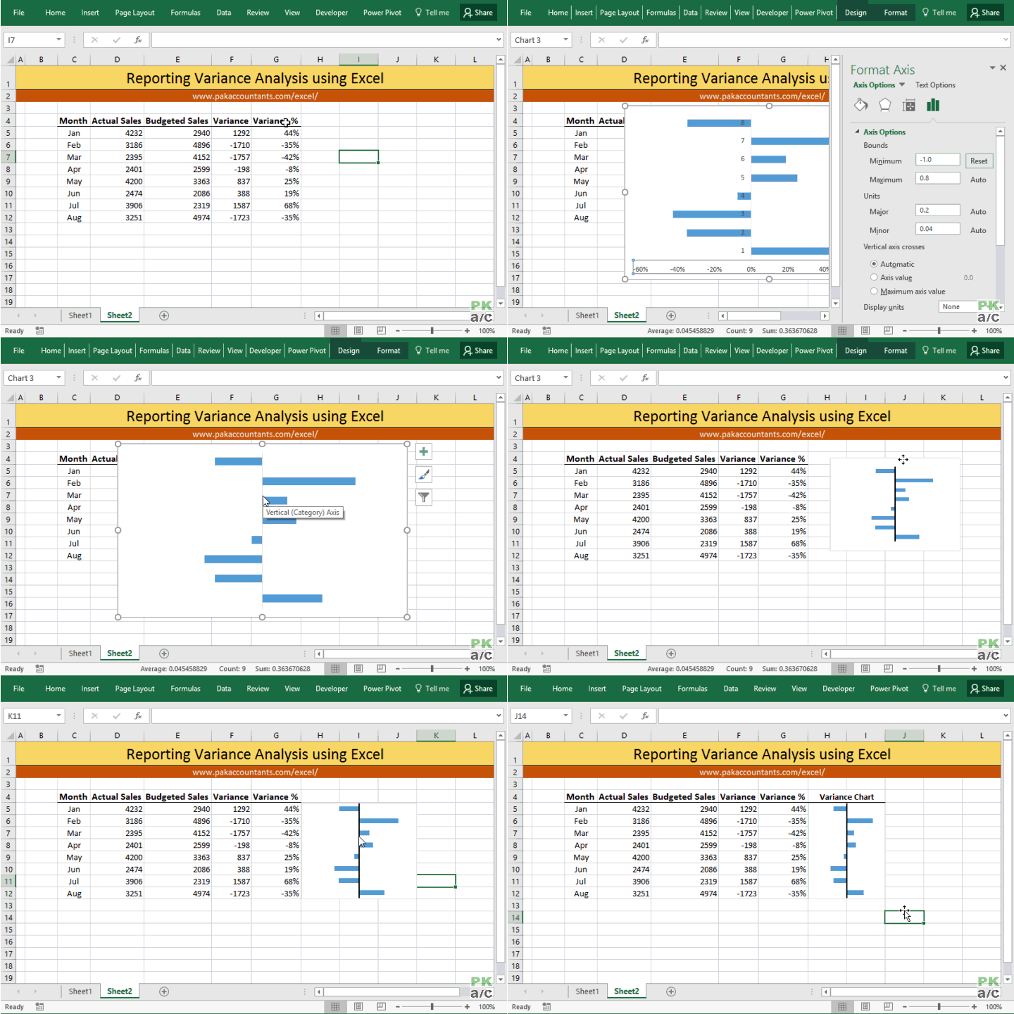
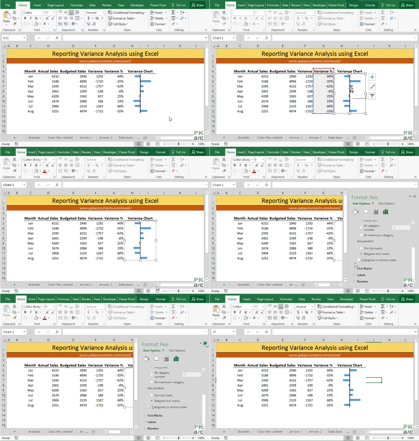
Select the data meaning only numbers or percentage whatever you want to use as base data for chart. Go to Insert tab > charts group > click column or bar chart drop down button > click stacked bar chart.
Chart will be inserted. We need to make few formatting changes like getting rid of legends, title, bottom axis scale adjustment and later deleting it, and hiding the series labels using custom number format option to be left with bare bars!
Following animation walks you through the whole process:
In my case the values are plotted as last value first. To correct this we can choose the “reverse order” option.
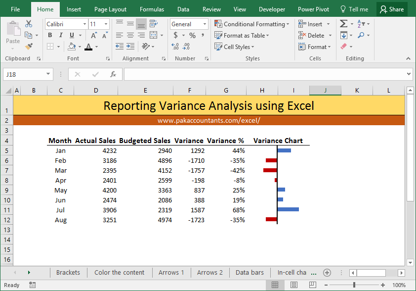
Now the values are plotted in the right order and also on the correct side of the chart i.e. positive values on the right side and negative on the left.
Here is another variation achieved with a little clever application of the same technique:
This chart is included in the downloadable bundle
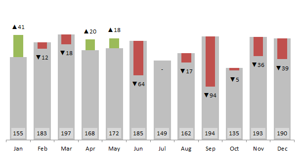
Method 9 Make better variance charts
Have a look at it first:
Lovely isn’t it! Want to make it? I have discussed its construction in probably the most detailed tutorial till date here: Variance Analysis in Excel – Making better Budget Vs Actual charts
Give it a read. The tutorial is not just about one variance analysis chart but a lot of other techniques that go into making it. One notable one is dynamic data labels
This chart is included in the downloadable bundle
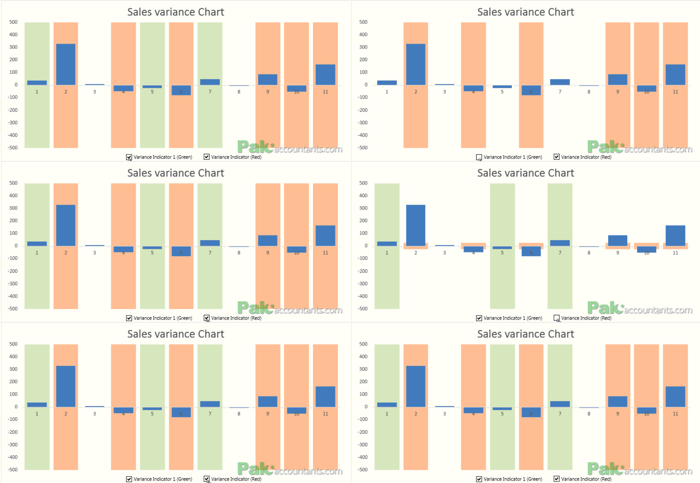
Method 10 Highlight instances in chart
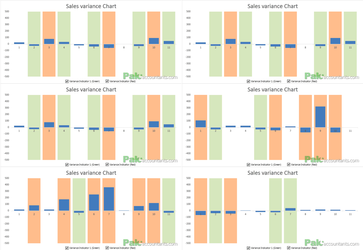
Probably the most interesting of all of the above. This is basically a chart but designed in a way that positive values are plotted with different color and negative values are plotted with another.
In addition to this, I have added On/Off switch so that if someone wants to highlight only negative or positive figures then it can be done easily.
To learn the technique head over to this tutorial: Highlight instances in Excel charts in different colors with shaded bars in background
This chart is included in the downloadable bundle
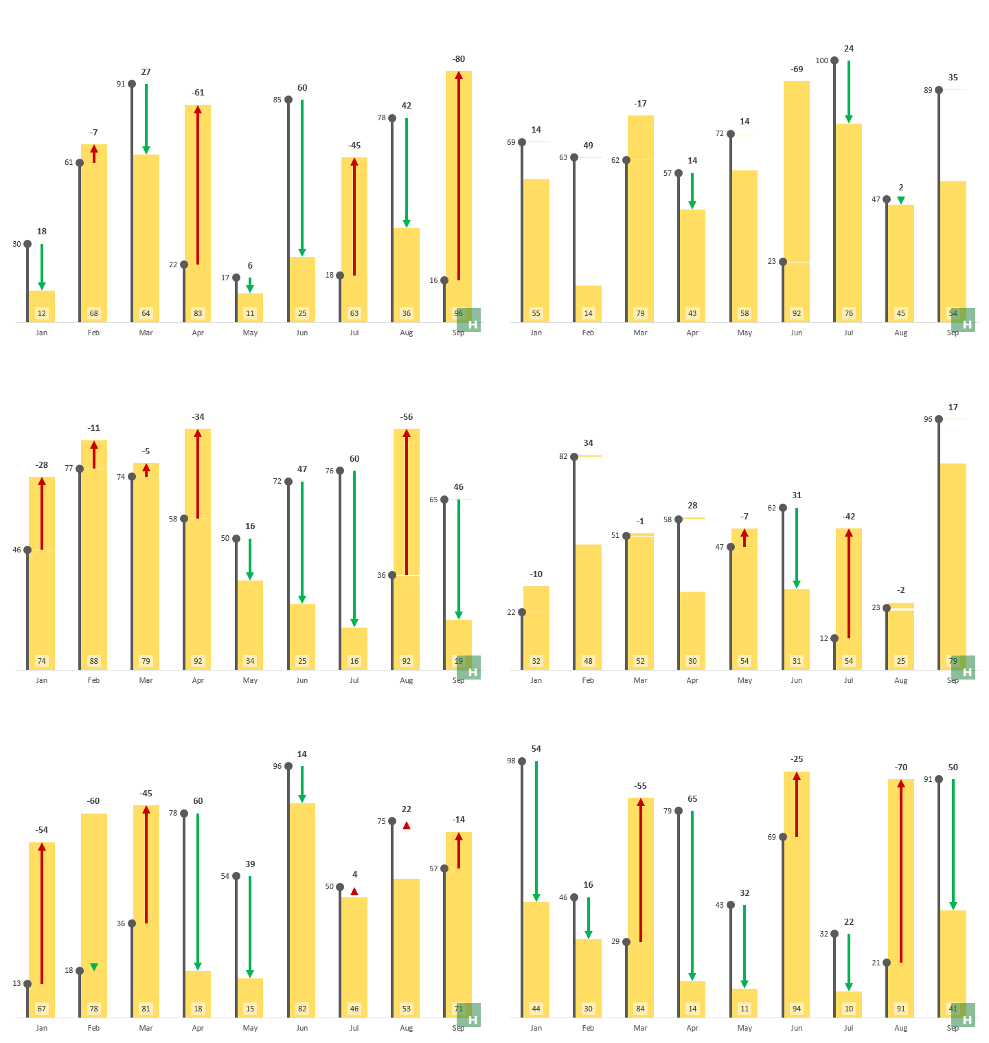
Method 11: Awesome Actual vs target variance charts
This advanced variance analysis chart does more in less space with amazing clarity to present actual and budgeted or targeted results in one Excel chart. To learn how to make this chart head over to this detailed tutorial.
This chart is included in the downloadable bundle
Method 12: Actual vs target variance charts with floating bars
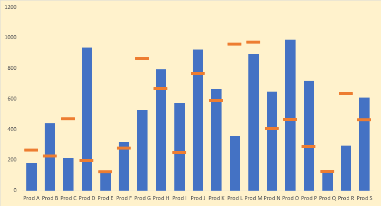
In this quick and easy tutorial you will learn how to make a variance analysis chart in less than 60 seconds that is not just functional but beautiful to look at as well. To learn this specific chart head over to this page to read the tutorial.
This chart is included in the downloadable bundle
Method 13: Top to bottom vertical variance analysis with bar charts
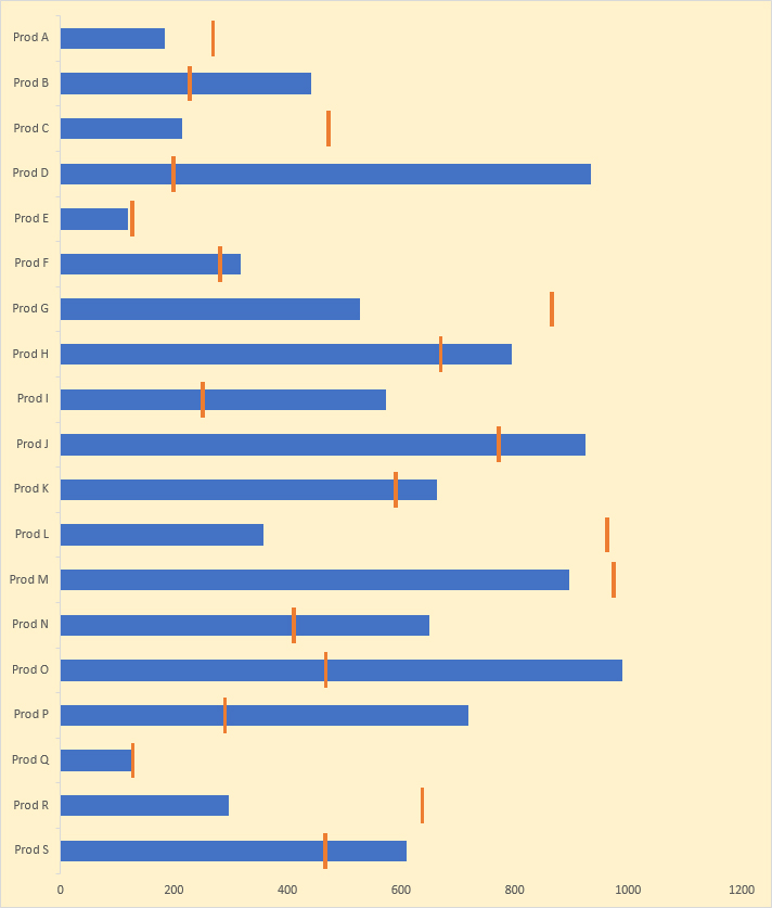
With advancement in tools we use to manage and communicate, our screen orientation has taken complete 90 degree change and this is where this charting technique comes handy. Instead of having your cell phone in landscape orientation and still missing the bits, you can keep the cell phone in natural portrait orientation and easily scroll up or down for even longer charts.
Also you will learn a fine technique to have floating bars using ONLY bar charts. This nifty technique is a must learn!
This chart is included in the downloadable bundle






Leave a Comment