Vertical Actual vs Target Charts in Excel – Top to Bottom Variance Analysis using Bar Charts
Vertical Actual vs Target Charts in Excel – Top to Bottom Variance Analysis using Bar Charts
Charting and comparing actual with a target/budgeted results in Excel is a widely used visual business analysis technique. Variance analysis techniques range from simple numeric values to advanced charts and reports.
Previously, on using Excel to make actual vs target variance reports I have written few tutorial guides. One of my favourite ways to present variances is a chart where outcomes are plotted against budgeted values with favourable or unfavourable variances visible right in the chart. Till this date, I have already covered more than 10 different and creative ways to present actual versus target results in Excel.
Today’s tutorial, however, is meant to address issue executives are facing lately. Especially the ones that are on the move and rely on tablets, phablets or cell phones to check performance KPIs.
View Contents [hide]
Understanding the present day charting problem
Have a look at following two images and see which of the two is easy to read on handheld screens?
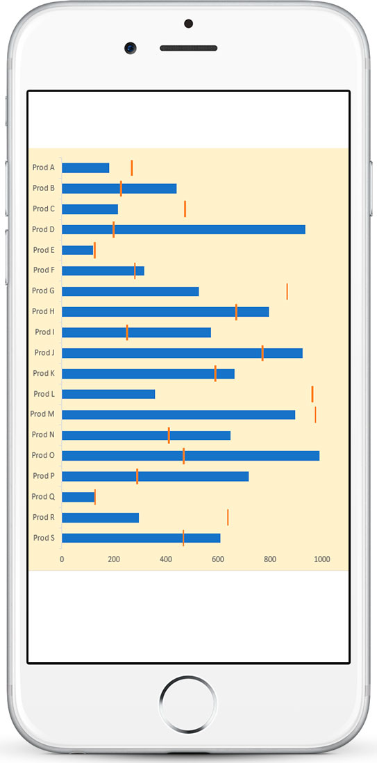
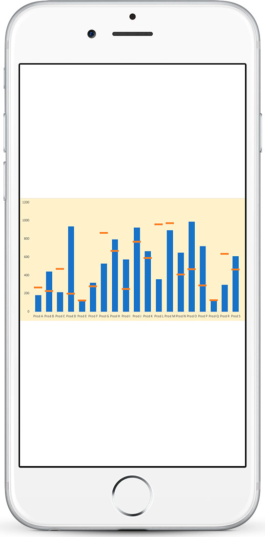
Now if you are reading this tutorial on a cell phone then you will most probably find portrait orientation more suitable as you can simply scroll up and down while reading. For mobile readers here are the two charts for your smart phone screens:
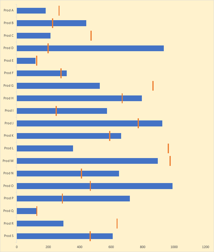
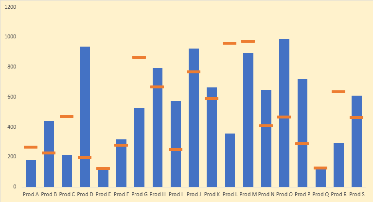
So we can agree that Excel charts with vertical or portrait orientation are better. This, however, leads to another challenge.
Making horizontal variance charts with floating bars [Read full tutorial here] is easy in Excel as one can use the mix of line with markers and bars to make a chart. But the same method cannot be used to make a variance chart with floating bars in vertical or portrait orientation as for unknown reasons line charts in Excel are always horizontal.
So a workaround is needed where we get the floating bars in actual vs target chart using only Excel bar chart and today we are learning the same!
Vertical/Portrait Orientation Actual vs Target Charts in Excel
Step 1: Download the Excel workbook with sample data to follow the steps detailed in this tutorial.
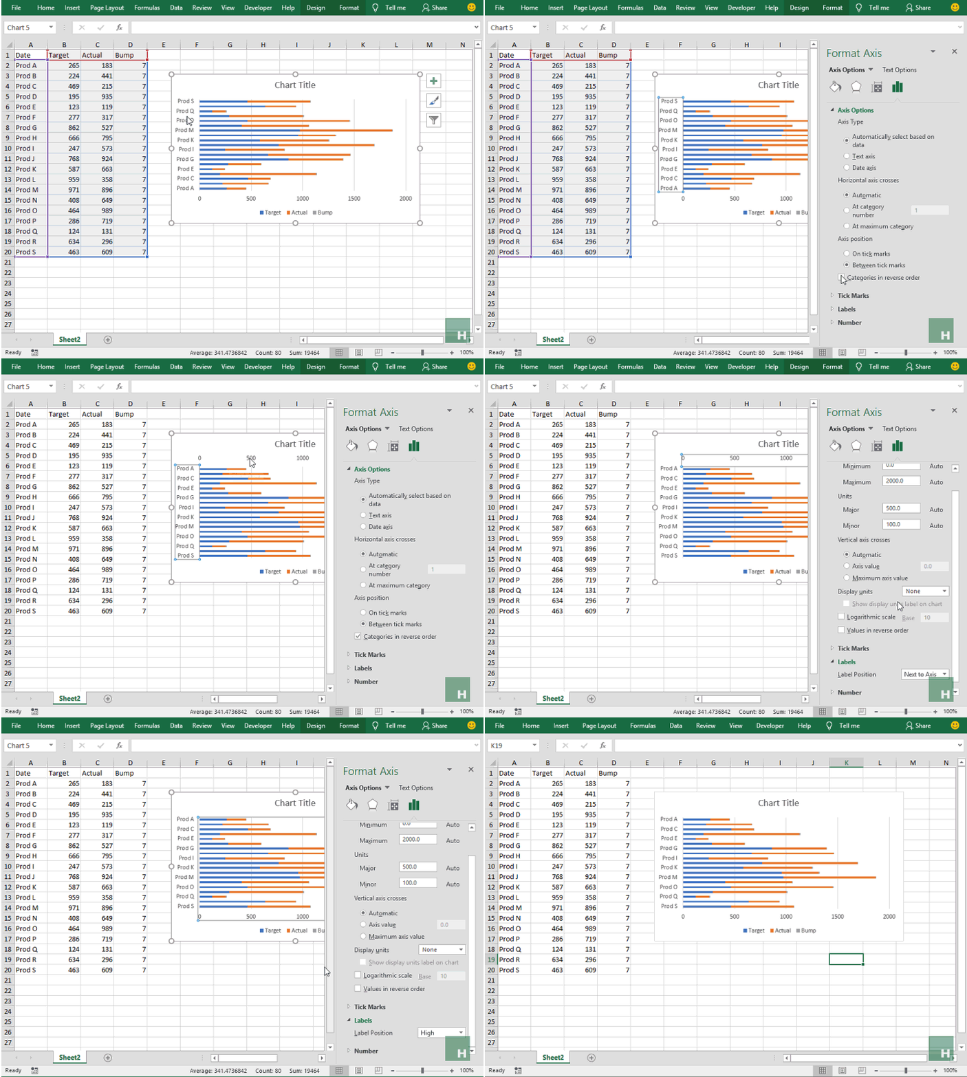
Step 2: Select the data by having an active cell inside the data and hitting CTRL+A.
Step 3: Go to Insert tab > Under charts group > click column / bar chart button > from the drop down select 2D stacked bar charts. This will insert the chart with all three series plotted.

Step 4: Right-click on the y-axis containing products and select format axis. This will option the options bar on the right. Under axis position check the box categories in reverse order. This will plot the products in the right order.
Step 5: Left click once on the x-axis, that is now appearing on top, go to and click the labels tab and change the label position to high. This will shift the x-axis back at the bottom.
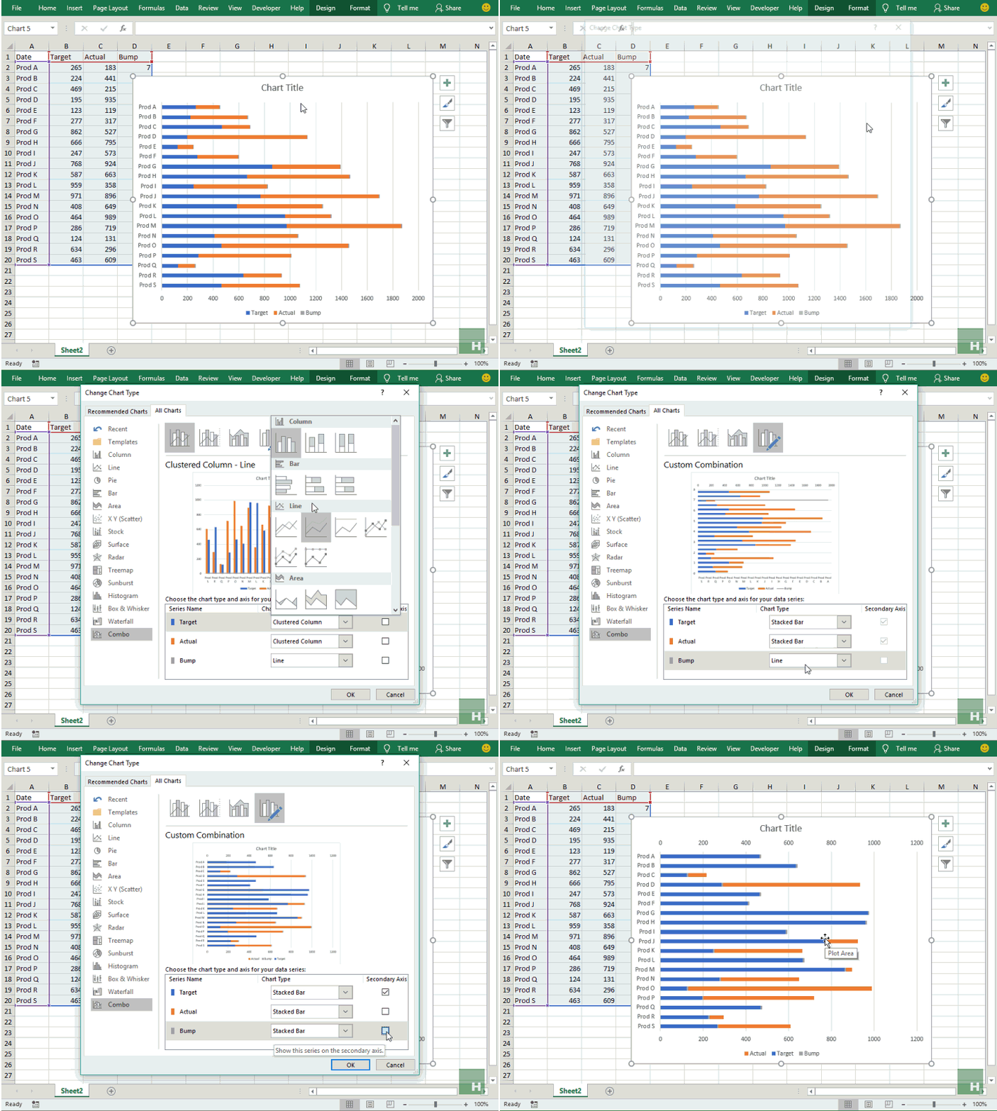
 Step 6: Having chart selected, go to design tab under chart tools and click change chart type. From the list on the left side click Combo and make sure all the chart type are stacked bar.
Step 7: Make the target and bump series tick the secondary axis option.
 Step 8: Right-click on the target series in the chart and select format data series. From the options in the right bar, reduce the gap width to your requirement. I made it to 50%.
Step 9: Select the target series again if not already selected and go to format tab under chart tools and select no fill from shape fill drop-down.
Step 10: If target floats don’t have the appropriate color simply left click on any to select the series and change the color from format tab. Mine was gray so I change it to blue to make them more legible.

Step 11: Remove the chart elements you don’t need. I removed almost everything except the bottom and left bar to make it clearer.

Mind the secondary axis!
Step 12: I kept this step at the last so that readers can learn why it is a good idea to ALWAYS confirm if the secondary axis is correct according to the situation.
Having the chart selected > go to design tab > click add chart elements > axes > click secondary vertical axis to insert the secondary y-axis.
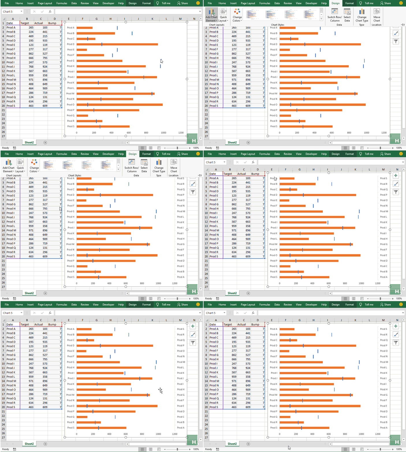 And here we see a BIG problem that must never be overlooked especially in these kinds of graphs. Remember we reversed the items in the chart so that they start with Product A at the top in step 5? For some reason, the secondary axis hasn’t kept it and we need to reverse that order to correctly show the variance floating bars.
To do this simply right click on the secondary axis > format axis > under axis position tick the box categories in reverse order.
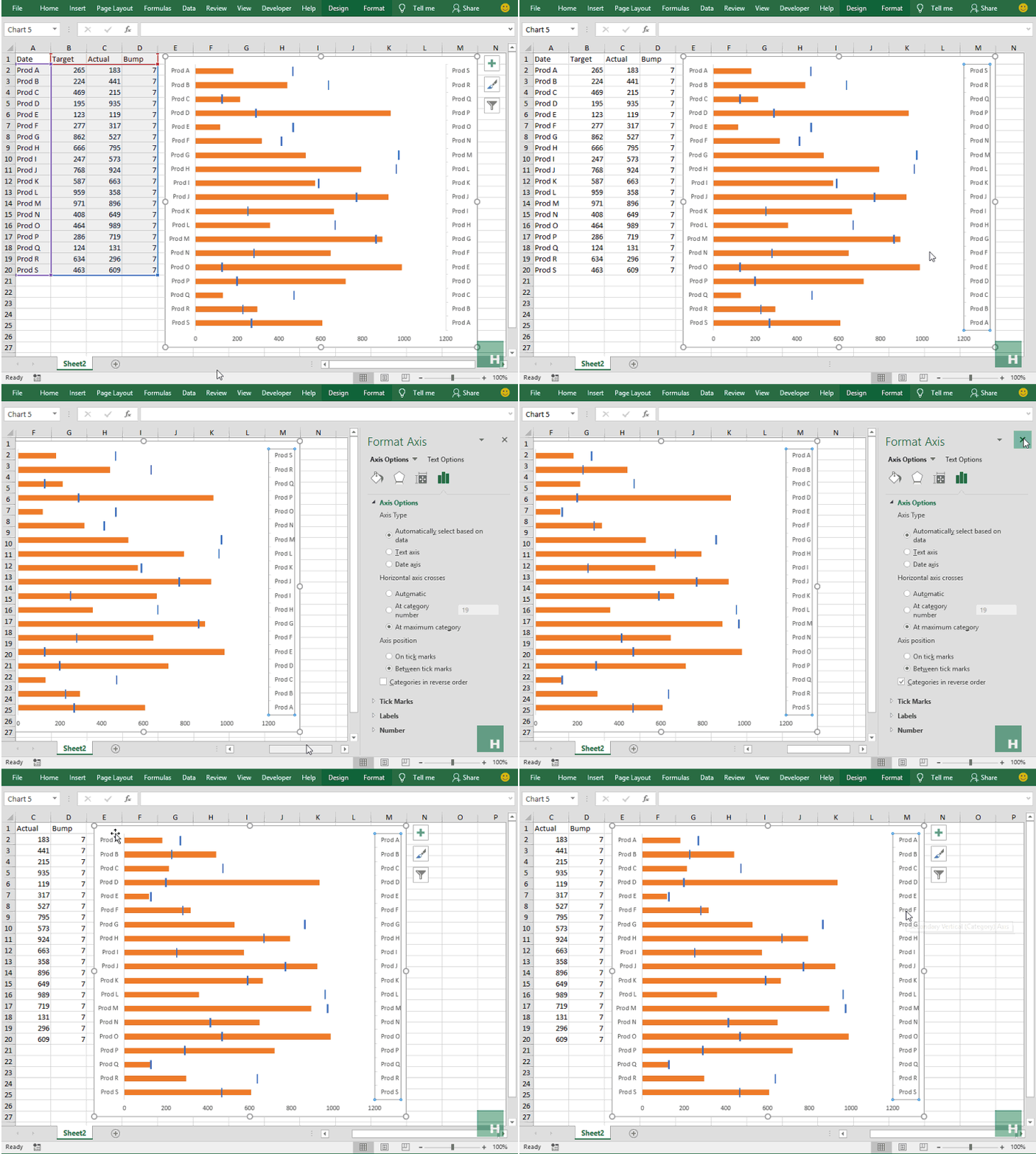
And then remove the secondary axis as it is redundant by simply selecting it and hitting the delete button on the keyboard.
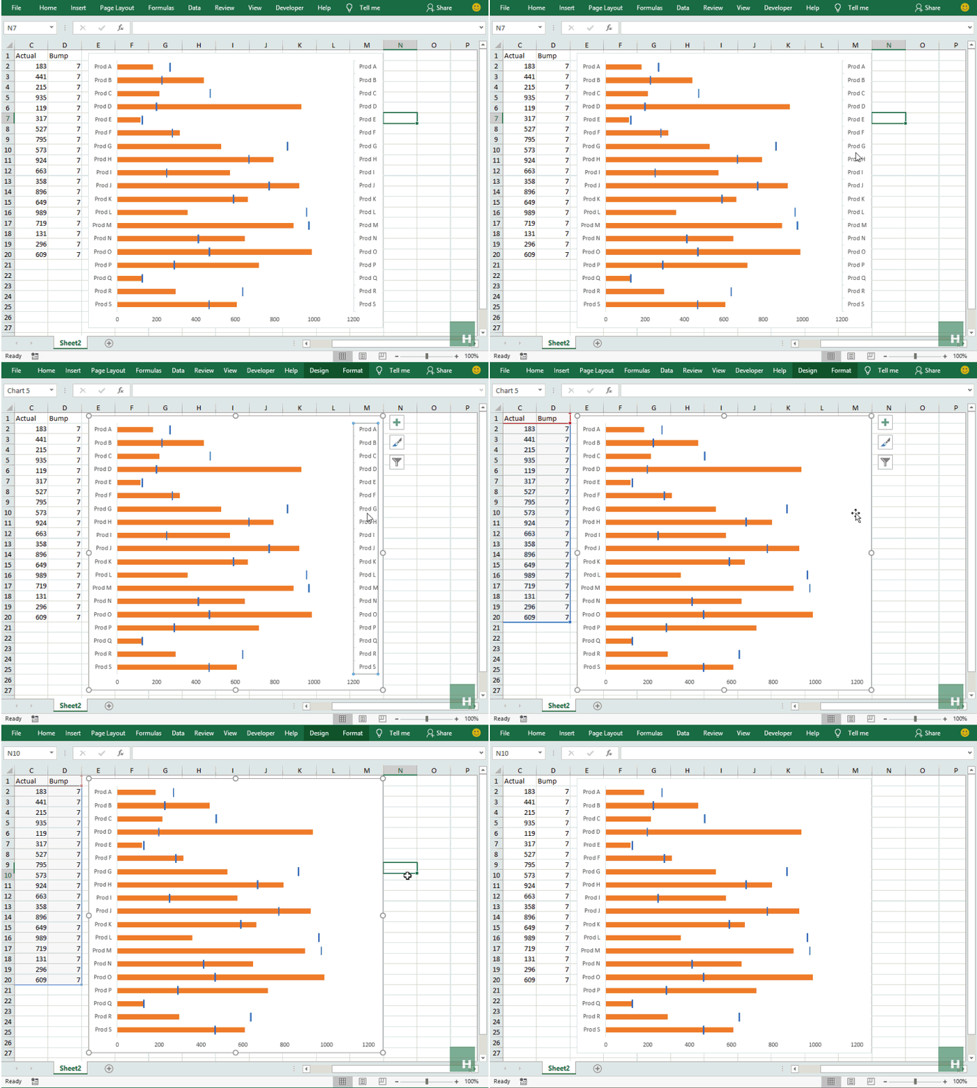 So there you have it!
Actual vs target variance charts in portrait orientation with floating bars all done with ONLY stacked bars, DONE! The champion of this tutorial is the ability to chart graphs on the secondary axis. And not forgetting to check if the order matches the primary vertical axis.
Loved the tutorial? Pin it!


Leave a Comment