Create Regular Excel Charts from PivotTables
Create Regular Excel Charts from PivotTables
PivotTables are a great way to summarise your data, but PivotCharts can be a pain in the, um, neck because...
- They’re not as customisable as a regular Excel chart
- They only play nice with data from one PivotTable
- PivotCharts aren't available for all chart types e.g. Sunburst, Scatter, Histograms, Waterfall and more.
In this post I'm going to show you 3 methods you can use to trick Excel into creating a regular chart based on a PivotTable, allowing you to have all the benefits of PivotTables with the flexibility of regular charts.
Download the Workbook
Download the Excel Workbook. Note: This is a .xlsx file please ensure your browser doesn't change the file extension on download.
Method 1: Manual Chart Table
A while ago I showed you how to create Excel charts from Multiple PivotTables. And this is great if your data needs arranging into contiguous cells so it can be plotted as one series, or if the source data is inconsistent in the two PivotTables and needs organising first.
For example, the chart below consists of values from both the Actual and Budget PivotTables. Notice the sort order of the categories isn't the same in each PivotTable. By using GETPIVOTDATA to return the values from the respective PivotTables I don't need to worry about the order of the categories, even if the sort order in the PivotTables changes later.

Method 2: Dynamic Named Range
However, if the order of the data is identical in each PivotTable (and you can be certain it always will be), or if you only have one PivotTable, then you can skip the Manual Chart Table and simply reference the PivotTables using Dynamic Named Ranges. This is also useful if you're expecting the data to grow and you need the range to automatically expand to include the new data.
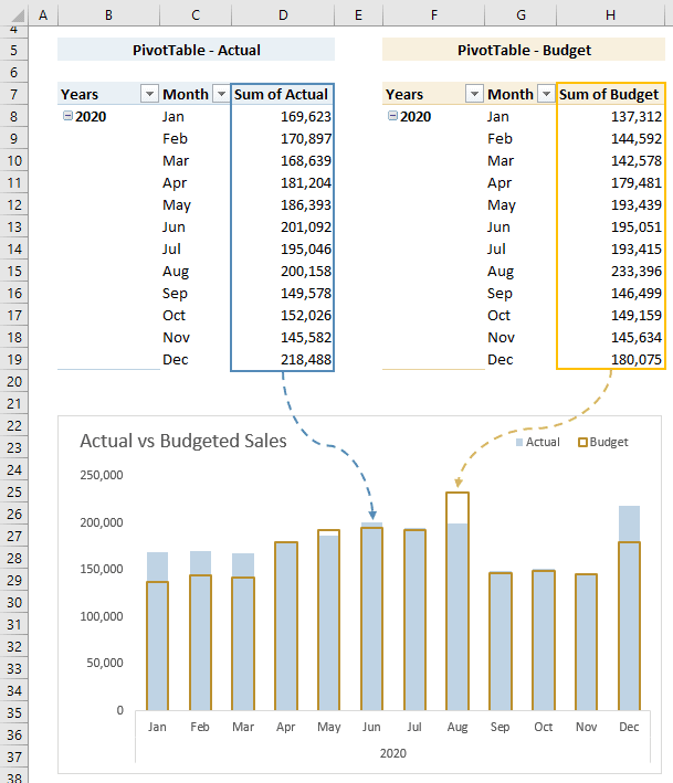
Note: I don’t recommend using the chart colours above. I used yellow and blue so you could more easily follow the data trail.
Tip: Remove the Grand Total columns and rows from your PivotTable as you don’t need them in your chart and they will only interfere with your dynamic named ranges.
Dynamic Named Ranges in Charts
Once you’ve set up your Dynamic Named Ranges you need to insert them in your chart. I’ve set up the following dynamic named ranges:
- chart_actual
- chart_budget
- chart_axis
Insert the Chart:
- Insert an empty chart by selecting any empty cell > Insert tab > Column Chart (or whatever chart type you want)
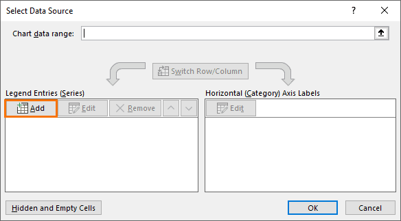
- Right-click the chart > Select Data
- In the legend entries side of the dialog box click ‘Add’:
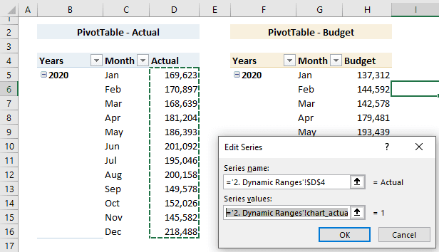
- I’ll add the Actual series first. In the Edit series dialog box, cell D4 contains my series name and my series values are the dynamic named range chart_actual. Note: you must prefix the dynamic named range with the sheet name enclosed in apostrophes and an exclamation mark on the end e.g. ‘2. Dynamic Ranges’!
- Repeat for the Budget series
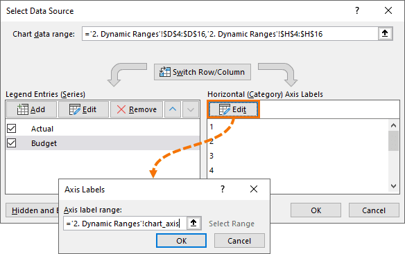
- Now add the dynamic named range for the axis labels by clicking ‘Edit’ under Horizontal Axis Labels:
Now you’re ready to format your chart as you wish.
And the best part is when you refresh your PivotTable and it expands/contracts your chart will automatically adjust, just like a Pivot Chart only better.
Method 3: Bait and Switch
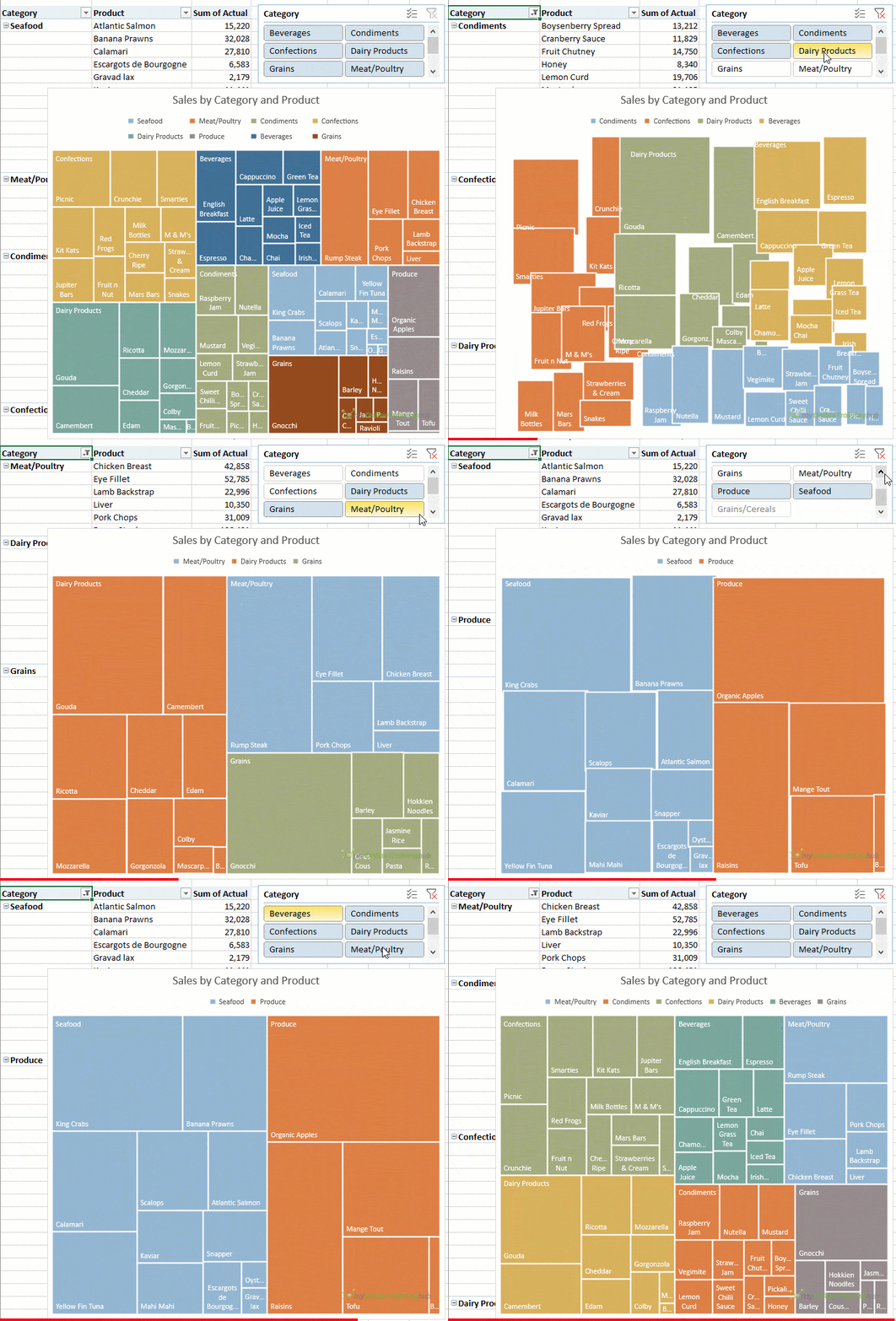
This method works well with charts that can ignore empty cells, like the Treemap and Sunburst etc. It's a bit less work than the previous methods:
- Create a PivotTable containing the data for the chart and insert a Slicer if required.
- Copy and paste the PivotTable as 'values' in some empty cells adjacent to the PivotTable.
- Insert the chart based on the pasted cells from step 2.
- Edit the chart range to point back to the PivotTable cells.
- Delete the data you pasted in step 2.

📤How to Download ebooks: https://www.evba.info/2020/02/instructions-for-downloading-documents.html?m=1



Leave a Comment