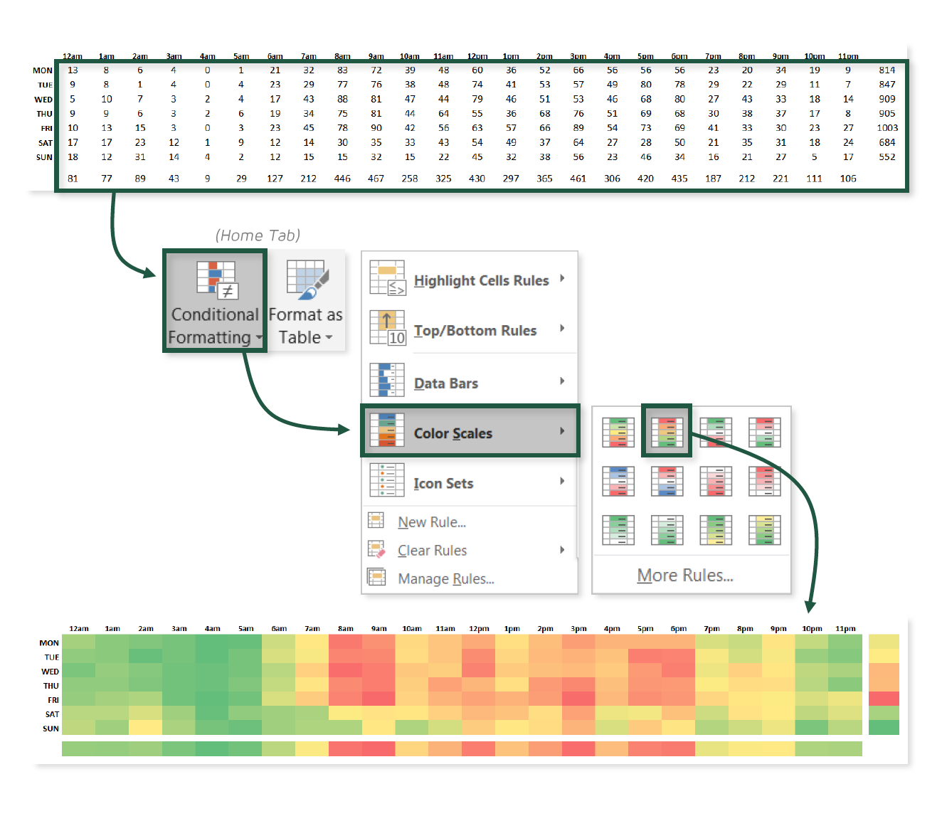
HEAT MAPS WITH COLOR SCALES
HEAT MAPS WITH COLOR SCALES
Would you believe me if I told you that one of my all-time favorite visuals in Excel doesn’t involve a single chart, object, or number? I hope so, because that would be a very strange thing to lie about.
This tip is all about using conditional color scales and custom number formats to create an incredibly simple — yet highly effective — heat map visual in Excel.

COMMON USE CASES:
- Quickly identifying patterns or trends using common color scales
- Highlighting “hot spots” or outliers based on the colors alone
📤You download App EVBA.info installed directly on the latest phone here : https://www.evba.info/p/app-evbainfo-setting-for-your-phone.html?m=1


Leave a Comment