
FILLED MAP VISUALS
FILLED MAP VISUALS
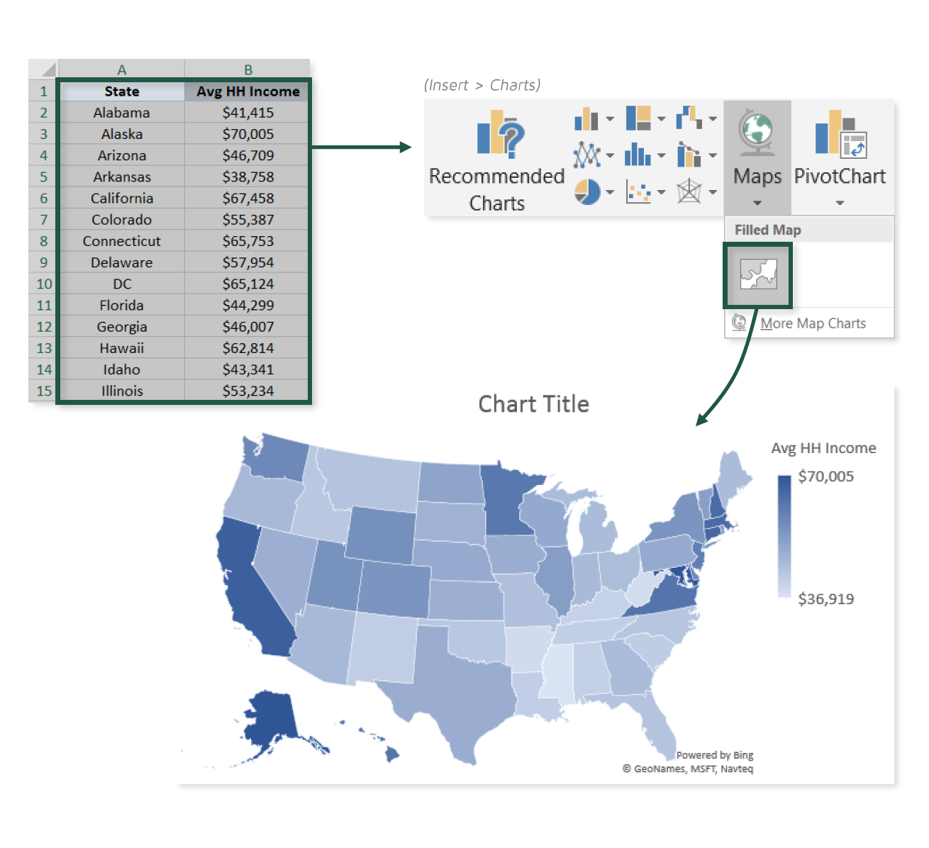
For those of you working with the latest versions of Excel, visualizing geospatial data just got a whole lot easier.
In this tip, we’ll practice plotting state-level population and income data using Excel’s new Filled Map visual, and discuss some important considerations to keep in mind along the way.
COMMON USE CASES:
- Quickly visualizing regional patterns or trends
- Comparing census information like population, GDP, income, or birth rates across areas
📤You download App EVBA.info installed directly on the latest phone here : https://www.evba.info/p/app-evbainfo-setting-for-your-phone.html?m=1


Leave a Comment