CUSTOMIZING CHARTS TO TELL STORIES
CUSTOMIZING CHARTS TO TELL STORIES
Most people don’t think of Excel as a “data viz” platform, but then again most people have never ventured beyond basic, default templates. The fact is, Excel offers an insane amount of creative freedom — if you know what you’re doing.
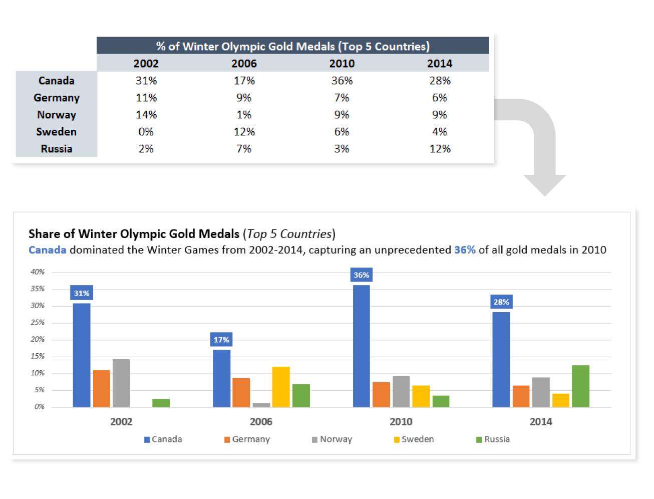
In this tip, I’ll show you how a few basic adjustments to colors, labels and titles can help bring your visuals to life.

COMMON USE CASES:
- Preparing visuals for use in presentations, where comprehension is key
- Reducing the risk of users misinterpreting the story that a chart is designed to communicate
📤You download App EVBA.info installed directly on the latest phone here : https://www.evba.info/p/app-evbainfo-setting-for-your-phone.html?m=1


Leave a Comment