Create a report in excel for sales data analysis using Pivot Table Techniques
Create a report in excel for sales data analysis using Pivot Table Techniques
Why it’s important to do data analysis?
Nowadays, competition has increased immensely in every field; no matter which product you are trying to promote, you can be sure that there are several other competitors trying to promote the same product. Hence, you need to collect all sorts of data to keep track of your progress. However, gathering data isn’t enough, you need to properly analyze that data. In fact, statistics show that this is the main part which separates successful companies from mediocre ones. The better you are able to analyze the data, the more information you have about your progress and hence, you can create a proper and accurate plan on how to improve your position. Fortunately, there are several tools available nowadays to analyze data. One of the most powerful software is Microsoft Excel, which provides several features for data analysis. Today, we shall discuss an important feature via Excel training on the pivot table.
What is a pivot table? & How to use it?
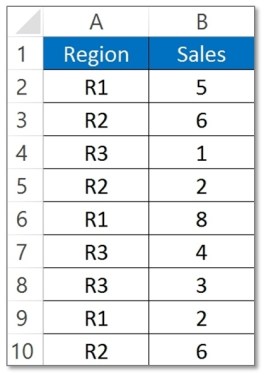
Firstly, let’s discuss what is a pivot table and it’s importance. A pivot tool can be thought of as a mechanism to summarize huge amounts of data. It is mostly used to understand and recognize patterns in the data set. Recognizing patterns in a small dataset are extremely easy. But as the size of the dataset increases, the effort required to find the patterns will increase exponentially. In such cases, a pivot table can be a huge asset since it takes only a few minutes to summarize groups of data using a pivot table. Consider the following example. You have a dataset consisting of regions and number of sales (normally there will be many more columns, but for simplicity, this is kept at 2). You are interested in knowing the number of sales based on the regions, which can be used to determine why a particular region is lacking and how to possibly improve in that area. Using a pivot table, you can create a report in excel within a few minutes and save it for future analysis.

Steps to create a report in excel using pivot table:
Creating a pivot table is extremely easy in Excel. Just follow the steps below to create one for your dataset.
- Select any cell in your dataset.
- Choose the option PivotTable from the Insert menu.

- You will be presented with a dialogue box and the cells will be already selected. Choose OK.
- Give a name to your pivot table, and on the right-hand side, you will notice the field names.
- Choose the appropriate field names to generate the required data.
Your pivot table will be created instantly. With practice, it shouldn’t take you more than a minute to perform this task.
Pivot Table Calculated Field:
Another important feature of the pivot table is the calculated field table. Basically, these are table fields which can also calculate values. Consider the following example to understand better. In your dataset, you have two fields – “sales” and “profits”. Now, you want to calculate profit per sale or the percentage profit. A straightforward solution would be to add another column to calculate this. However, if you know calculated fields, you don’t need to do the extra work; simply create custom fields to generate data.
The following steps will show you how to create one such field.
- Select the option “calculated field” in the “Formulas” menu.
- Add the necessary formula to the field (in this case, it will be profit/sales*100).
- Click on OK, and now give an appropriate name.
Your calculated field is ready! You will find that you are using this feature often, since you don’t have to create any new columns for additional data and can easily generate one in a few seconds.
Create a report in excel for sales data analysis using Advanced Pivot Table technique:
The pivot table can be used to perform several other tasks as well. Some of these include:
- Categorise daily data on a monthly or yearly basis
You can group data from the daily dataset based on a month or a year using a pivot table. Moreover, you can also categorise it into custom groups, e.g. if you want to group it at an interval of 10 days, you can easily achieve that.
- Use Slicers
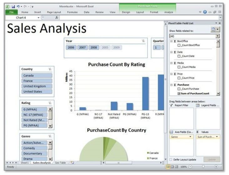
Slicers can be used to create visual reports in excel (graphs, charts, etc.) from pivot tables.
 Use Report filters
Another feature in Excel, It is used for various types of reports from a dataset within a few seconds.
Hopefully, you can now understand why a pivot table is important. Data analysis is a tough job, but your workload will be significantly reduced if you can properly use this feature.
#evba #etipfree #kingexcelYes, You can ask any question you have on this tutorial by leaving a comment in our comment section. We always reply to queries.
📤You download App EVBA.info installed directly on the latest phone here : https://www.evba.info/p/app-evbainfo-setting-for-your-phone.html?m=1


Leave a Comment