CHARTING DATE RANGES
CHARTING DATE RANGES
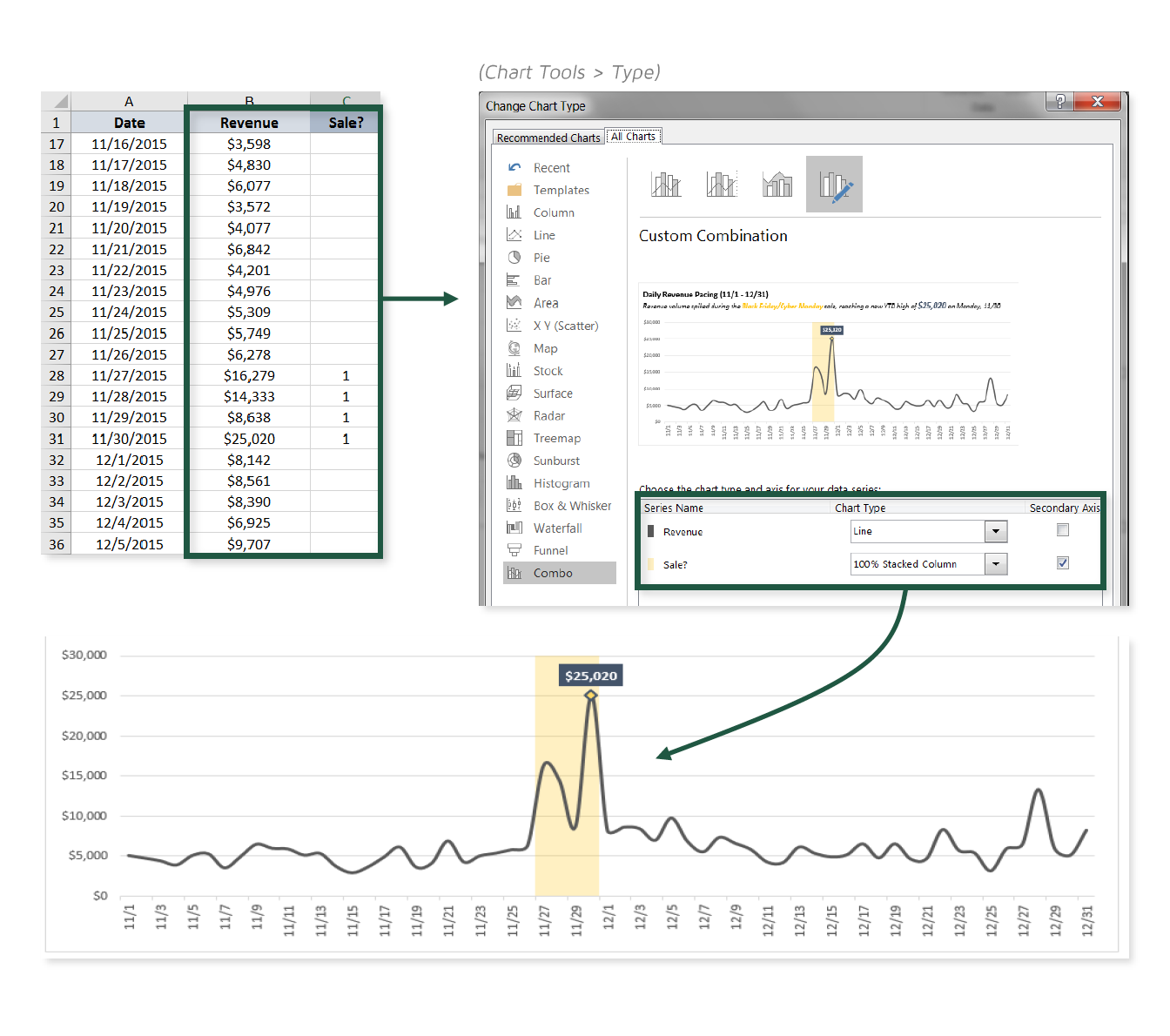
One of my favorite things about data viz in Excel is that you can mash together all sorts of chart types to create Frankenstein-style visuals. Generally this sort of experimentation will lead to ugly, confusing, or just plain ridiculous results, but with a bit of practice you’ll begin to discover some truly interesting and powerful combinations.
In this tip, we’ll practice combining a line chart with a 100% stacked column to draw attention to specific time periods within our sample sales data.

COMMON USE CASES:
- Highlighting sales or promotional periods to add context to charts
- Drawing attention to seasonal patterns or trends (i.e. peak vs. off-peak, weekends vs. weekdays)
📤You download App EVBA.info installed directly on the latest phone here : https://www.evba.info/p/app-evbainfo-setting-for-your-phone.html?m=1


Leave a Comment