ABC Inventory Analysis using Excel Charts
ABC Inventory Analysis using Excel Charts
Earlier this month we learnt how to carry out ABC inventory analysis in Excel using conditional formatting technique. It was easy and we had loads of fun as we not only understood how to apply conditional formatting we learnt bunch of other things too like AND() function and how to manage different conditions to get the desired results.
Today we are going to conduct same ABC analysis but this time we will use Excel charts. The reason why charts are better in this is because when it comes to reports, we cannot show the present the information using the conditional formatting technique. Therefore, charts are more effective.
Hold on a second! Stop sweating already! You don’t really have to do much if you already have done your part of practice from our previous article. Today’s article is a step ahead and I will be using exactly the same data. Exactly the same formula and with few additional steps we will be able to get this:
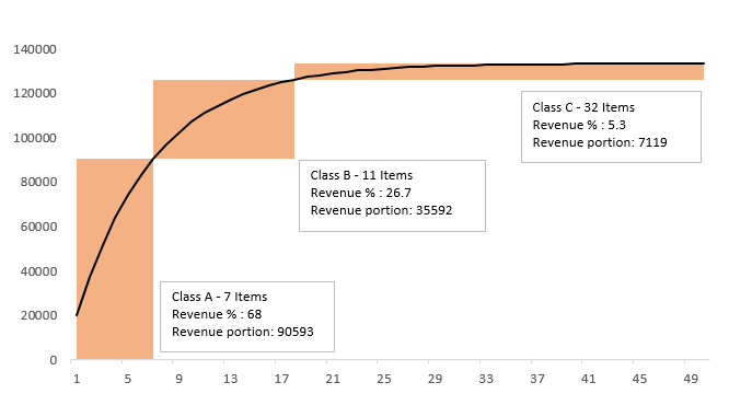 ABC Analysis using Excel chart – Step by Step
Step 1: Download this Excel tutorial workbook. It contains the basic data we need to produce the analysis.
Step 2: In cell C5 put the heading “Accumulated total”. And in cell C6 put the following formula:
=B6
Step 3: In cell C7 put the following formula and double click the fill handle to instantly populate the range down to appropriate cell:
=C6+B7
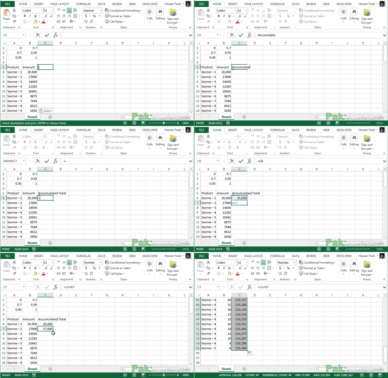
Step 4: Go to cell D5 and put the heading “Class A” and in cell D6 put the following formula and double click the fill handle:
=IF(C6<=$B$1*$C$55,TRUE)
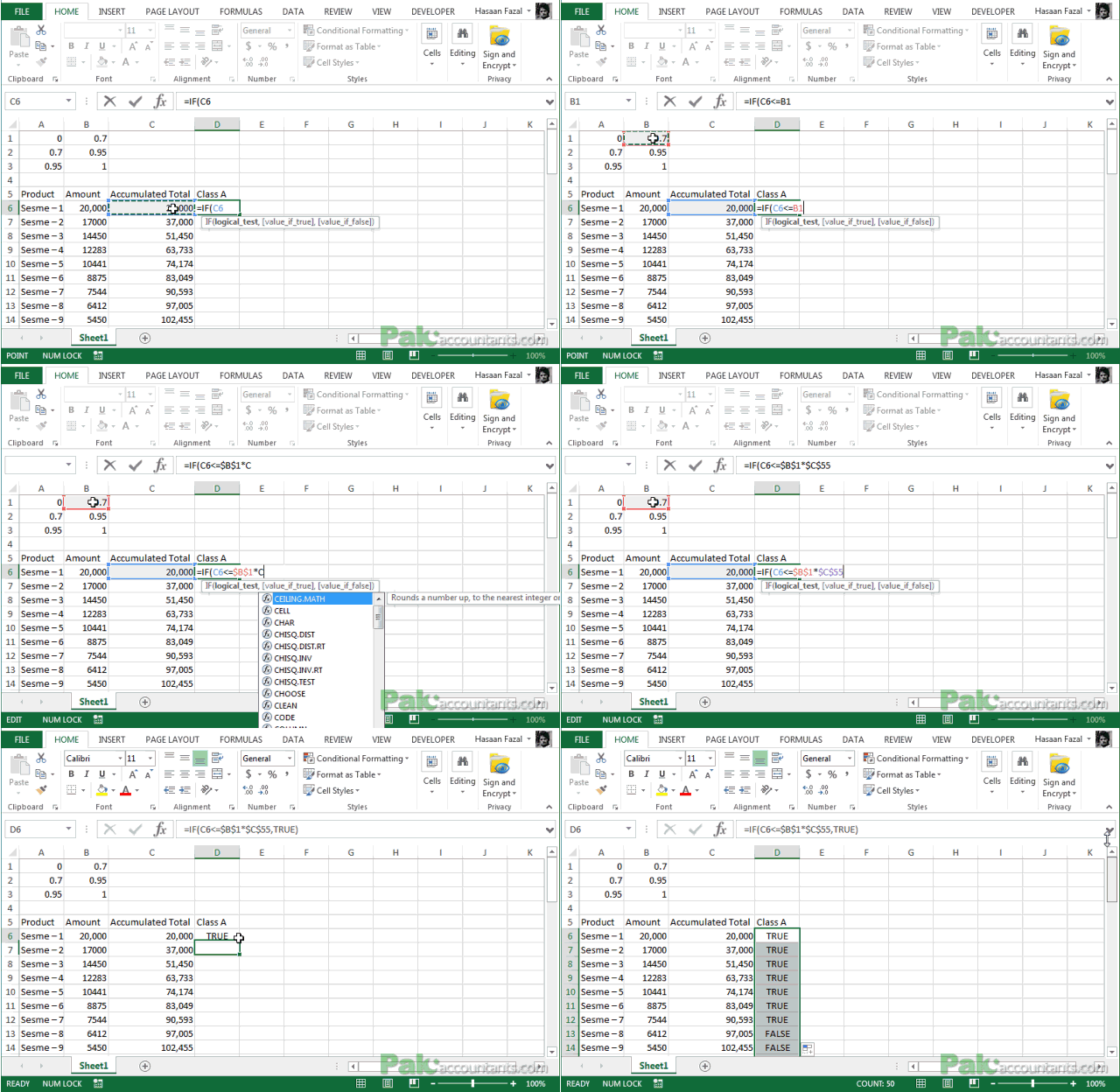
Step 5: Go to cell E5 and put the heading “Class B” and in cell E6 put the following formula and double click the fill handle:
=AND(C6>=$B$1*$C$55,C6<=$B$2*$C$55)
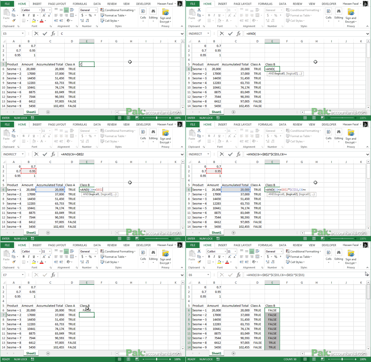
Step 6: Go to cell F5 and put the heading “Class C” and in cell F6 put the following formula and double click the fill handle:
=AND(C6>=$B$2*$C$55,C6<=$B$3*$C$55)
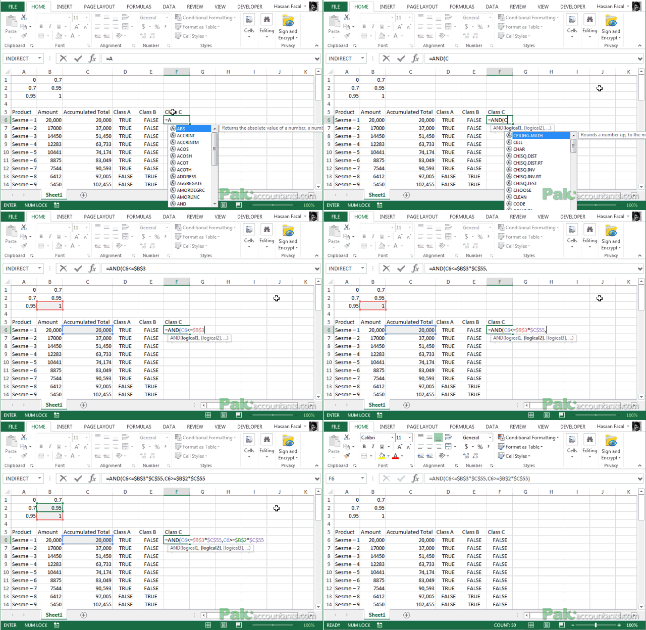
Step 4 through Step 6 will make sense once we are done with the following steps. The work we have just done is going to provide necessary information we need for developing input values for our ABC analysis chart. So lets prceed
Step 7: Put the following values in the cells mentioned:
In cell G5 put the heading: Axis values
In cell G6: 1
In cell H6: 0
In cell I6 put this formula and drag the fill handle down to I7: =SUMPRODUCT($B$6:$B$55*$D$6:$D$55)
In cell G6: 1
In cell H6: 0
In cell I6 put this formula and drag the fill handle down to I7: =SUMPRODUCT($B$6:$B$55*$D$6:$D$55)
Step 8: Follow these instructions:
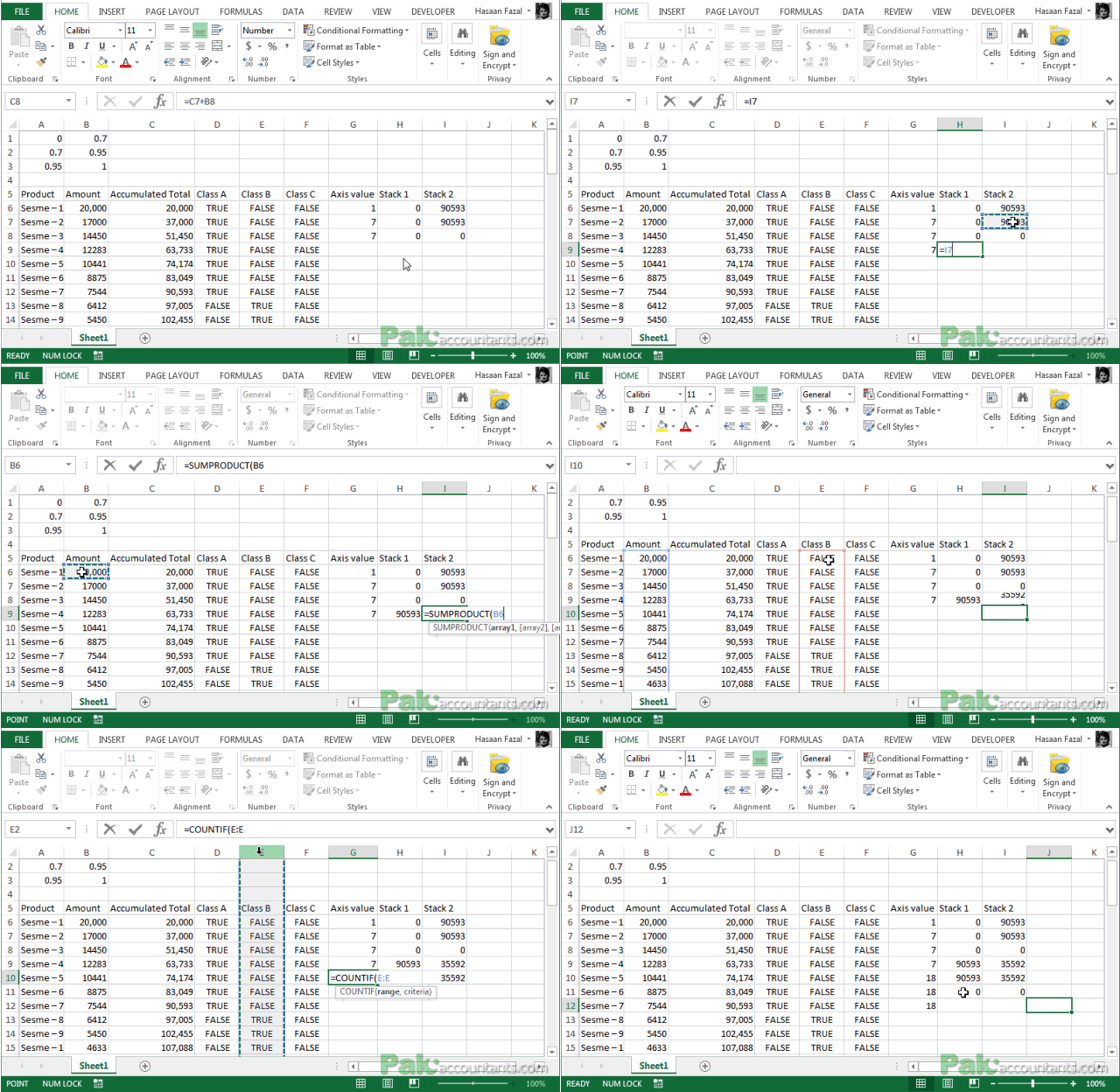
In cell G7 put this formula and drag the fill handle down to cell G8: =COUNTIF(D:D,”true”)
In cell H7, H8 and I8 put value: 0. Yes zero.
In cell H7, H8 and I8 put value: 0. Yes zero.

Step 9: Select cell G8 and drag the fill handle down to G9. In cell G10 put this formula and drag the fill handle down to G12:
=COUNTIF(E:E,”true”)+$G$7
Step 10: In cell H9 and H10 put this formula: =$I$6
Step 11: In cell I9 and I10 put this formula:
=SUMPRODUCT($B$6:$B$55*$E$6:$E$55)
Step 12: In cell H11 and I11 put 0 (zero) as value
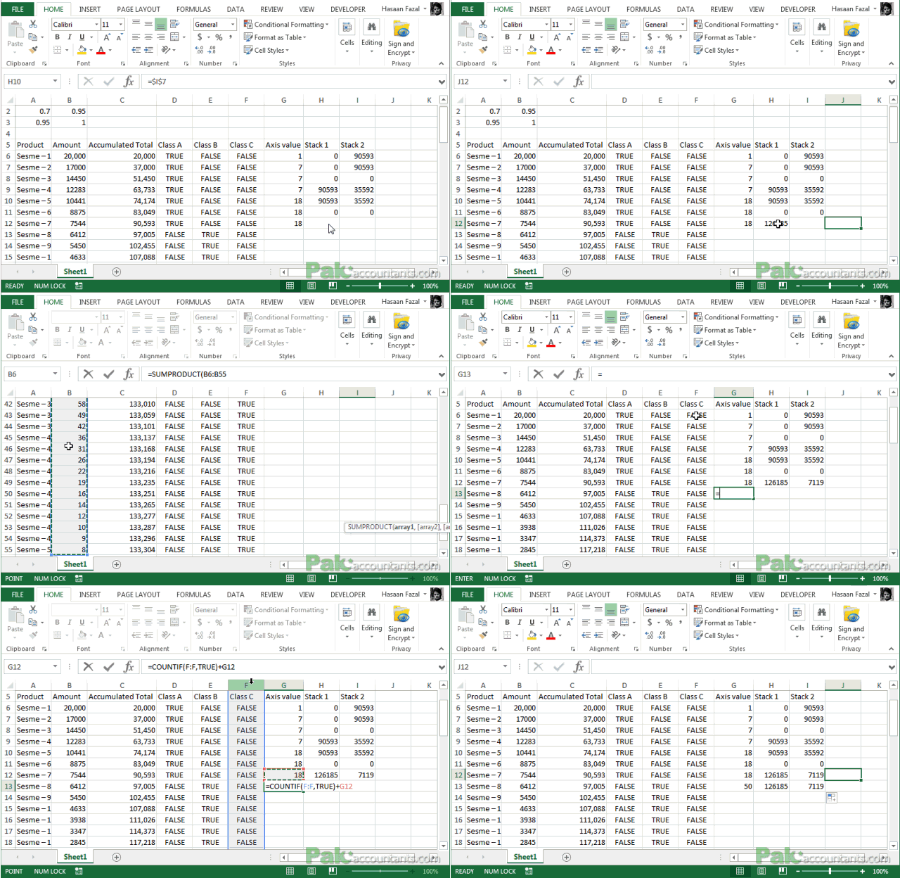
Step 13: In cell G13 put this formula:
=COUNTIF(F:F,”true”)+$G$10
Step 14: In cell H12 and H13 put this formula:
=$H$10+$I$10
Step 15: In cell I12 and I13 put this formula:
=SUMPRODUCT($B$6:$B$55*$F$6:$F$55)
Step 16: And in the last put these formulas in the mentioned cell addresses:
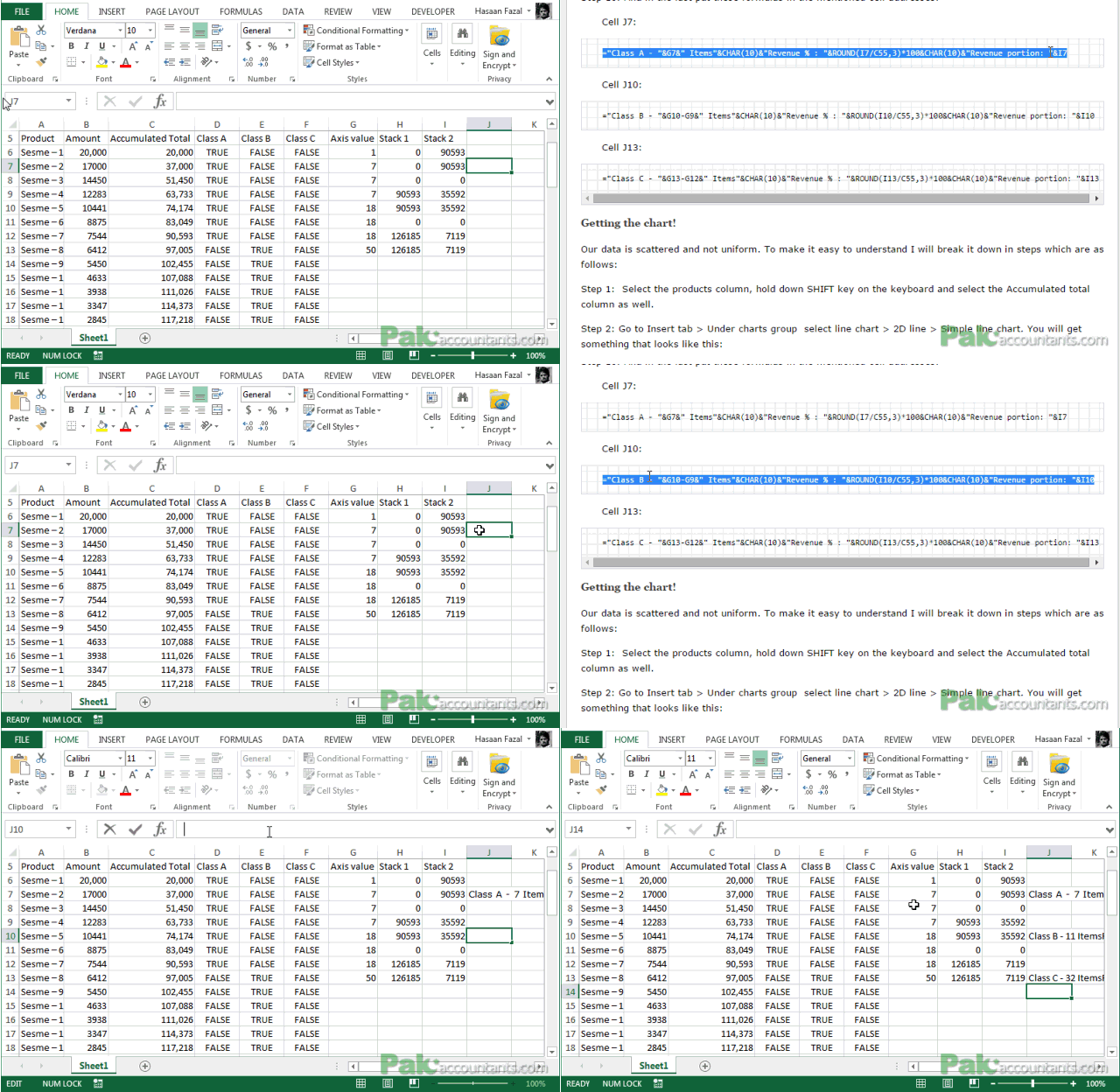
Cell J7:
="Class A - "&G7&" Items"&CHAR(10)&"Revenue % : "&ROUND(I7/C55,3)*100&CHAR(10)&"Revenue portion: "&I7
Cell J10:
="Class B - "&G10-G9&" Items"&CHAR(10)&"Revenue % : "&ROUND(I10/C55,3)*100&CHAR(10)&"Revenue portion: "&I10
Cell J13:
="Class C - "&G13-G12&" Items"&CHAR(10)&"Revenue % : "&ROUND(I13/C55,3)*100&CHAR(10)&"Revenue portion: "&I13
Getting the chart!
Our data is scattered and not uniform. To make it easy to understand I will break it down in steps which are as follows:
Step 1: Select the products column, hold down CTRL key on the keyboard and select the Accumulated total column as well.
Step 2: Go to Insert tab > Under charts group select line chart > 2D line > Simple line chart.
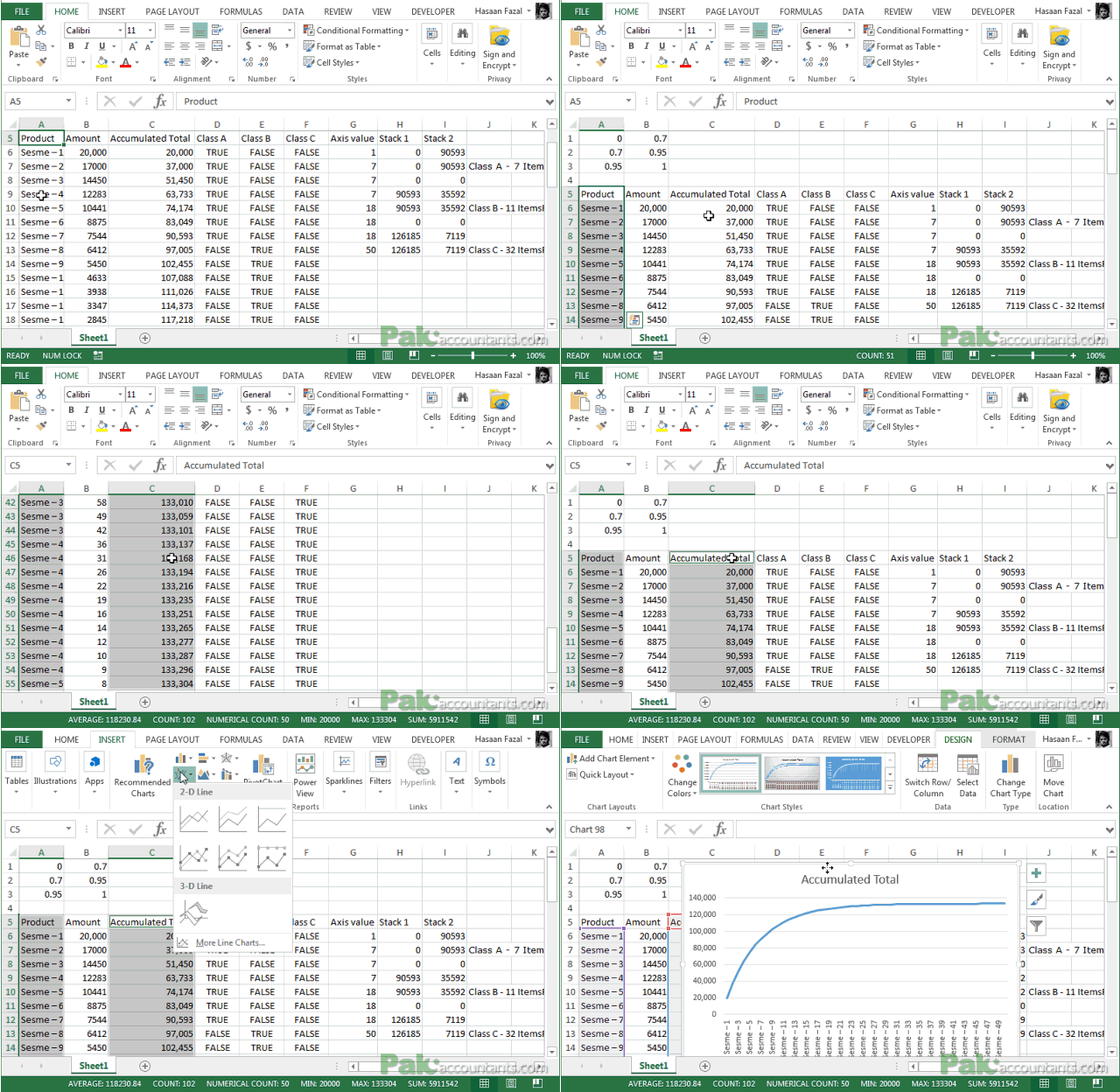
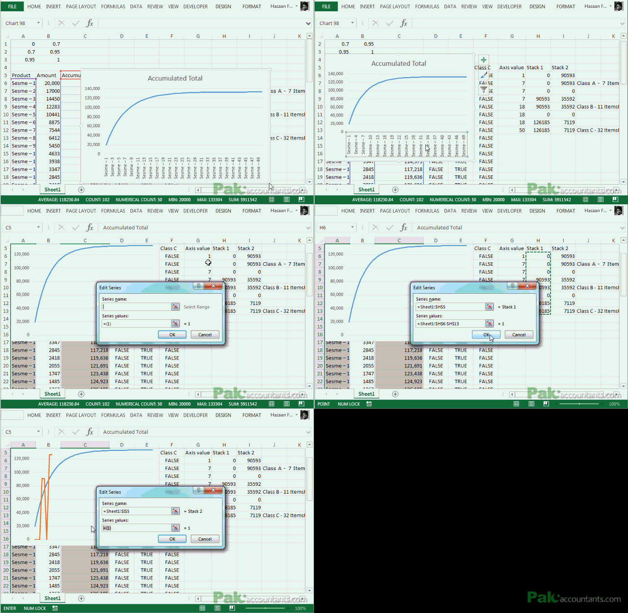
Step 3: Right click anywhere empty inside the chart > select data. Select data source dialogue box will open.
Step 4: Click Add button. Have the cursor on series name input field and click the cell H5. It will fetch the series name from this cell. Delete anything in the series values input field and select the entire Stack 1 column. Click OK
Step 5: Click Add button again and this time insert Class B values doing the same process as discussed in step 4. Click OK and exit all the dialogue boxes.
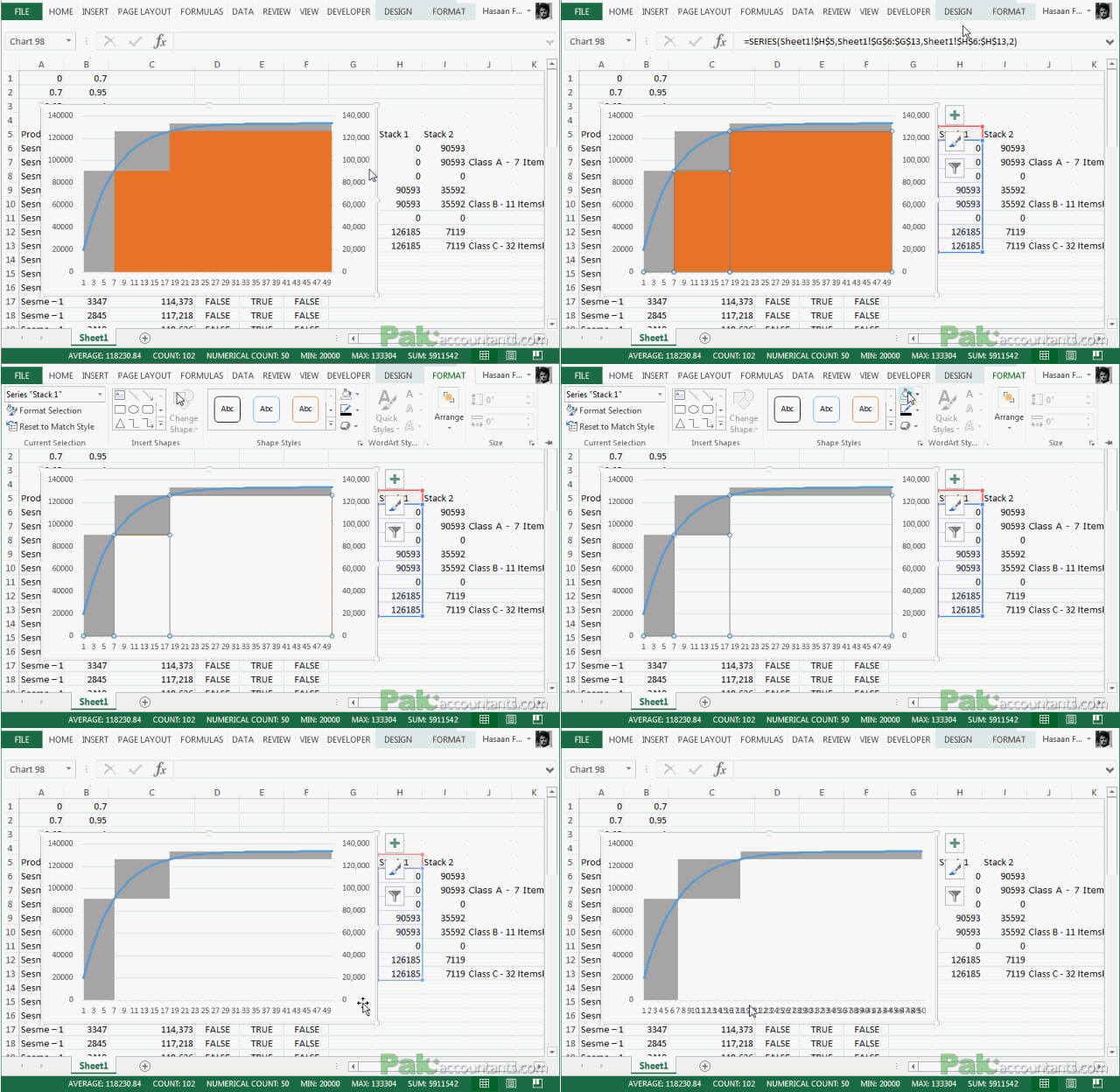
Step 6: Right click on the line and click format data series. Under series options click secondary axis.
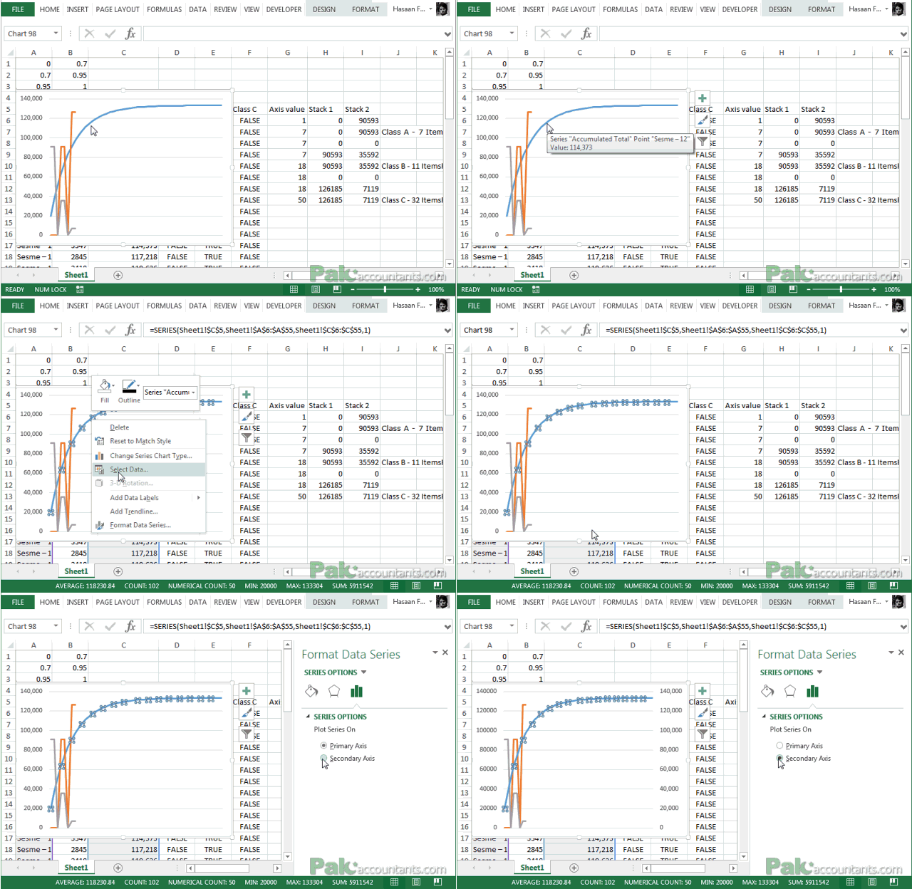
Step 7: Right click on the chart somewhere empty and click select data. Select either Class A or Class B series and click Edit button on the right under horizontal category axis labels and select the values of Axis column. Click OK to close.
Step 8: Right click anywhere in the chart empty and click change chart type. For class A and class B series select stacked area chart type and click OK.
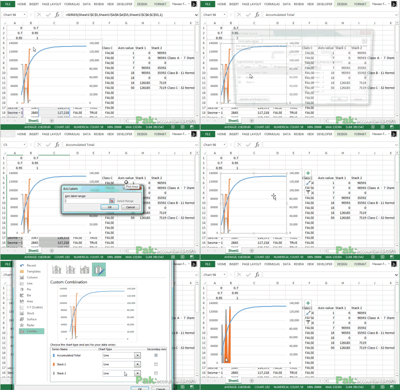
Step 9: Right click on axis and click format axis. Under Axis options > axis type > select date axis.

DANG! Did you see that? 

Almost finished. We are now left with only few cosmetic tidbits and then we are all done!
Finalizing ABC Analysis chart
Step 1: Click on the series below the line and take out its fill color and line color and even borders if they are there by default so that its completely clean.
Step 2: Get rid of secondary vertical axis at the right by left clicking and hitting delete key.
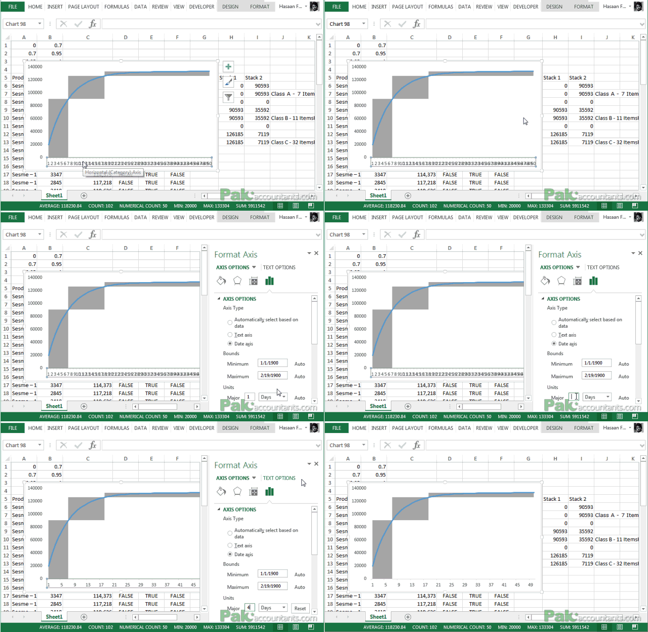
Step 3: Right click on horizontal axis > format axis. In the major input field type 4. This will only display the units at the interval of 4 thus making it less messy and clean.
Step 4: Go to insert > illustrations group > shapes drop down button > text box. Draw it somewhere and copy it.
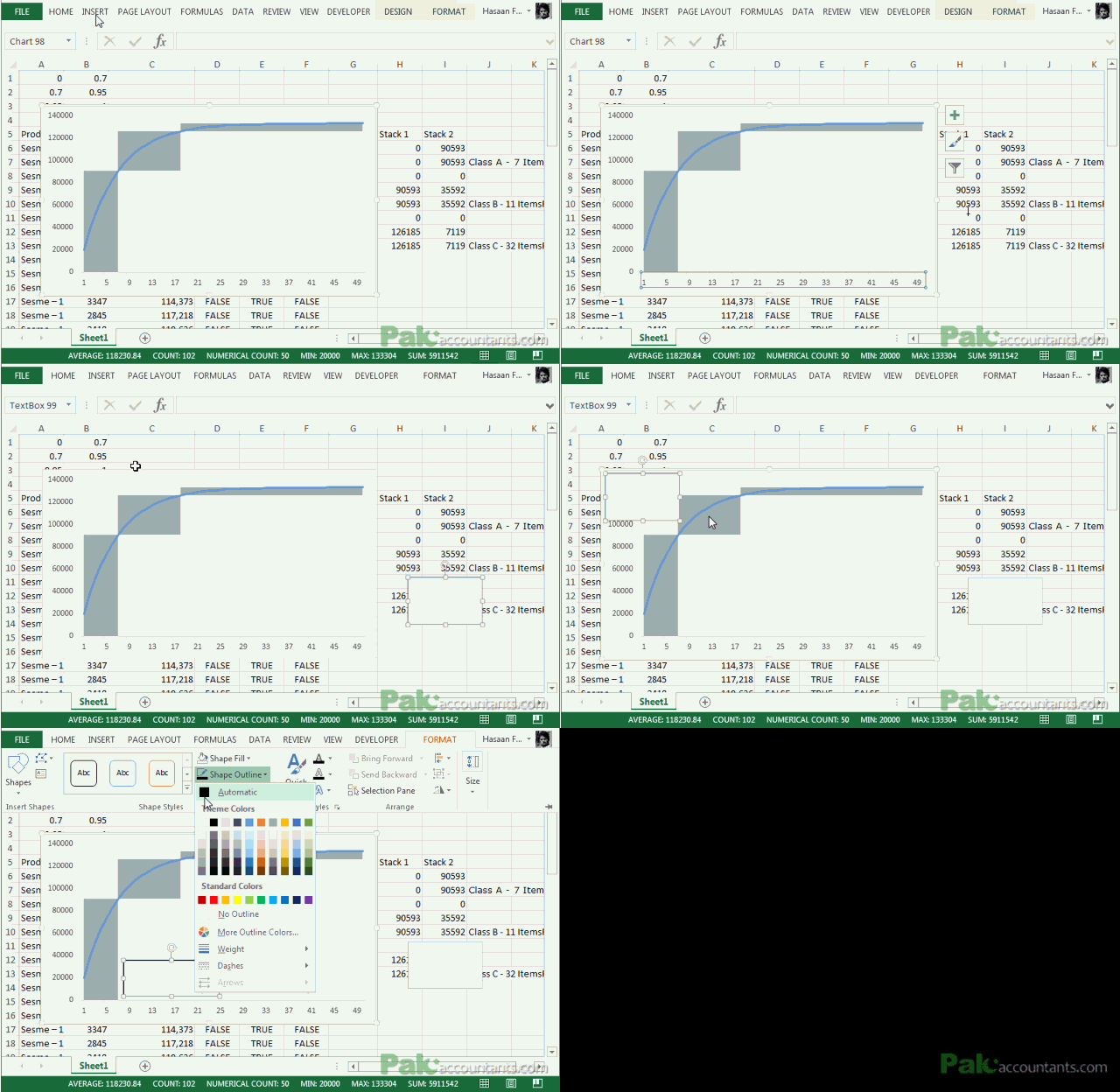
Step 5: Right click on the border of chart and click paste. This will paste the text box right inside chart area thus making it easy for us to move chart as text box will move with it. You need three of such text boxes. You can press and hold CTRL key on the keyboard and left button click on the text and drag to have a duplicate easily.
Step 6: Select the first box at the bottom and go to formula bar and hit equals button on the keyboard and select cell J7. This will fetch the contents of cell J7. Format the text box if you need by expanding it and reducing the text size.
Step 7: Same way click select the middle text box and go to formula bar hit equals sign and click on cell J10. Same for the third text box but for that cell is J13.
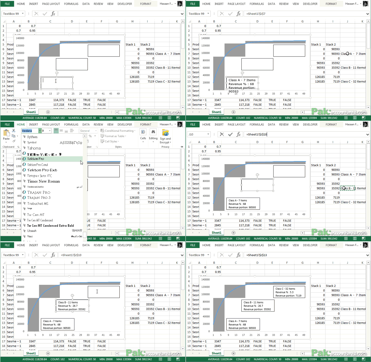
AND DONE!
Phew! That was an uphill task! But I hope you have learnt loads of things. This was quite a feat for me too as I have never used the area chart especially in this manner. Practice and just in case you have any question you have comment section available
📤You download App EVBA.info installed directly on the latest phone here : https://www.evba.info/p/app-evbainfo-setting-for-your-phone.html?m=1


Leave a Comment