Highlight instances in Excel charts in different colors with shaded bars in background
Highlight instances in Excel charts in different colors with shaded bars in background
- Variances that require moderate inquiry (highlighted by for example green color)
- Variance that require high level inquiry (highlighted by for example yellow color)
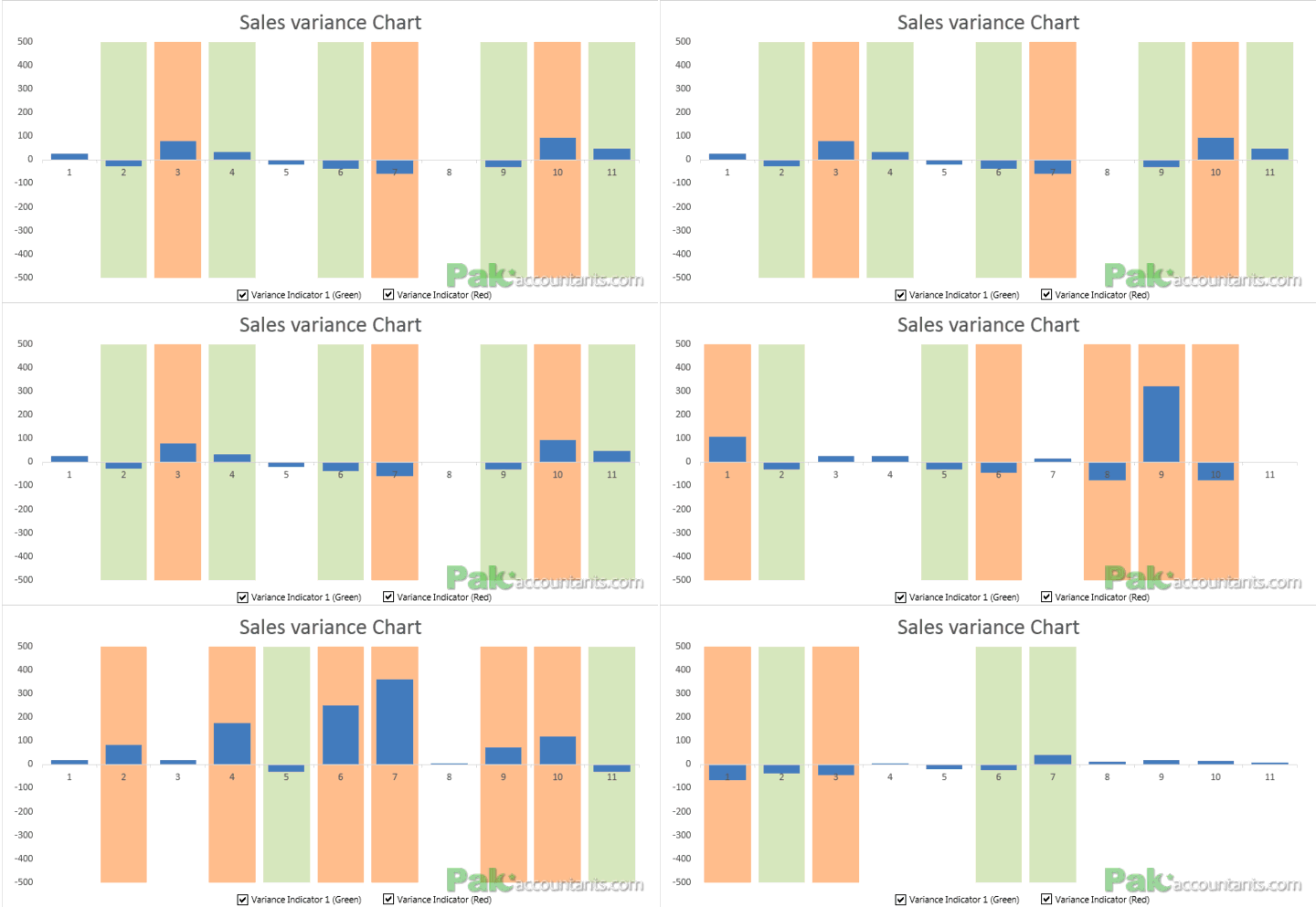
And this is how the chart looks once you implement it that updates dynamically if the data changes
The fully worked file which you can download comes with On/Off functionality
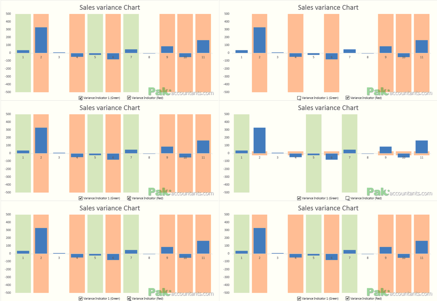
Now plotting a chart of variance information is no difficult but having a way to highlight them adds much more meaning to it as you can instantly know which of these variances require what degree of attention and thus making it easier for management to judge if critical problems are less or more. So lets learn how to do it.
Download Basic Excel Tutorial file
Click here to download the Excel tutorial file that contains basic data and will help you to follow the steps discussed in this tutorial
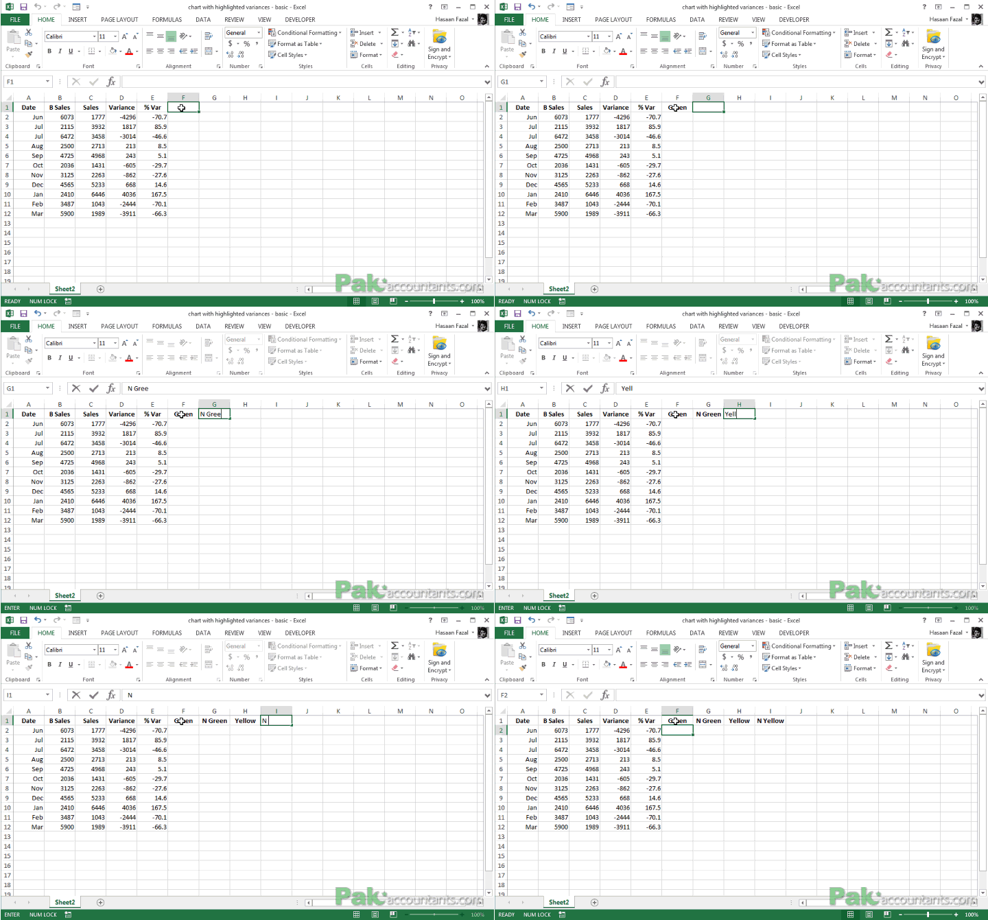
Step 1: You need to include 4 new data series or columns. Make a heading like this:
- Green in cell F1
- Negative Green in cell G1
- Yellow in cell H1
- Negative yellow in cell I1
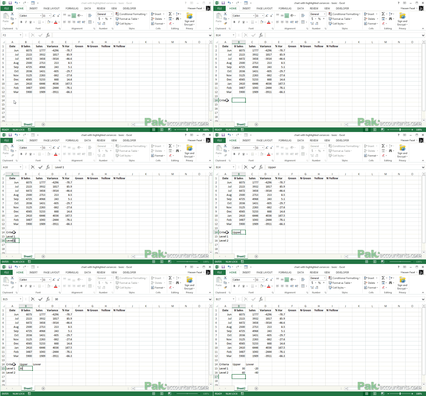
Step 2: Go down to cell A15 and define upper and lower limits of each inquiry levels. What variance to consider and what not at specific level depends on entity’s policy. This is what I had:
- Level 1 (Green): 30, -20
- Level 2 (Yellow): 60, -40
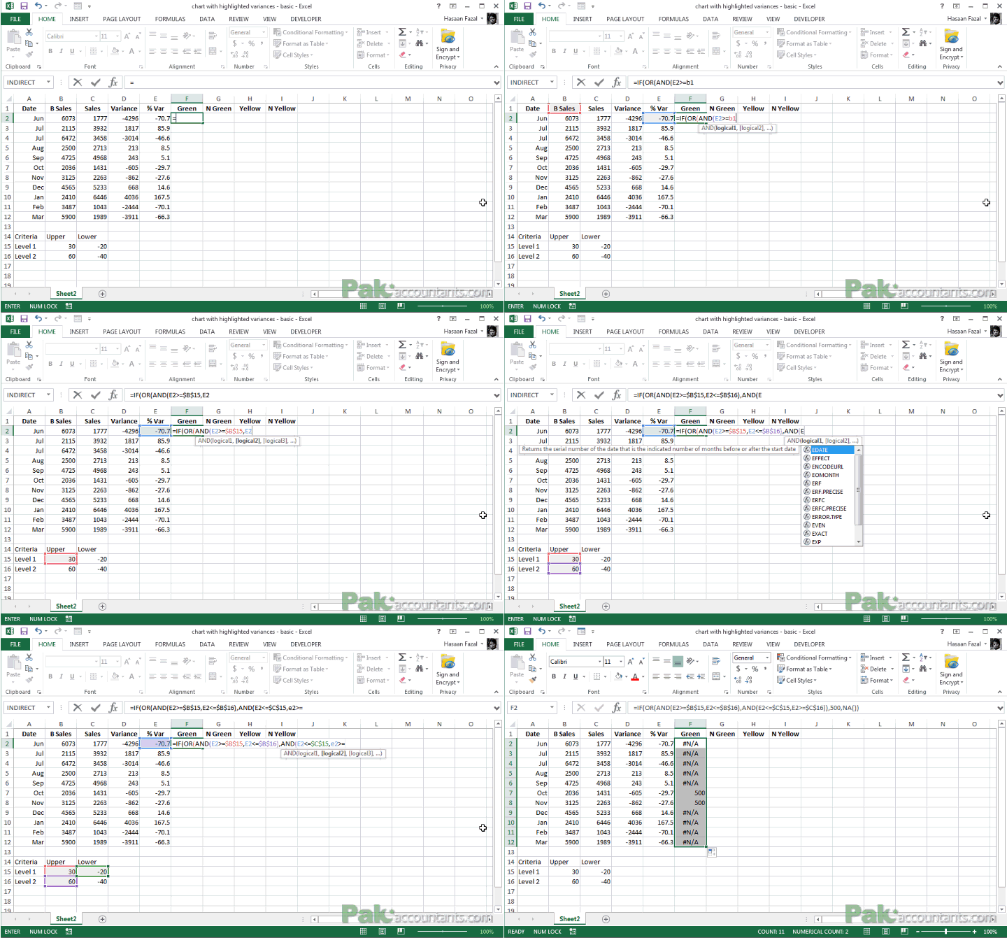
Step 3: Go to cell F2 and put this formula:
=IF(OR(AND(E2>=$B$15,E2<=$B$16),AND(E2<=$C$15,E2>=$C$16)),500,NA())
Understanding the formula
Yes this formula has three functions tied up together to perform the logic which goes like this:
IF
the value in cell E2 is greater than or equal to the value in cell B15
BUT (performed by AND function)
the value in cell E2 is less than or equal to the value in cell B16
OR
The value in cell E2 is less than or equal to the value in cell C15
BUT
the value in cell E2 is greater than or equal to the value in cell C16
If all above is TRUE then
Put 500 as a value
Otherwise (ELSE)
Put NA()
If all still doesn’t make sense then it goes like this:
If the value in cell E2 is greater than and equal to the value in cell B15 AND also less than or equal to the value in cell B16
OR
If the value in cell E2 is less than and equal to the value in cell C15 AND also greater than or equal to the value in cell C16
Than put 500 as value otherwise put NA().
Step 4: Once the formula is in place double click the fill handle to populate it down to the appropriate row.
Step 5: Put the following formulae in the mentioned cells and afterwards double click the fill handle to populate the rest of the column:
Cell G2: =IF(OR(AND(E2>=$B$15,E2<=$B$16),AND(E2<=$C$15,E2>=$C$16)),-500,NA())
Cell H2: =IF(OR(E2>=$B$16,E2<=$C$16),500,NA())
Cell I2: =IF(OR(E2>=$B$16,E2<=$C$16),-500,NA())
Why we need Negative yellow and Negative green?
The way I have chart in my mind is that it will have both positive and negative values plotted, that way positive values will appear above axis and negative below axis. To highlight both positive end and negative end, we need highlighters on both sides to make the variance stand out. That is the reason we are going with these two additional data sets or columns.
Step 6: Select values of variance column with green, negative green, yellow and negative yellow column values.
Step 7: Go to insert > Charts > Bar charts > Stacked column bar charts. Chart will be inserted.
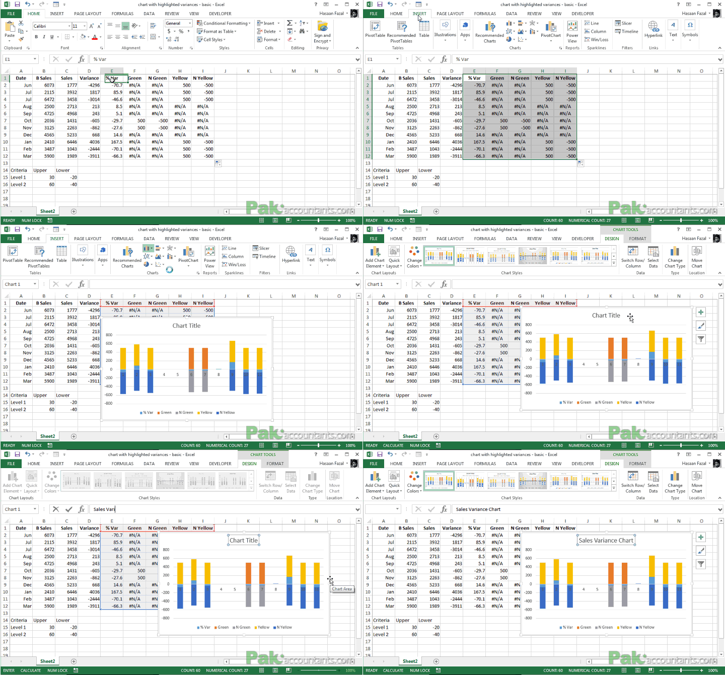
Step 8: Right click variance data series and click change series chart type. A dialogue box will open, go to combo and for variance series check secondary axis.

Step 9: Right click on axis on the right (secondary axis) and click format axis. Under the bounds specify minimum as -200. This will adjust the chart back in place. You can also adjust the primary axis to 300 and -300.

Step 10: We need to adjust the highlighter series for colors and width. Looking at the legends which is what and can make adjustments easily. In my case Green series is in orange, Negative green in gray. I need them to be in the same color i.e. green. Both of them. Same goes with Yellow and Negative yellow series. Both of them should be of the same color i.e. yellow.
Step 11: Right click on any highlighter series and click format data series. Under series options reduce gap width to make it wider than the variances series.
Clean up the chart and there you have it! Chart with variances plotted and particular variances highlighted in colors to indicate level of inquiry required.

I played with it a little more and added functionality to turn the highlighters On or Off using Excel form controls. You can download the file to know by reverse engineering to see how it works:

📤You download App EVBA.info installed directly on the latest phone here : https://www.evba.info/p/app-evbainfo-setting-for-your-phone.html?m=1



Leave a Comment